App design updates

Budibase apps now look much better by default. At the end of Cycle 1, we changed the platform to enable users to create better-looking apps faster. In our pursuit, we made the following changes...
A better starting point:
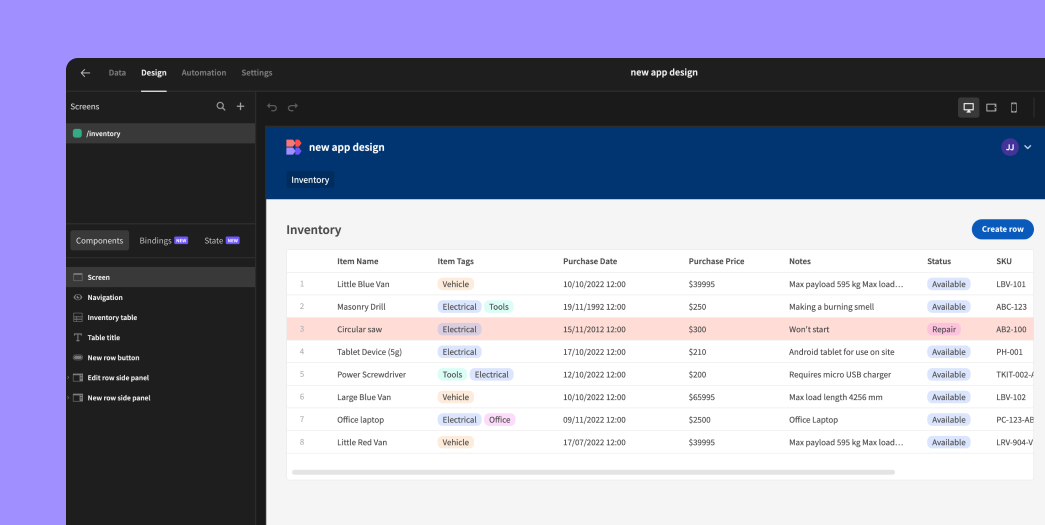
New apps launch with pre-populated sample data and a pre-built inventory screen with a whole CRUD experience! The table comes preloaded with conditions (red row highlights) and formatting (currency symbols) to showcase powerful features instantly.
Unified Text Component:
Goodbye headline and paragraph; hello versatile "text" component! Enjoy markdown support and a dynamic text input that grows with your content (up to 5 rows).
Revamped Navigation:
The default nav bar now sports a blue background with crisp white text. Navigation links have been refined with improved styling. The old "portal" link has been replaced with a user avatar and dropdown menu, offering quick access to profile updates, password changes, portal access, and logout.
Table Style Refinements:
- Table whitespace has been optimized for a cleaner look.
- The header font is now bold for improved readability.
- Row number colors have reduced contrast for a softer appearance.
- The "quiet" table setting now features a more opinionated style, including no header icons and subtle header background contrast.
- The table header background and striped row colors are now customizable.
- Checkboxes are now hidden when they serve no purpose.
Expanded Color Palette:
The color picker has been updated with new static color options, ensuring consistent colors regardless of the app theme. This is used for the new nav background.