OAuth 2.0

by Joe Johnston

We're excited to announce a significant security upgrade for Budibase users: you can now seamlessly integrate OAuth 2.0 for secure user authentication flows. This powerful feature is available to everyone.

What's New?

  • OAuth 2.0 Client Credentials Support: Budibase now supports the OAuth 2.0 client credentials grant type, enabling robust and secure authentication for your applications.
  • Enhanced Security: Implement industry-standard authentication protocols to protect sensitive data and applications.
  • Streamlined Integration: Easily connect Budibase with your existing OAuth 2.0-compliant identity providers.

How to Get Started:
You can configure OAuth 2.0 authentication within your Budibase application settings. To establish a secure connection, provide your client credentials and endpoint details.

After adding your OAuth 2.0 configuration details, add the authentification method to your API via the REST interface.

As always, we appreciate your feedback and support. Happy building!

App scripts

by Joe Johnston

Budibase Enterprise now supports injecting custom scripts directly into your applications. This feature enables advanced customization and integration with third-party libraries and services.

Often, you want to inject JavaScript snippets into all pages of your site, either in the or at the end of the tag. Most analytics providers, font services, and A/B testing services will give you an HTML snippet and ask you to add it to every page on your site. Budibase now lets you do this from the app settings interface.

Technical Details:

App design updates

by Joe Johnston

Budibase apps now look much better by default. At the end of Cycle 1, we changed the platform to enable users to create better-looking apps faster. In our pursuit, we made the following changes...

A better starting point:
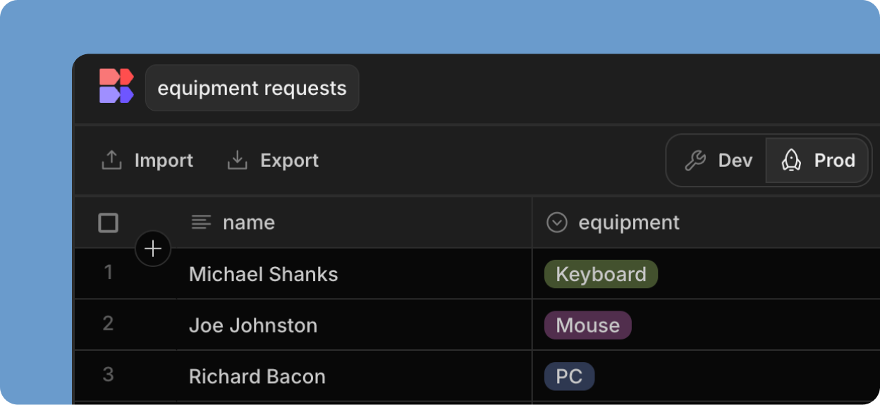
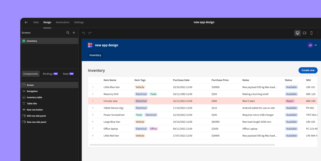
New apps launch with pre-populated sample data and a pre-built inventory screen with a whole CRUD experience! The table comes preloaded with conditions (red row highlights) and formatting (currency symbols) to showcase powerful features instantly.

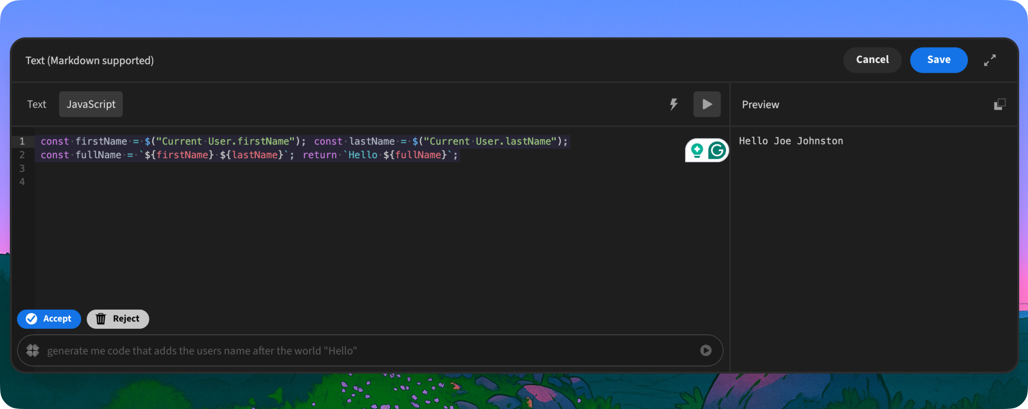
Unified Text Component:
Goodbye headline and paragraph; hello versatile "text" component! Enjoy markdown support and a dynamic text input that grows with your content (up to 5 rows).

Revamped Navigation:
The default nav bar now sports a blue background with crisp white text. Navigation links have been refined with improved styling. The old "portal" link has been replaced with a user avatar and dropdown menu, offering quick access to profile updates, password changes, portal access, and logout.

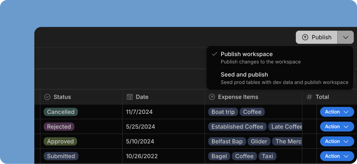
Table Style Refinements:

  • Table whitespace has been optimized for a cleaner look.
  • The header font is now bold for improved readability.
  • Row number colors have reduced contrast for a softer appearance.
  • The "quiet" table setting now features a more opinionated style, including no header icons and subtle header background contrast.
  • The table header background and striped row colors are now customizable.
  • Checkboxes are now hidden when they serve no purpose.

Expanded Color Palette:
The color picker has been updated with new static color options, ensuring consistent colors regardless of the app theme. This is used for the new nav background.

SQL attachments

by Joe Johnston

We're thrilled to announce Budibase now supports SQL attachments! This feature empowers you to build even more robust and versatile internal tools directly within Budibase.

How to Get Started:
Add an attachment column to your SQL database table within Budibase to enable attachments. It's that easy!

As always, we appreciate your feedback and support. Happy building!

The Budibase Team.

Error Popover

by Joe Johnston

Tired of guessing where things went wrong in your Budibase app? Say hello to a streamlined, intuitive way to tackle errors: the new Budibase Error Popover!

We've completely revamped how you find and fix issues, giving you a powerful new tool to boost your development workflow. No more cryptic messages, the Budibase Error Popover puts all the information you need at your fingertips.

Here's what you can expect:

  • Centralized Error Hub: A dedicated space within Budibase's design section where errors relating to the specific screen are aggregated and displayed.
  • Clear and Concise Error Messages: We've translated technical jargon into plain English so you can quickly understand the root cause of each issue.
  • Links: Each error links to the component and setting, allowing you to pinpoint the problem area in seconds.

Stop wrestling with bugs and start building with confidence. The Budibase Error Popover empowers you to:

  • Debug More Efficiently: Spend less time tracking down errors and more time building amazing features.
  • Improve App Quality: Identify and resolve issues quickly, leading to a more stable and reliable application.

In addition to the new Error Console, we've added preemptive measures across the builder to inform you of the effects of a dangerous deletion. For example, if you delete a data source, we will list the affected screens.

State panel

by Joe Johnston

It is common to use state when building Budibase apps. Sometimes, a screen can have multiple instances of state. The new state panel makes it quick and easy to see what state has been set on a specific screen and where it's being used.

Key features:

Viewing state: You can see all the state variables defined within your screen.

Testing state: Before the introduction of the state panel, to test your state, you would have to open the app preview and then activate it. The new test input allows you to test state and see the result within the design preview without opening the app preview.

Linked components: Understand what components are setting state and what components are using it. Referenced components are linked to make them easier to locate. When clicked, the specific setting will be highlighted within the component settings panel.

Bindings panel

by Joe Johnston

The new Bindings panel serves as a window to view the data available to your screen or tied to your component, essentially providing a central location to inspect and understand how data is flowing through your app.

Key features:

Viewing bindings: You can see all the bindings defined within your screen, including their current values which is helpful for debugging and understanding data flow.

Accessing component data: The panel displays information about each component in your app, letting you check their current state and values.

Debugging tool: By using the Bindings panel, creators can quickly identify issues with data consistency or unexpected changes in their application.

JS Console Logging

by Joe Johnston

Introducing console.log type functions within JavaScript bindings, enhancing the developer experience by providing previewable logs directly in the platform.

Key Features:

Previewable Logs: console.log, console.warn, and console.error calls within JavaScript bindings are now displayed in the preview pane. This allows developers to debug and understand binding behavior before deployment.

Distinct Log Levels: console.warn and console.error messages are visually differentiated from regular console.log messages, improving readability and highlighting potential issues.

Comprehensive Formatting: The implementation supports comma-separated log statements and correctly displays different data types, including proper highlighting for JSON objects.

Frontend-Only Logging (Initial): Currently, all logging is handled on the frontend. This means logs are visible when previewing formulas or automation bindings (where preview is supported). Backend logging is not yet implemented.

Design to App Preview Persistence: Logs generated in the design section will persist and be visible when previewing the actual application. This enables you to effectively debug binding evaluations within a realistic app preview.

App speed is an obsession within Budibase. While we try to pay attention to performance when adding new functionality, regressions and unoptimized codepaths do happen.

This time around, the opposite has occurred. Whilst delivering a different feature, we discovered an opportunity to optimize performance for JS bindings within the design section.

The change included forking vm-browersify to reduce its resource usage.

The result

When running tests, we used a repeater to display 1000 components, each containing 1 JS binding, and the render time went from 32.8 seconds to 1.4 seconds. This enhancement dramatically improves the performance of JS bindings.

Field components no longer have to be wrapped in a Form component to work. When used without a form, they provide a global binding of their value.

Almost all field types support this usage, except attachments (single and multiple), signatures, and relationship pickers, which must be bound to a datasource to function.

A couple of things to note:

  • The field setting is now optional for standalone fields. Instead, the component name will be used to generate the global binding.
  • All settings, such as validation, default values, and on-change actions, continue to function as expected.