Added
Modal Component
over 1 year ago by Budibase
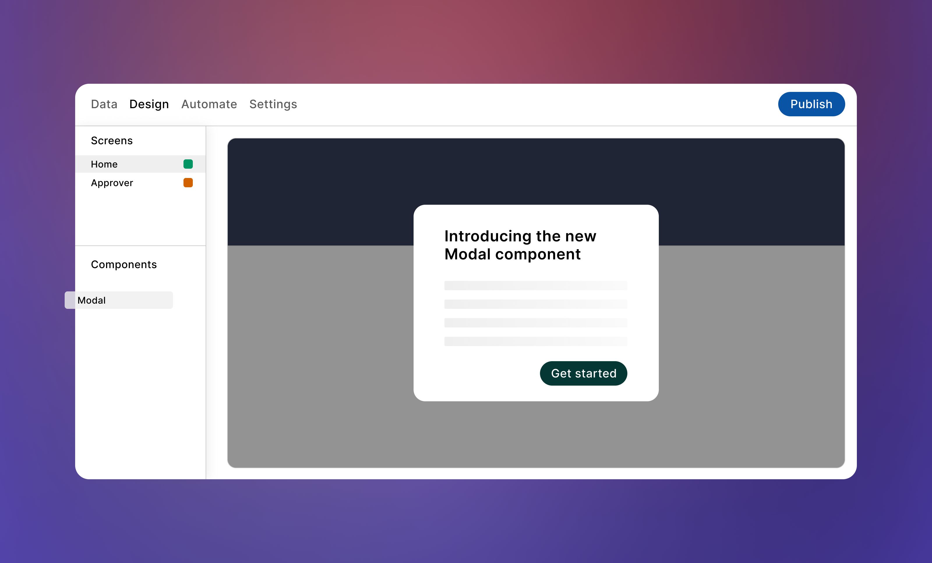
We are excited to introduce the new Modal component in Budibase. This feature enables a pop-up modal to appear on your screen when triggered by an action, such as a button click. It functions similarly to the existing Side Panel component but is designed for different use cases, such as confirmation dialogs, notifications, form inputs, and more.
Key features:
- The modal will be centered on your screen by default for optimal visibility.
- Choose from four different size options to suit your needs:
- Large: 800px * 600px
- Medium: 600px * 400px
- Small: 400px * 200px
- Full screen: 100% * 100%
You can find the new Modal component under Layout in-app.
Please note that modals block interaction with the rest of the app until users perform an action to dismiss them, so we recommend using them sparingly.