Blocks
Working with pre-built components in the Design Section
Blocks in the Budibase are pre-built components comprised of multiple Components themselves. They perform a common functionality and take away the complexity of having to repeat yourself.
At the time of writing, there are seven types of blocks available.
Adding a Block
To add a block to your application, head over to the Design section, then press Add component. The blocks can be found under the Blocks category.
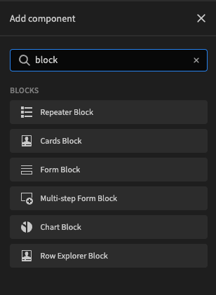
List of available blocks
Once you choose one of the blocks you want to have, it will appear in the design window.
Configuring Blocks
Configuration of blocks is done by clicking the block you just added to open the Settings Panel.
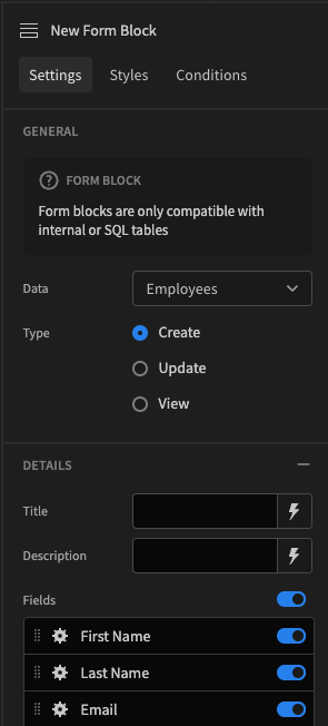
Form block
The most important selection you will have to make first is picking which data table you want to use. Click the Data dropdown to see the list of available Datasources.
Other settings are composed of the different Components that were encapsulated within the block. To learn about which components are used for each block, look at the respective section below.
Empty text
Most blocks support a custom message when no data is found. This is most likely to occur when filtering returns no results. For example:

Empty text setting

You can also use Bindings in your message.
Types of blocks
Name | Description |
|---|---|
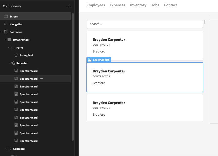
Cards block | The Cards Block merges three different components into one. In order, it uses Data Provider, Repeater and Card components. All the configuration options relevant to all three components are available in the sidebar. Additionally, you can easily add search fields to allow users to filter your card blocks. |
Repeater block | The Repeater Block is a quick way to have both the Data Provider and the Repeater component into one. |
Form block | The Form Block is a comprehensive component that makes building different types of forms much more convenient. |
Multi-Step Form Block | The Multi-Step Form Block allows large forms to be broken up into pages. |
Chart block | The Chart Block combines a Data Provider with a nested Chart that matches the type chosen from the Chart Type dropdown menu. |
Row explorer block | Allows you to view data in an alternative way. It combines a searchable and scrollable list of cards on the left hand side, whilst displaying a detail form on the right for the selected card. |
Ejecting blocks
As mentioned, blocks combine various components for convenience. Whilst there are many settings, sometimes blocks wont provide the full flexibility you are after. In this case, you can eject the block.
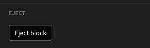
An ejected block will split a single block component into its constituent components. To eject a block, you can press the Eject block button in the settings panel, or select the option from the component tree.
Eject block button in the settings panel
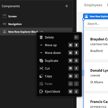
Eject block from component tree
Ejected content