Buttons
Buttons allow users to perform an action or to navigate to another page. They have multiple styles for various needs and are ideal for calling attention to where a user needs to do something to move forward in a flow.
Button
Use the button component to encourage users to take action and make choices with a single click or tap. The Button component requires text and an Action .

Customizing the button
| Setting | Description |
|---|---|
| Name | Rename how the component reads in the tree. |
| Text | Update the button text |
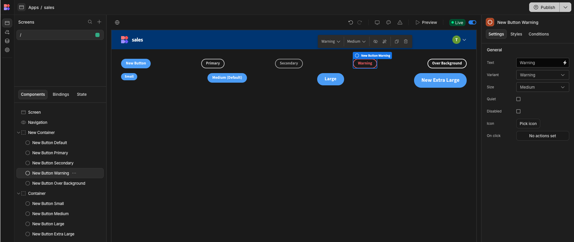
| Variant | Budibase buttons come in a number of different variants including, Action, Primary, Secondary, Warning, and Over Background (for colored backgrounds). |
| Size | Change the size of the button (Medium and Large) |
| Quiet | Whether the button should be displayed with a quiet style. |
| Disabled | Whether the button is disabled. |
| On Click | Clicking this button will bring up the Actions panel. In the Actions panel, you can configure and chain Actions in response to a user clicking on the button. |
Adding buttons to table rows
Click on the table component in your component tree and scroll to the bottom of the settings side panel on the right of your screen. You should see an Add button button. Click this to add your first button. This will then work similarly to the Button group component discussed below.

Button Group

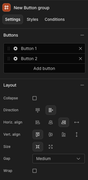
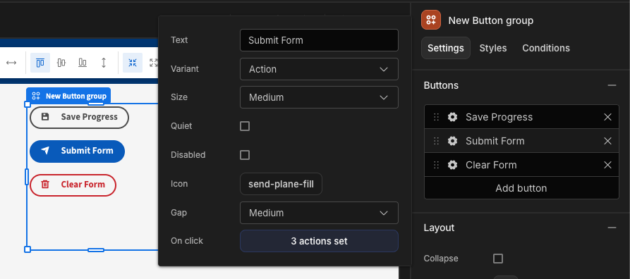
The Button Group component behaves in much the same way as a single Button component, with the added benefit of being able to configure and style multiple buttons at once. Adding a new button here will create a new button in just the same way as a Button component on it's own, but it will be part of this group. We can configure the button's actions and appearance using the cog-icon in the list of buttons. We can also drag-and-drop using the grab-handle (dots) to the left of the cog, to re-order the buttons, which will change the order they appear on the screen, as well as in the list.

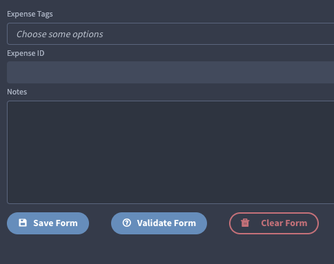
You could use Button Groups in Form components, offering a variety of options for the user, which are managed and styled from one place.

Updated 7 months ago