Side panel
Show/Hide content without a modal screen
A side panel is a special container that slides in from the right-hand side when opened.
You have a wide variety of different components that can be added to the side panel. There are a few that aren't allowed to be nested inside. Another side panel, modal and a section.

Side panel with nested form block
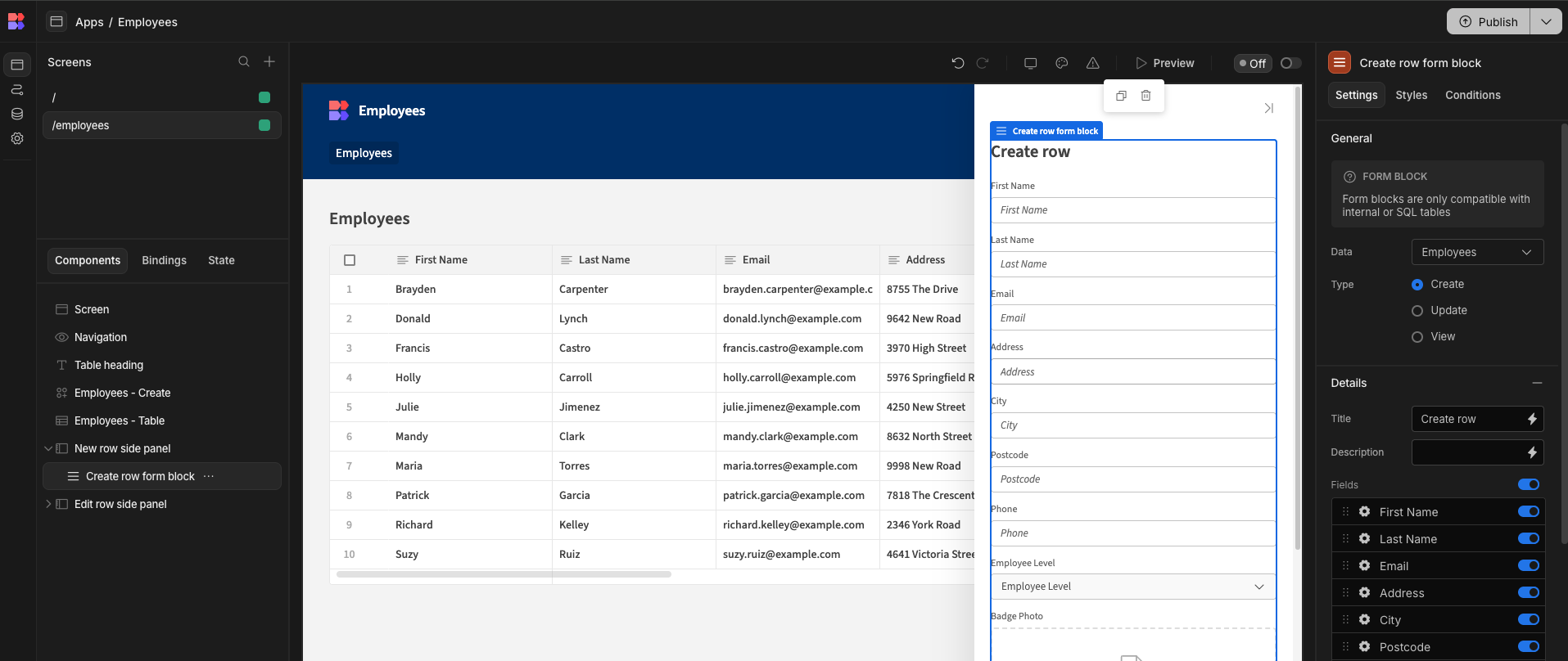
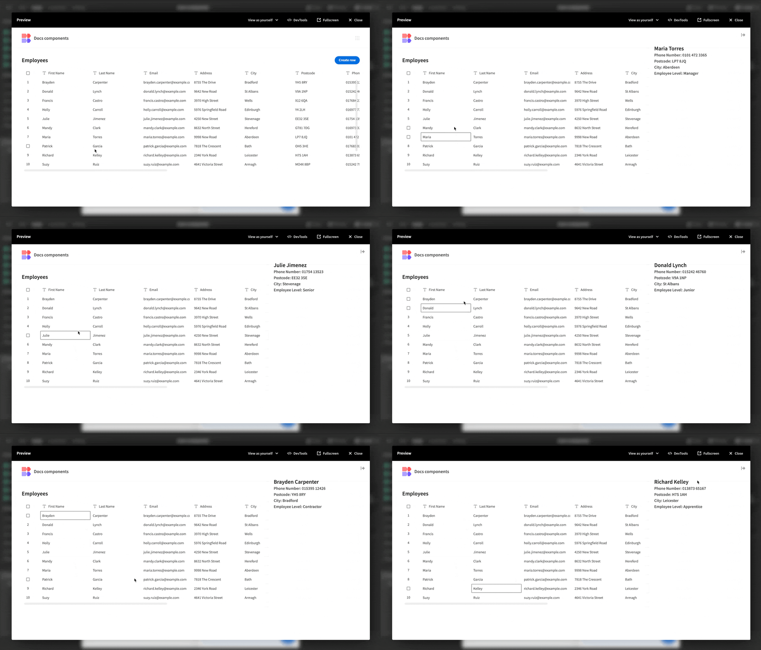
App preview of a side panel
Opening a side panel
Side panels are opened via the Open Side Panel Action. This could be triggered from a button click, or some other event such as on change.

You can choose to open any side panel that is anywhere in the screen component tree.
Closing a side panel
By default, a side panel can be closed by a user simply clicking an area outside of the panel, or by clicking the close arrow. Clicking outside of the side panel to close it will be ignored if "Ignore clicks outside to close" is checked.
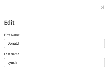
Close side panel
Alternatively, the Close Side Panel action can be used.

No screen needs to be selected as this action will automatically close any currently open side panel.
Side panel settings
The side panel component itself has some settings.
- Ignore outside clicks—when checked, this prevents the side panel from closing unless a button action is clicked or the closing action shown above is clicked.
- On Close - This setting allows you to run actions when the side panel is closed. For example, you could run an action that refreshes a data provider or update a state value etc.
App state & Side panel
When using the side panel you may want to create/update App state for use by a component nested within. An example of this would be; the Form / Form Block components, app state can be passed into these. The aim of this is to prevent users from jumping between pages and providing a more enriched interactive experience.
Additionally you can use the side panel as an area which contains additional information of the selected item.
Example
Form usage
- Add the table component with a related data provider (for this I will be using the inbuilt test data).
- Add the side panel component.
- Within the table component
ON ROW CLICKadd 2 different actions:Update stateandOpen side panel

- Add a key name, I've used selectedRow and updated the value with
{{ Clicked row._id }}.
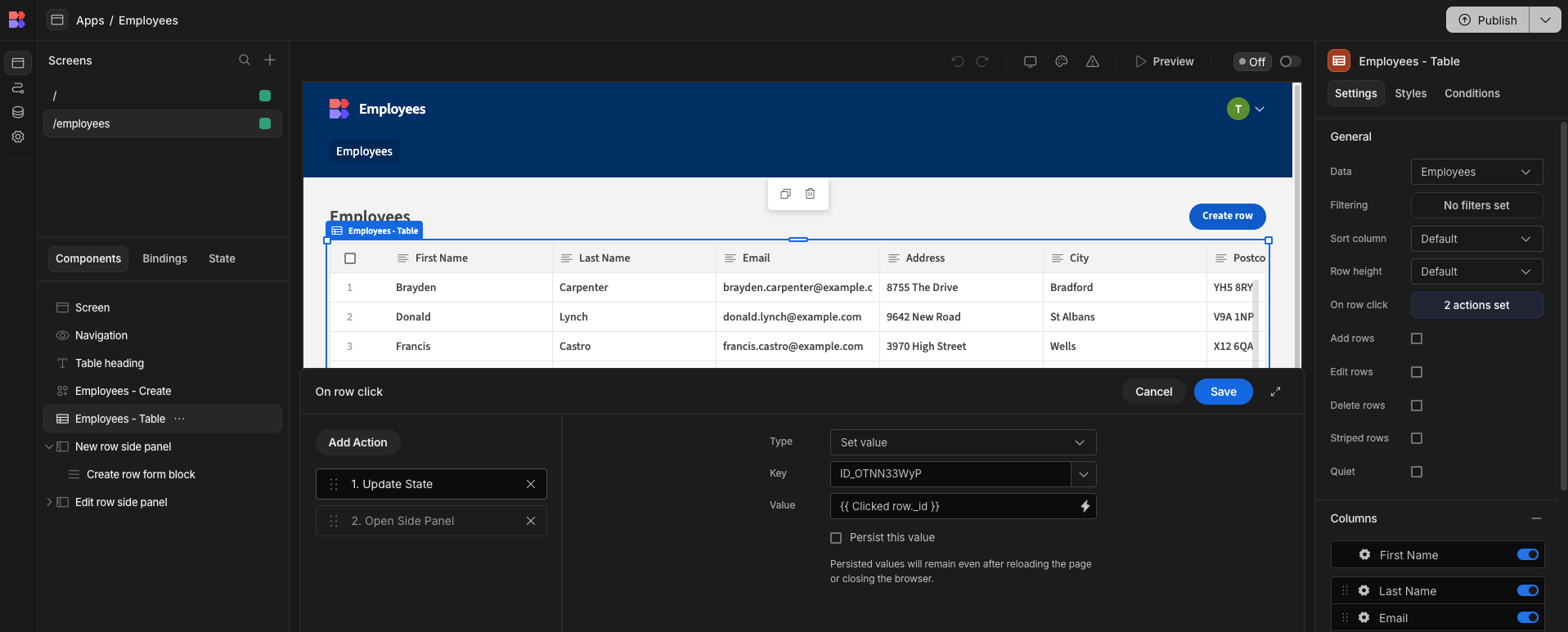
- Add a Form / Form Block for this example I will be using the Form Block
- Change the form to update/read only, then add the selectedRow app state to the
Row ID
A similar approach to the above can be done for simply displaying additional information.
Follow the previous steps until Step 5. (Please ensure the side panel along with the newly created data provider are nested within the parent data provider.) From here we are going to add a Single Row Provider and pass it the row_id from state. We can then nest a Text component within it, which will have access to the values stored on the row.
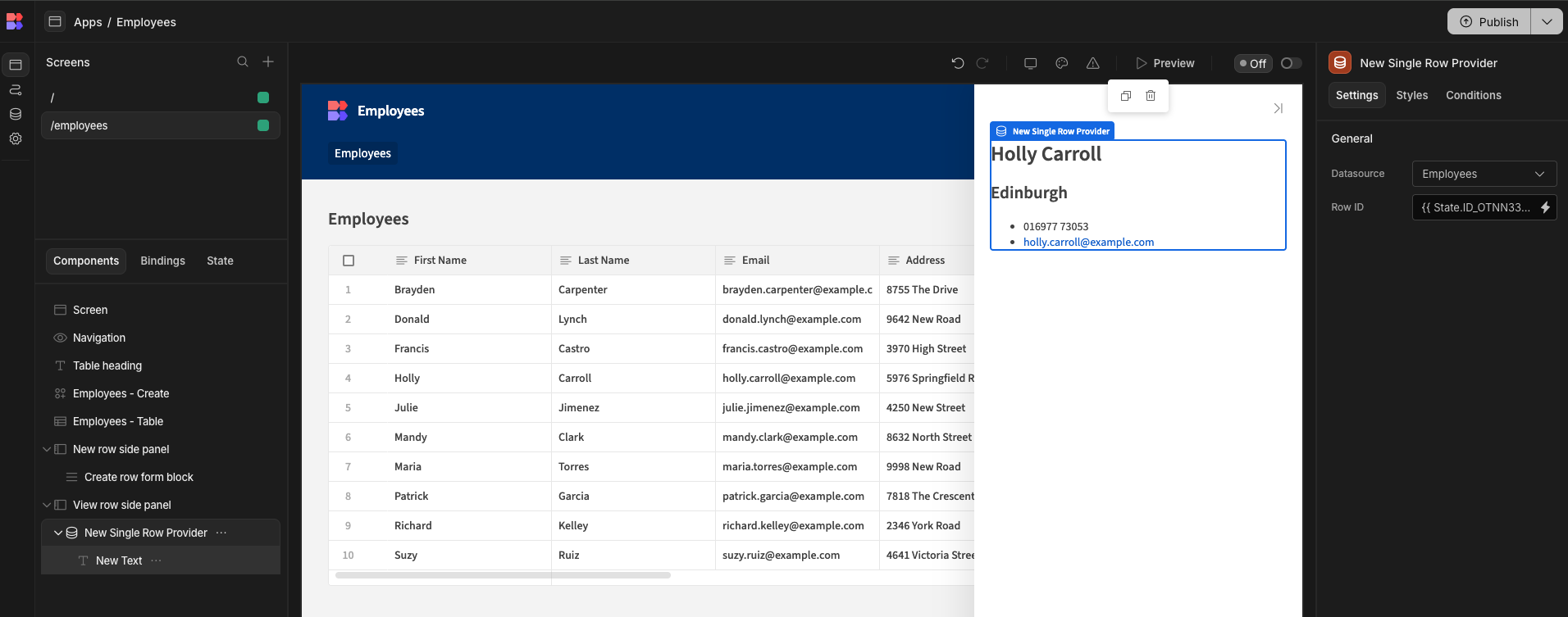
Start building out your side panel area to include additional content you wish to show on click.
In order to make designing your side-panel easier, you can manually set a value in State within the builder. Under normal operation, this value would be set when the user clicks on a row, but because that doesn't happen in the builder, no row will be shown. To tackle this, head to the Data section and view the table you're using to provide this information. Right click on a row and click copy row _id . You can then paste this into the "State" panel.

Updated 7 months ago