Pie & Donut Chart
The Pie and Donut Charts are both circular charts. They're great in visualizing percentages, like how much of a pie you're going to get.
They both behave and look the same, with the exception of the shape. The Donut Chart has a hole in the middle, where the Pie chart does not.

Comparison of the Pie Chart (left) and the Donut Chart (right)
Adding a Pie or Donut Chart
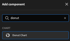
To add a Pie or Donut chart, head over to the design section in the Budibase UI. Then, you'll need a wrapping Data Provider. After you've added the data provider, add a Chart > Pie Chart or Chart > Donut Chart to the design as a child of the data provider. This should connect your chart to the database directly.
Then, in the Settings Panel, you will want to configure how to display the data. This kind of chart is probably often filled with data coming from a View, but can of course be connected directly to a table as well.
First, in the Label column setting, you want to select which column represents the label of the data you want to display, then in the Data column you want to select the column which represents data in a Number format to display in the chart. Once this is done, your chart should already be ready to view!
For more customization, check the reference table below.
Settings panel
The settings panel has quite a few customization options, allowing you to get the most out of your pie or donut chart.
| Setting | Description |
|---|---|
| Provider | The Data Provider as a parent of your chart |
| Label Column | The Labels you want to display with your data. These are displayed on the legend |
| Data Column | The data you want to display as the segments. This has to be numeric. |
| Colours | Choose from one of the predefined colour-palettes |
| Width Height | The size you want the chart to be, supports all CSS supported sizes |
| Data Labels | Shows the percentage of each section on the segment. |
| Animate | Will animate when the data changes or on startup. Data-change can happen through Dynamic filter's for example. |
| Legend | Will display, in the upper-right corner, the label for each of the data columns displayed on the chart |