Form block
The fastest way to build forms
Form blocks combine all the necessary components to build a comprehensive and flexible form.
There are three key types.
| Type | Fields | Save button |
|---|---|---|
| Create | Provides blank fields to be filled out. | Creates a new row. |
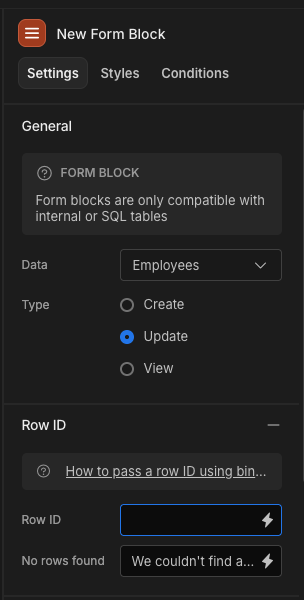
| Update | Provides pre-populated fields based on the record that matches the row ID. | Updates the existing record. |
| View | Provides pre-populated read-only fields based on the provided row ID. | N/A |
Next you can select a table which will provide the Datasource and Schema. This supports both the Budibase internal table, as well as the core SQL databases.
If you want to use a custom schema then you will need to Eject the block. Alternatively you can build your own custom form using a Form component. This approach requires more work but is much more customisable.
Detail form with Row ID
Auto-configured details side panelManual setup is not required when creating an autogenerated table block.
A Details side panel will already be included with the Row ID set to App state of the Clicked row.
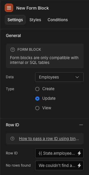
When selecting Update or View type, you will need to provide a Row ID so that the form block knows which row data to populate the fields with.
Example usage
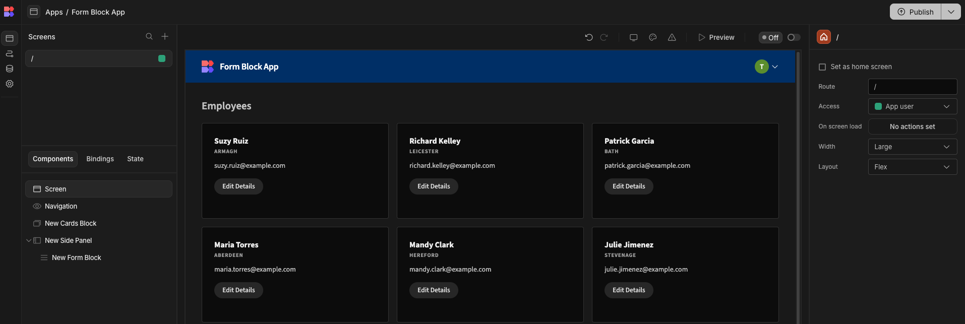
Add a Block, such as the Cards block for your data, and add a Side panel to your screen.
In the Settings Panel of your Cards block, enter a Title Binding for your rows.
Click on the Click actions button, and add an Update state action to set a new key 'employee_id' to {{ Employees Cards Block.Employees._id }}.
Next click Add Action: Open Side Panel, and make sure to select your side panel from the dropdown. Then Save your actions.
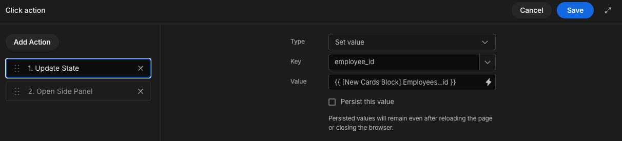
What is '_id'?The _id field represents a unique row identifier, which will exist on all data tables, including the internal DB and SQL tables within Budibase. It is a URL-safe encoded string.
Finally add a Form block component inside your Side panel. In the Settings Panel, set Type to 'Update'.
Provide Row ID with the app state binding you created above, i.e. {{ State.employee_id }}.
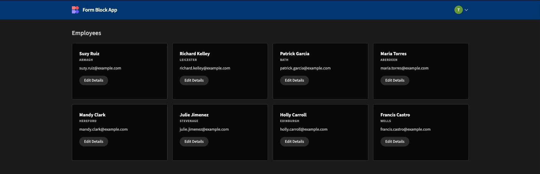
You should now be able to Preview your app to see the details side panel in action:
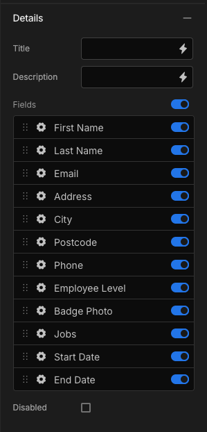
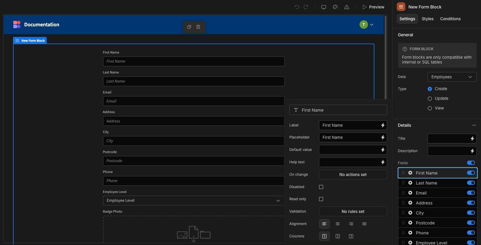
Fields
After you pick a table schema, you will be able to configure your fields using the right side panel.
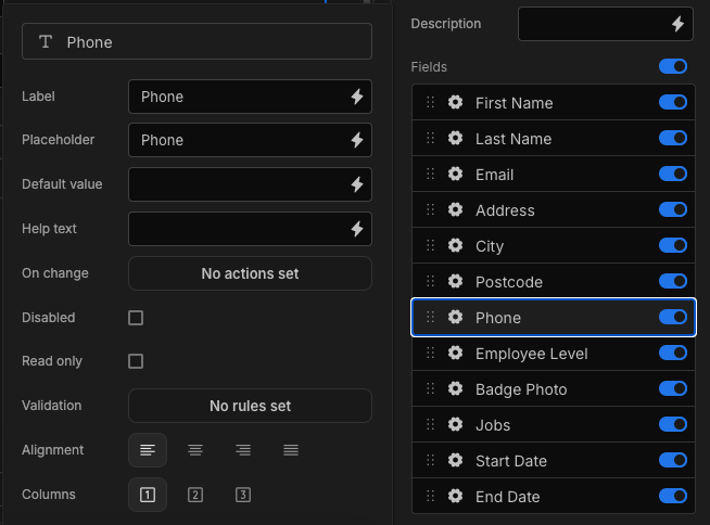
Form field configuration
Click on the cog to customise field placement, actions, validation, and much more.
Configuring form fields
You can adapt the layout of form fields with the layout option on each column, this allows for single, two and three column layouts.
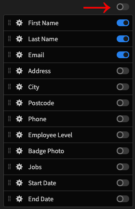
In field configuration you have a variety of things which can be done, you can use the switch to decide which fields appear in the form. Easily adjust the order by dragging items and alter the text of labels. You can also disable a field to prevent interaction or set it to read-only, maintaining the styling without allowing changes to the field's value.
Toggle all fieldsIf you only need to expose a couple of required fields, you can toggle the switch at the top to hide all fields, and then toggle on the few required ones.
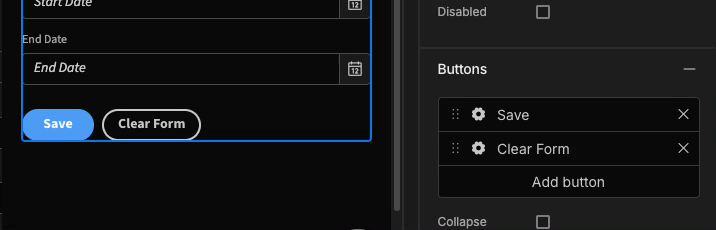
Buttons
Depending on the selected type, you will have the option to add or remove the form action buttons. For example, Update type will have the following buttons by default:
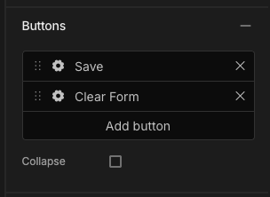
Click the cog icon to edit the preset button Actions. For example you may not want to perform navigation or show notifications after clicking the 'Save' button.
You can also drag the left hand edge to re-arrange the order that the buttons appear:
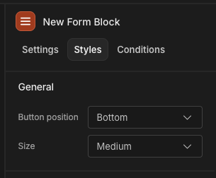
Position and size
By default the buttons will appear at the bottom of your form. If you want to place them at the top, inline with your heading, then you will need to change the Button position to 'Top'. This can be done in the Styles tab.
You can also enlarge the Size of your form, which will proportionally increase the field sizes, button sizes, and heading size.
Large form with buttons at the top
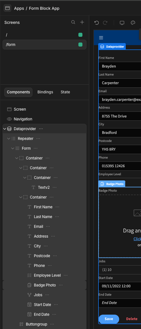
Ejecting
A form block can be ejected to expose it's constituent parts. When a Create type form is ejected, it will appear similar to the following:
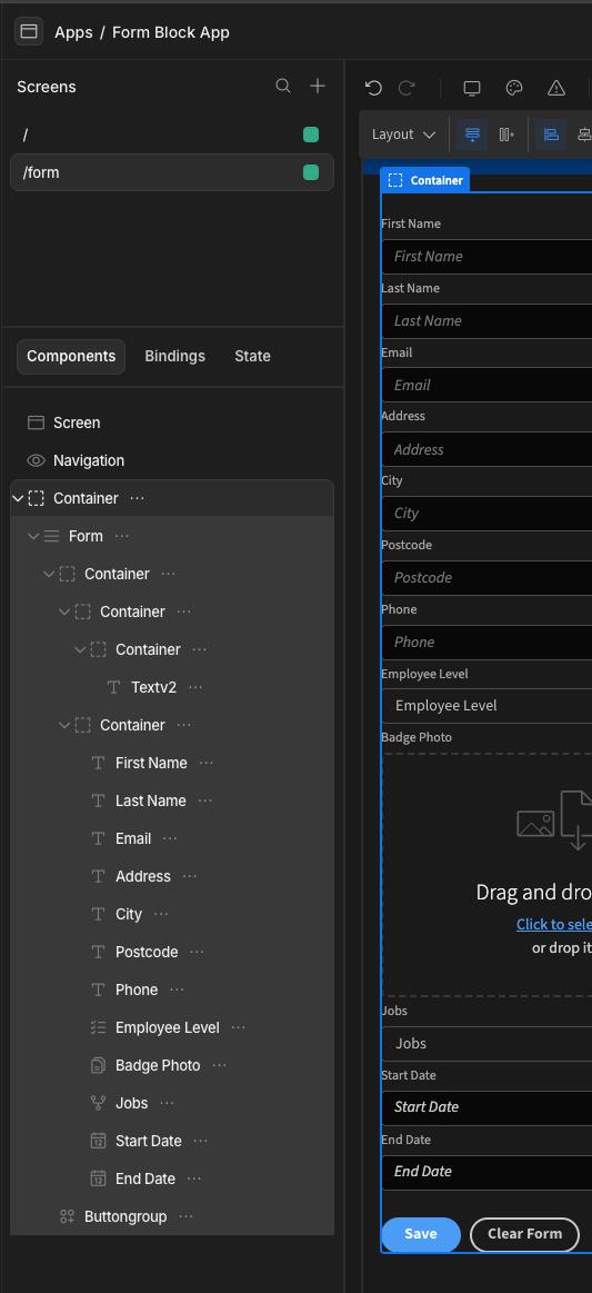
The Update type is similar, but will also include the Data provider and Repeater necessary to provide the row detail.