Theming your app
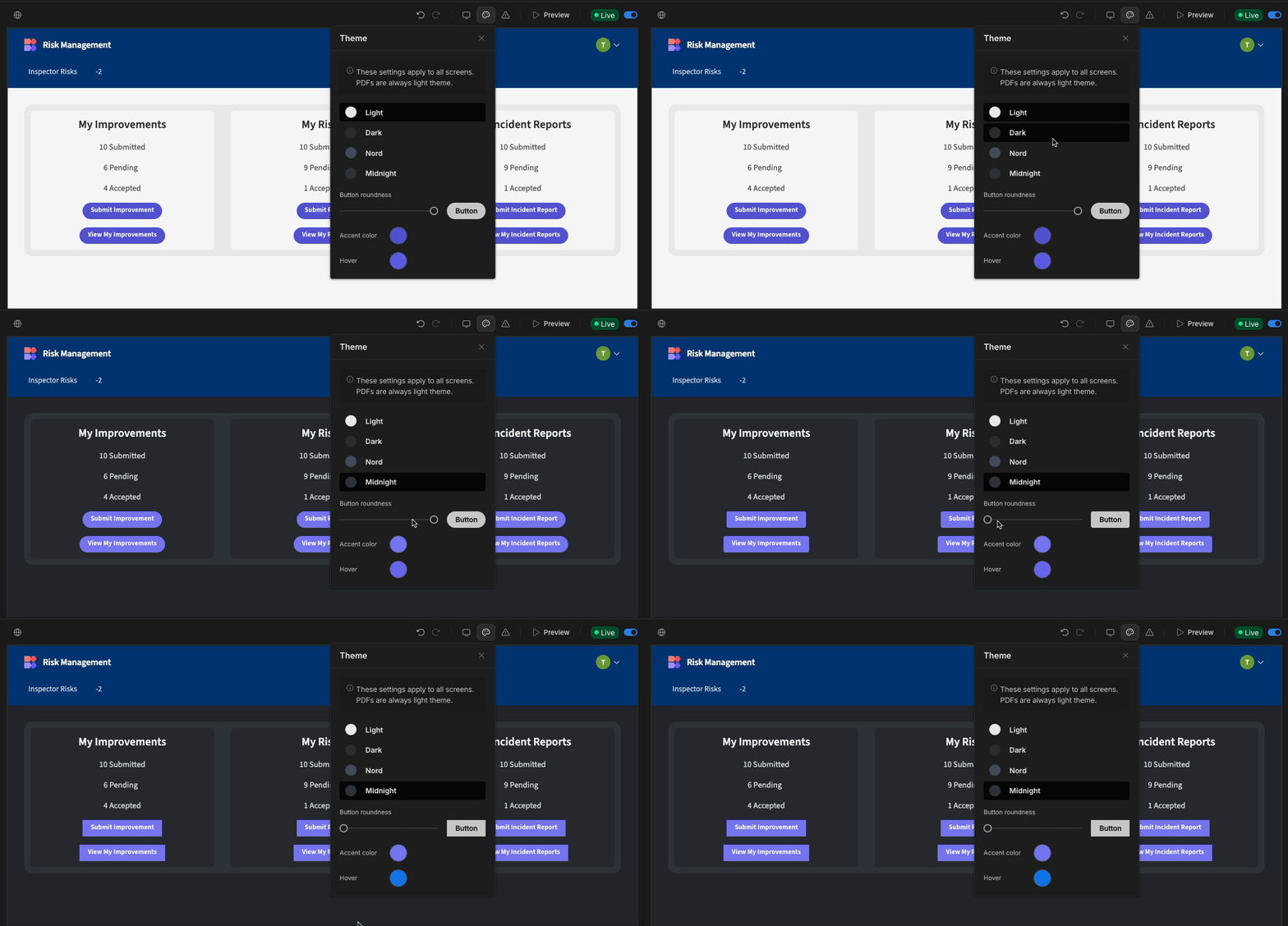
To streamline the design process, a Builder can update app-level theme settings. Updating these settings will update the style of all the screens within your app. Builder users can quickly update the theme of your app by selecting the screen in the component tree, and selecting the Theme tab in the settings panel.

Theme
Changing the theme will change the color palette your app uses. This is a great feature and allows you to update the core look of your app with just one click.
The default theme is Light, however there are another themes of varying brightness to choose from, including Nord and Midnight.
Button shape
You can customize the shape of your buttons at the app level using the button roundness slider.
Accent color + accent hover color
Accent color
The accent color represents your brand's primary color. Changing this setting will change the color of your action button, links, input highlights, and more.
Accent hover color
The accent hover color is the color of the element after a user has hovered their mouse over it.
Navigation background and text color
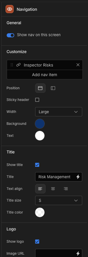
The navigation colors are set in the Navigation panel.

Updated 6 months ago