Table
Lift your tables from the Data section into your Design
The table allows you to display tables and queries, as seen in the Data section, in your apps and screens for end-users.
It is the quickest, most direct way to provide your users with a CRUD interface.
Add a table in a couple of clicks!
- In an App, within a screen, click
Add component. - Under the Data category, click
table.
You can also add a table by searching for "Table" and pressing the Enter key.
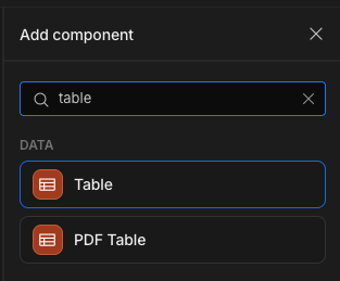
Adding the table

With the table added, you will want to select a Table in the Settings Panel.
Configure columns
Table columns can be configured under the Columns section of the settings. Click the cog icon beside a column to change its label.
Click on Configure columns to determine which columns should be included in your table view and to change their labels. The underlying database column name will still be shown above the label for reference.
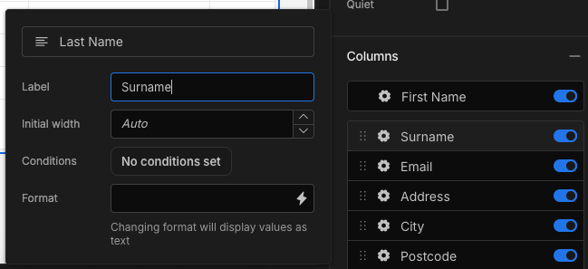
Giving the 'Last Name' column the display label 'Surname'
Columns can be shown or hidden with the toggle switches, and the column order can be set by dragging and dropping columns.
In-app column width and orderThe initial width and order of your columns will match the table in the Data section.
Users can use the mouse to drag columns to change their order, or drag edges to resize the width. These changes will only apply to the users' session.
Also note that the Display column will always be pinned.
On row click
Click Define actions to run Actions on click of a row.
You will be able to use the {{ Clicked row }} Binding to access the object data of the clicked row.


If you wanted to access a property of the clicked row, for example the _id, then you would write your binding like so: {{ Clicked row._id }}
Sorting
Select a Sort column and Sort order to set the initial default sorting; either ascending or descending. You can also set an initial sort on a column that is not being displayed.
A user can still override this sort by clicking the three dots beside a column. Text fields can be sorted alphabetically, whereas number fields will be sorted numerically.
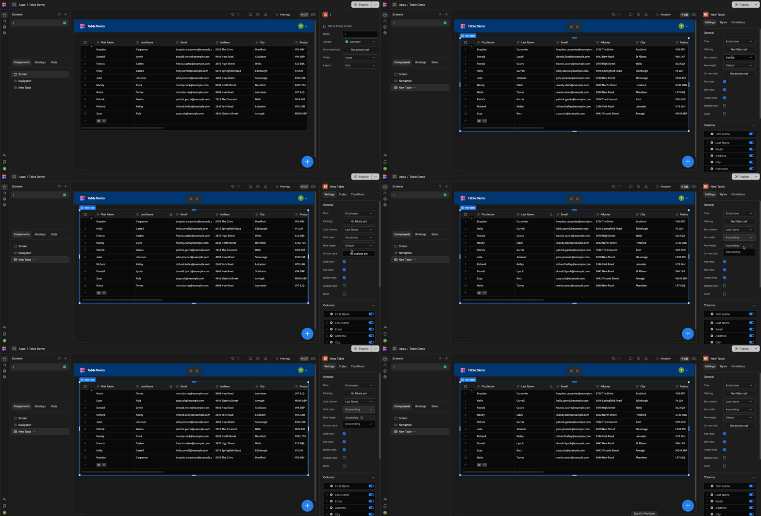
Row settings
The table offers a few row settings, including a mix of style and function.
| Setting | Description |
|---|---|
| Row height | Set the height of the table rows (Small, Medium and Large). The default is small. |
| High contrast | If checked, the table rows will be striped. |
| Add/Edit/Delete rows | Uncheck to prevent users from adding/editing/deleting rows. |
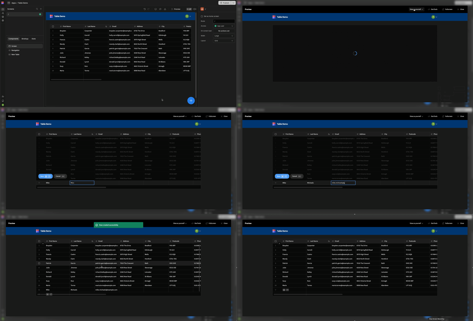
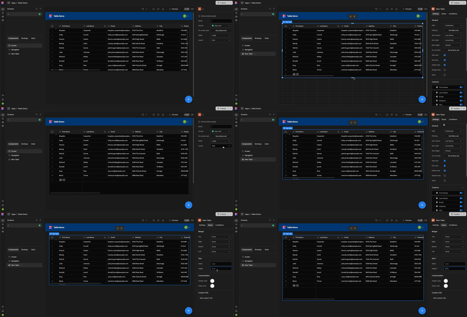
If you want to increase the number of rows displayed on screen, simply increase the height of the table in the Styles tab, or drag the component larger when displayed on a screen or inside a container set to "Grid".
Search
Search can be added to a table through the use of Bindings and filtering Using a form and text input.
Some field types also allow searching directly within the table's column. If you hover over a column and see a magnifying glass icon, you can click it to add a search input field in the column header. Typing into this field will perform a basic search on the data in that column.
Selected rows binding
If your table has the Allow row selection checkbox ticked, then you will be able to make use of the Selected Rows Binding.
This can be found underneath your table within the bindings drawer:
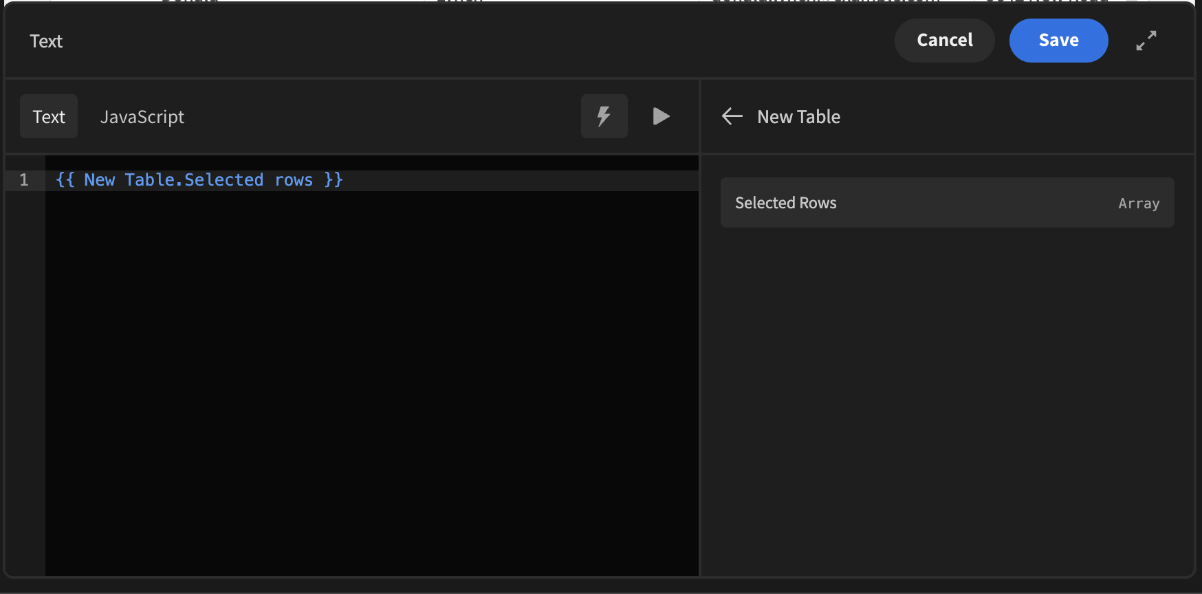
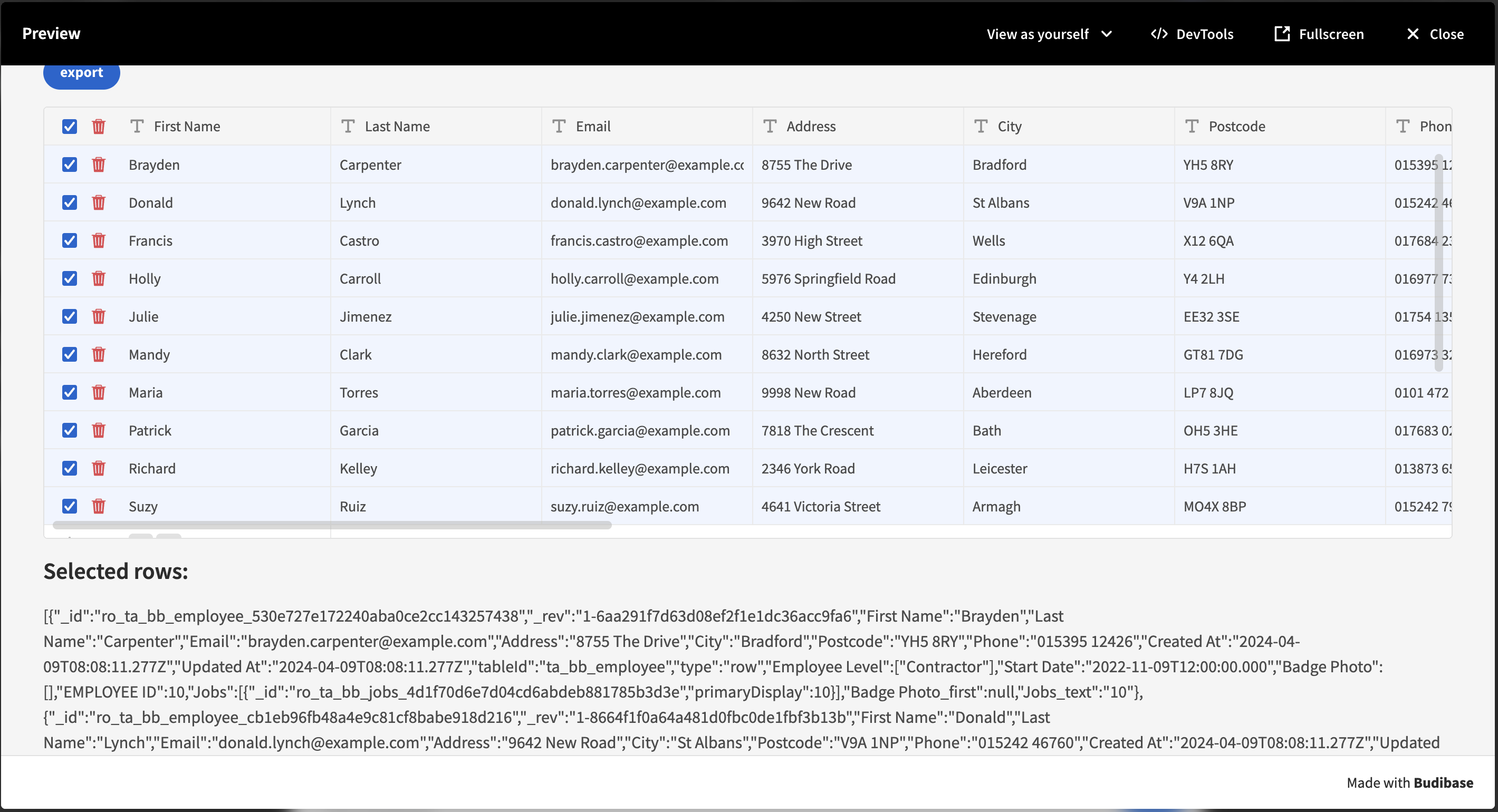
When using this binding, an array of the selected row data will be made available:
This binding can be used to Delete the selected rows:
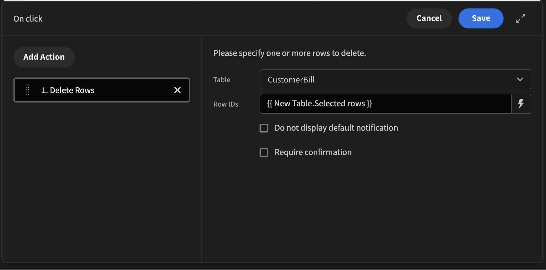
Delete selected rows
You could also pluck a field from the selected rows, such as an ID, to show which rows have been selected in a readable way: {{ pluck New Table.Selected rows 'id' }}
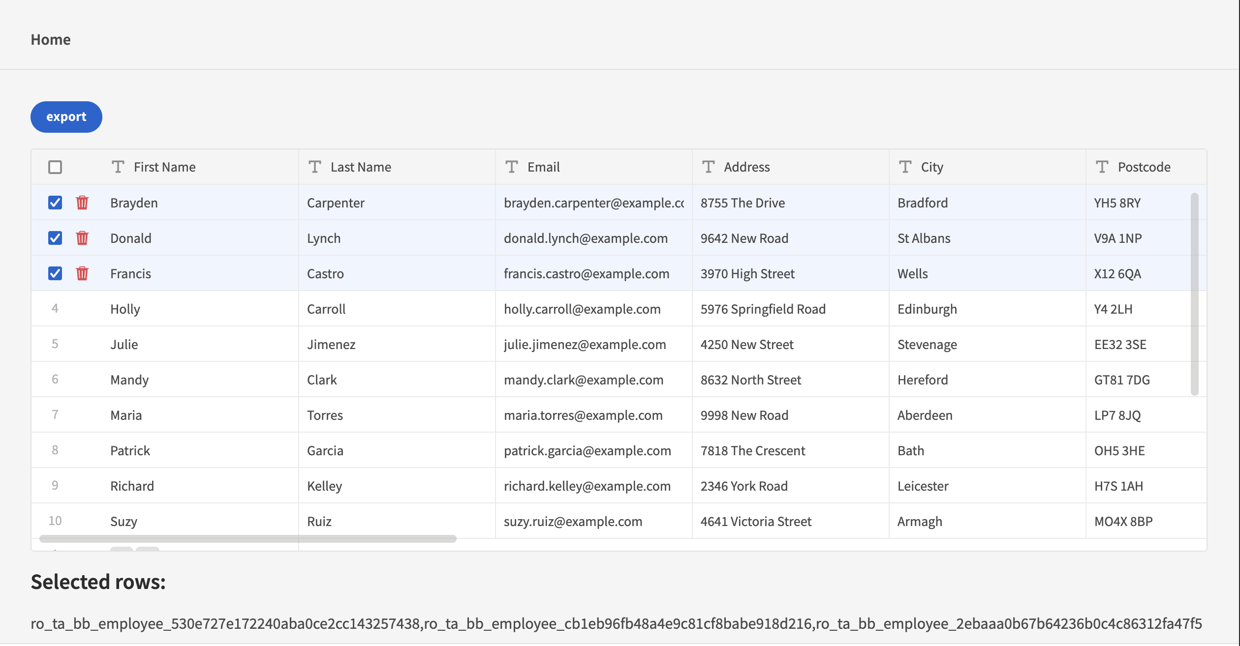
Displaying the IDs of the selected rows using the 'pluck' helper
Conditional formatting
With conditional formatting, you can now add conditional logic to either a cell or rows within your table. To make your formatting dynamic, you can set rules that change the format of cells based on their value. This can be done on a range of fields types, options, formulas, strings, numbers etc.
You can find conditional formatting options under the column settings:
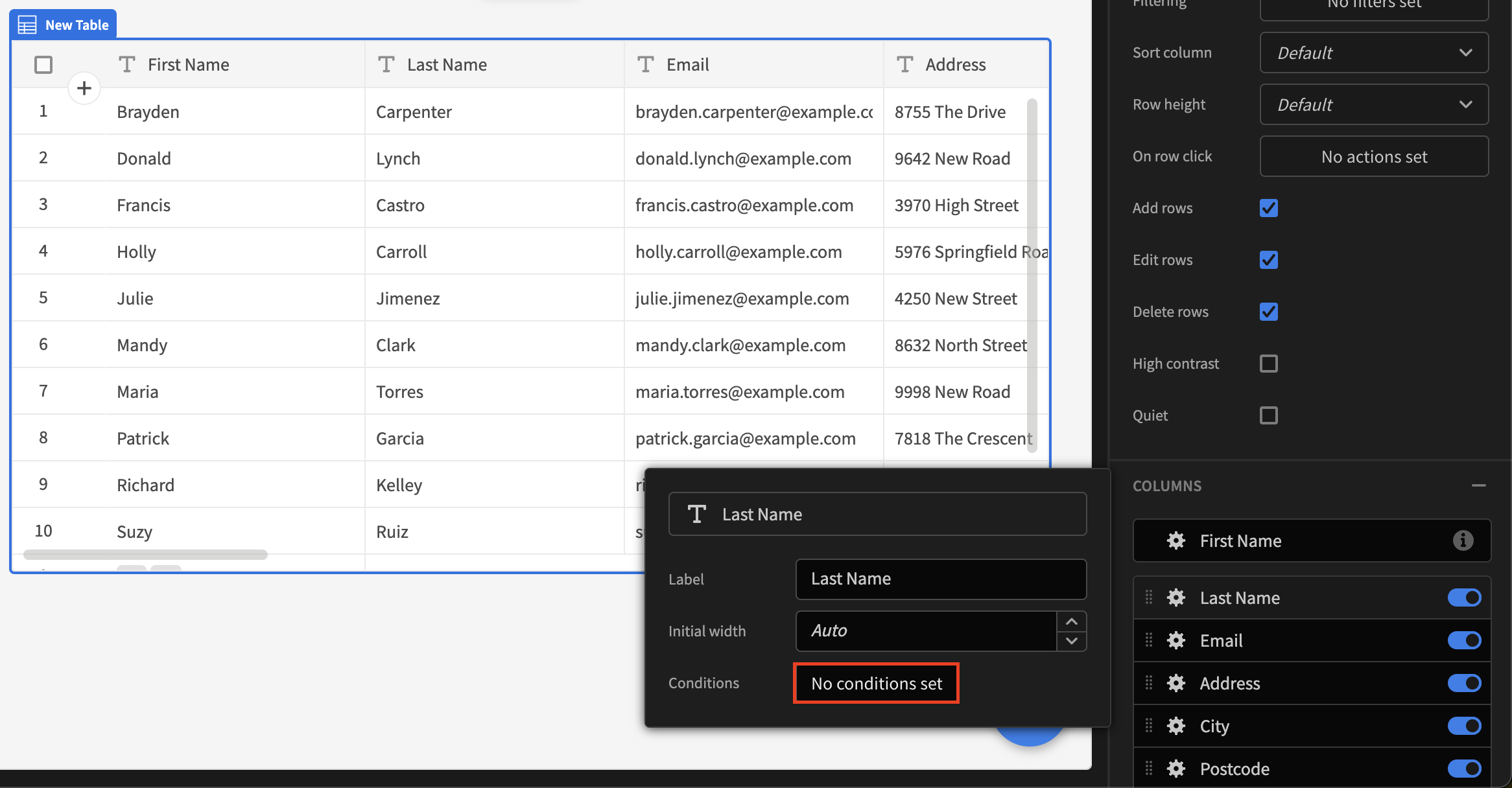
The above will open a new drawer when clicked, were you can begin adding your conditions in relation to the column you have selected.
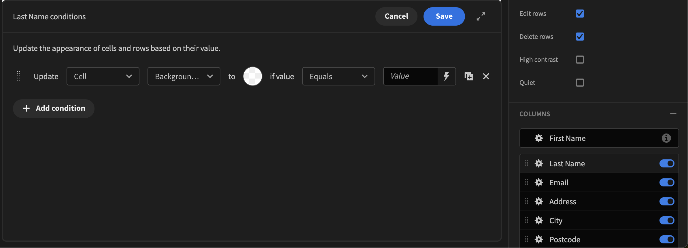
There are a few settings you need to be aware of.
- Cell ~ This will only apply styling to the specific cell chosen
- Row ~ This will apply styling to the entire row whenever the condition is met
- Background colour ~ This allows you to change the background colour of a cell or row
- Text colour ~ This allows you to change only the text colour of the cell or row
It’s worth noting that the order of your conditions matter, as Budibase processes these conditions from top to bottom. This is more specific to numbers as depending on the situation you may want to apply styling to higher values first and then apply styling to lower values next. Therefore you will need to order the conditions accordingly.
Deprecation - Selected row ids
Prior to v2.19.2, the selected rows binding provided a list of Row _ids only. This binding has been kept for backwards compatibility, however in future it will be removed. This change has been made because the new binding is more useful, allowing you to do the calculations outlined above.
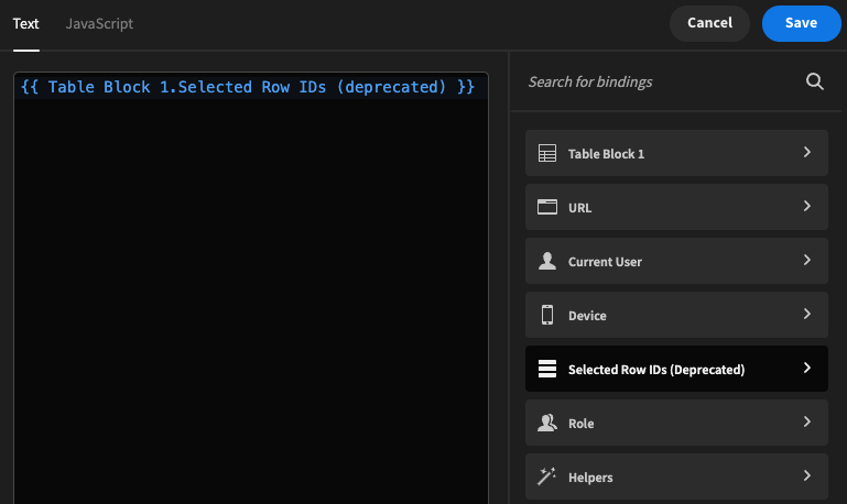
Please update your selected rows binding to the new one
Advanced settings
If you need more out of your table such as footers, resizeable and a more customisable search experience, you can check out the community Super Table.
Read more about Custom plugins.
Updated 7 months ago