Container
The container now has two different layouts. You can toggle between these two modes by switching between the icons of the layout setting. By default, the grid-based layout is selected. If you wish to use the old layout, you must click the first displayed icon.
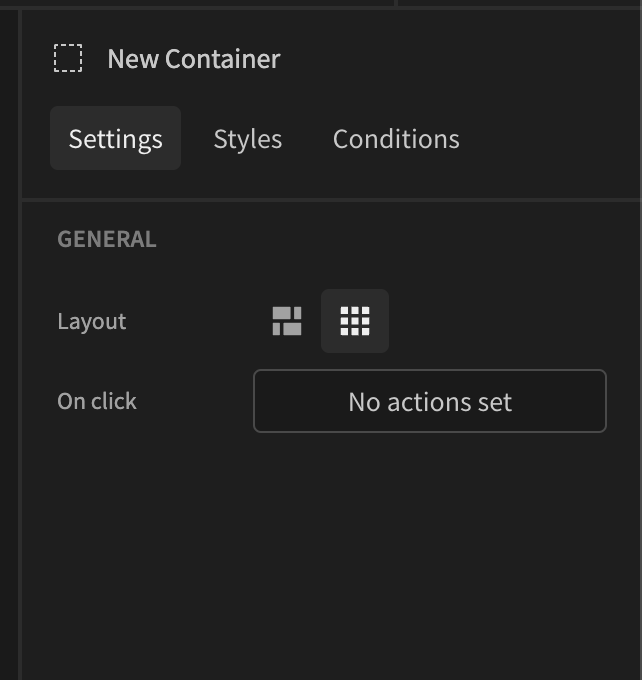
Grid-based
This layout allows users to drag, resize, and place their components anywhere on the screen. It also allows you to resize components based on the view mode you have currently selected in the builder. This allows you to build responsive screens easily for mobile and tablet devices.
To drag, hover over the component and click on its label. This will allow you to drag the component freely within the builder's design area. If you don't click on the label, you will just be able to resize the component.
Flexbox
A Container is a div with pre-defined styles. They are the building blocks of your application and critical for responsive design. Containers are used to structure your application and layout other components/elements in a structured way. You can use flexbox to layout the items within your container.

Learn FlexboxBudibase containers use flexbox to layout components. A great resource for learning flexbox is flexbox froggy.
Container settings
Flexbox
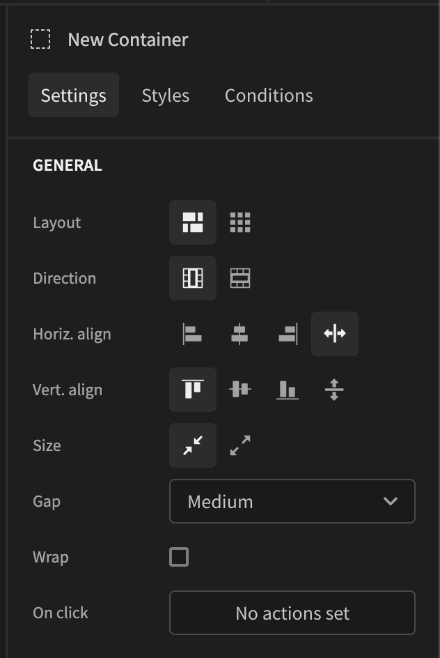
There are several general settings for the container component, most of which are shared with other components as well.
Setting | Description |
|---|---|
Layout | Switch between the flexbox and grid-base layouts. |
Name | Change the name of your component, and how it reads within the component tree. |
Direction | Change the direction of the components nested within your container. You can layout your components in a row (→) or a column (↓). |
Horizontal align | The horizontal. align setting is used to align the items on the main axis, the direction in which flex-direction has set the flow. The initial value is left which will line the items up at the start edge of the container, but you could also set the value to right to line them up at the end, or center to line them up in the center. You can also use the value stretch to take all the spare space between the items, and share it out evenly between the items so there will be an equal amount of space between each item. |
Vertical align | The vertical align property will align the items on the cross axis. The initial value is top which aligns the items along the top of the container (like they're handing from a roof), but you could also set the value to the bottom to align the items along the bottom (like they're standing on the floor), or middle to line them up in the center. You can also use the value to stretch, to stretch the items to fill the height of the container. |
Size | Where the grow option deals with adding space in the main axis, the shrink property controls how it is taken away. |
Gap | The gap property sets the gaps (gutters) between items stored within a container. You can select the different sizes of gaps you would like between your items. |
Wrap | Select the wrap to wrap your components onto multiple lines. This is critical when designing for mobile resolutions. With nowrap, the items are laid out in a single line which may cause the flex container to overflow. |
On click | By defining actions within the |
Container background colour
You can also splash some color into your apps with containers!
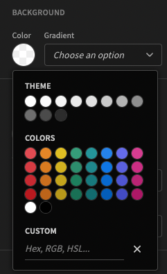
To clear the selected color, click on the X in the bottom right of the panel.
For additional flare, there are a range of gradients available.
Title | Gradient |
|---|---|
Warm Flame |  |
Night Fade |  |
Spring Warmth |  |
Sunny Morning |  |
Winter Neva |  |
Tempting Azure |  |
Heavy Rain |  |
Deep Blue |  |
Near Moon |  |
Wild Apple |  |
Plum Plate |  |
Peach Kiss |  |
Flamingo Sunrise |  |
Bud Mist |  |
Ballet Slipper |  |
Black Noir |  |
You can also add background colors to your Screens
Component layout
When using containers to layout your components, the most important setting is Direction as this will determine the flow of components.
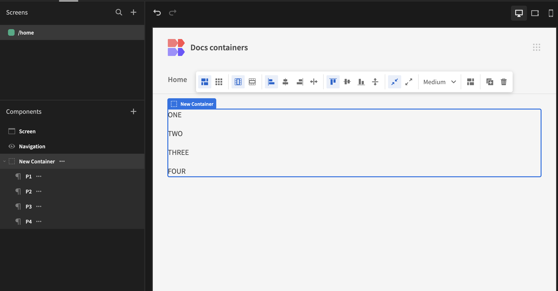
Container column layout
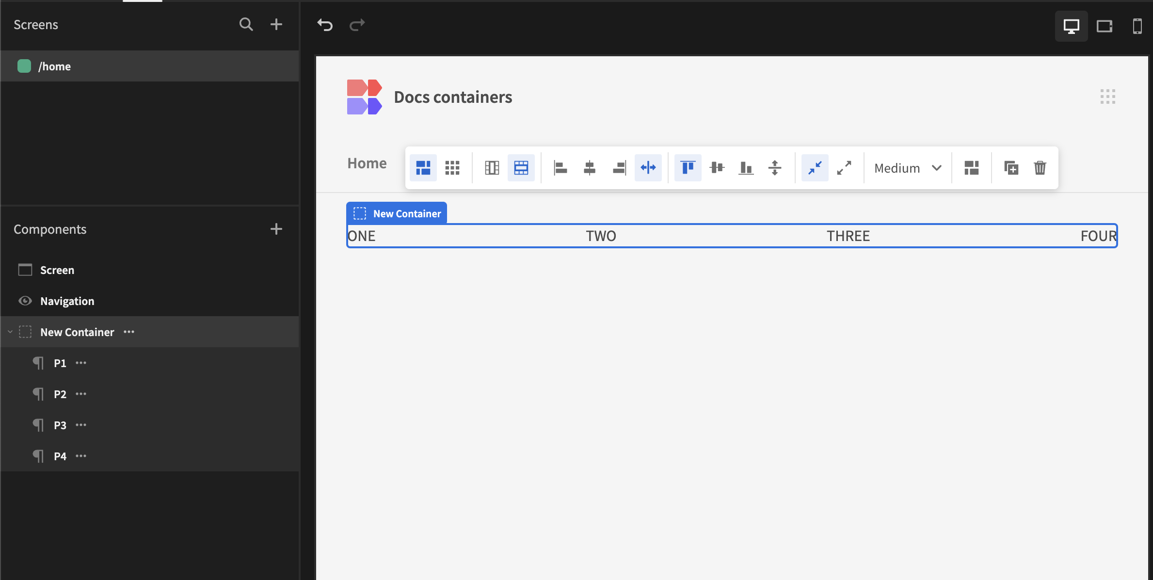
Container row layout
If you need additional layout you can add additional containers. For example what if we wanted to group 'THREE' and 'FOUR' in column direction, but have an overall row layout for the screen. In this case we need to add a container and nest P3 and P4 like so:
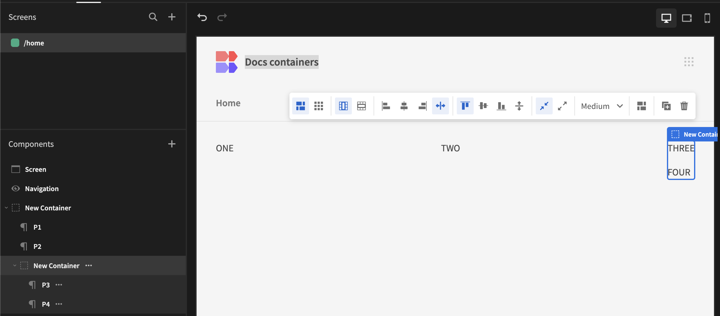
Multi-container row column directions
Containers are a really flexible way to arrange your components in the Design section. You can nest any number of containers with different styles and layout options.
You may, however be interested in Using sections or Field groups to get out-of-the-box layouts.
Updated 7 months ago