Icon
Icons are scalable vector graphics, which means that they look great on high-resolution displays.

To add an Icon component, click Add component and search for "Icon", or locate it under the Basic section.
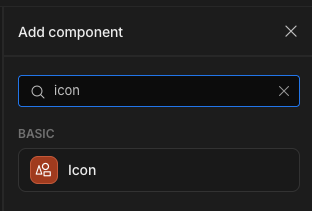
Adding an icon component
Within the Settings Panel under the Icon setting, a button will show the currently selected icon, or Pick icon if no icon has been selected. Click the button to change the icon.
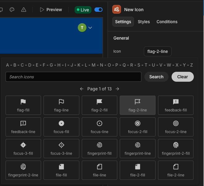
This will allow you to filter the Font Awesome library alphabetically or search for keywords.
Using an icon as a button
Icons support the On Click event. You can define all of the Actions that a button can.
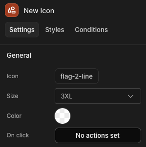
Define click actions in the settings panel
Tutorial: Displaying options as icons
In this tutorial, we will create an app with the sample data, and display an icon based on the Item Tags value of the Inventory table. To do this, we will make use of Conditional UI.
-
Add a Data provider for the Inventory table.
-
Add a Repeater nested inside the data provider.
-
Nest an Icon component within the repeater. This will display an icon for each tag.
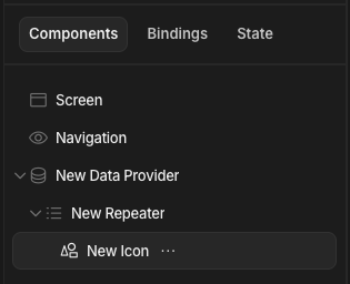
-
Select the icon component on the far right of the screen. You should see its settings.
-
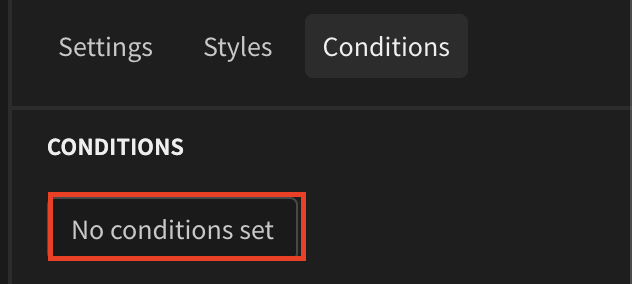
Click the conditions tab
-
Click the
no conditions setbutton, this will open a drawer were you can configure your conditions -
Click the
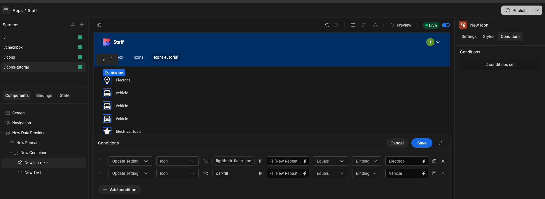
Add conditionbutton to create your conditions. In our case, we are going to use the update setting option. This will allow us to dynamically change the icon based on the inventory table's tag values. (Use the duplicate button to make your life easier!)
Result
Using a container to hold the Icon, and a Text component to accompany it, we can then show the item tags and an accompanying icon.
Updated 8 months ago