Options
Options data type is a straightforward way to provide options for a dropdown list or radio buttons in forms.
Adding an Options column
Options columnTo add an options column to your table, select "Options" from this dropdown list.
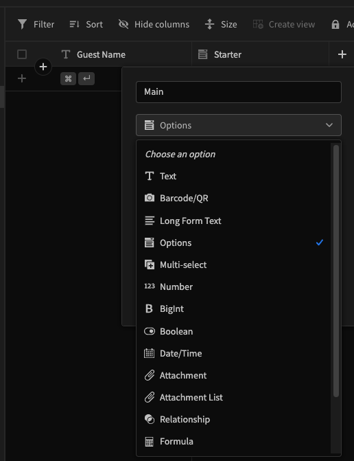
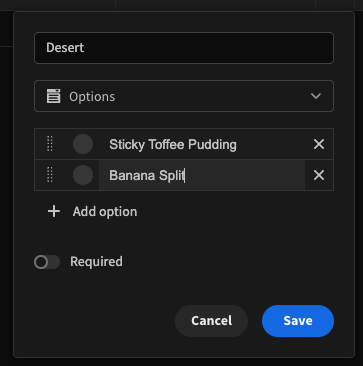
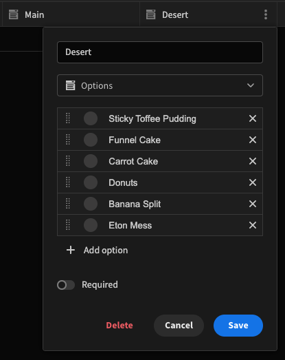
While creating the column, you will be able to add different options the user can select. These options can be edited later by clicking "Edit Column".
Use in Forms
Adding a Form Block component to your page, and setting the Data to your table will automatically populate fields into your form. Opening the settings panel will allow you to customise settings around your input.
| Setting | |
|---|---|
| Label | Text that will display above the input |
| Placeholder Text | Text that is displayed the field before the user makes a selection. Defaults to "Choose an option" |
| On change | Configureable actions that run on change. |
| Type | Chose between "Select" for a dropdown menu, or "Radio Buttons". Radio buttons not quite what you're looking for? Try Multi-select picker. |
| Direction | (Only available for Radio Buttons type input) Displays the options in vertically or horizontally arranged list. |
| Default Value | Assigns a default value should the user fail to make a selection |
| Help Text | Text that displays underneath, preceded by a question mark icon |
| Alphabetical | When unchecked, options will appear in the order that they shown in your data column. |
Changing the order of your options
To Change the order the options display in your form, firstly make sure "Alphabetical" is unchecked. Then, in the Data tab, click edit your column, and drag-and-drop your options. Alphabetical being checked will not change the order the options appear in the data tab, only the order in which they are displayed to the user in the form.