Divider
Dividers bring clarity to a layout by grouping and dividing content in close proximity. They can also be used to establish rhythm and hierarchy.
Dividers bring clarity to a layout by grouping and dividing content in close proximity. They can also be used to establish rhythm and hierarchy.
Size

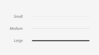
The small divider is the default size. This is used to divide similar components such as table rows, action button groups, and components within a panel.
The medium divider is used for dividing subsections on a page, or to separate different groupings of components such as panels, rails, etc.
The large divider should only be used for page titles or section titles.
Orientation

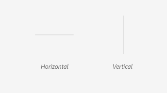
By default, dividers are horizontal and should be used for separating content vertically. The vertical divider is used to separate content horizontally.
Updated 8 months ago