State explorer interface
The State Explorer Interface enhances visibility and control over state management by clearly outlining where state variables are used and modified. This improves troubleshooting, debugging, and overall app maintainability.
Overview
The State Explorer Interface provides users with greater visibility and control over state variables used within a screen. It enables users to see:
- Which state variables are in use
- Where they are being used
- Which components they are attached to
Previously, there was no way to track which state variables were used or which components they were associated with. This feature addresses that gap, improving debugging and interface management.
Accessing the State Explorer
To open the State Explorer Interface:
-
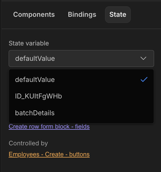
Navigate to the State tab to the right of Components and Bindings.
-
Click on the tab to reveal the State Variables selection field.
-
The first state variable in the list is selected by default.
-
To view a different state variable, select it from the dropdown list.
-
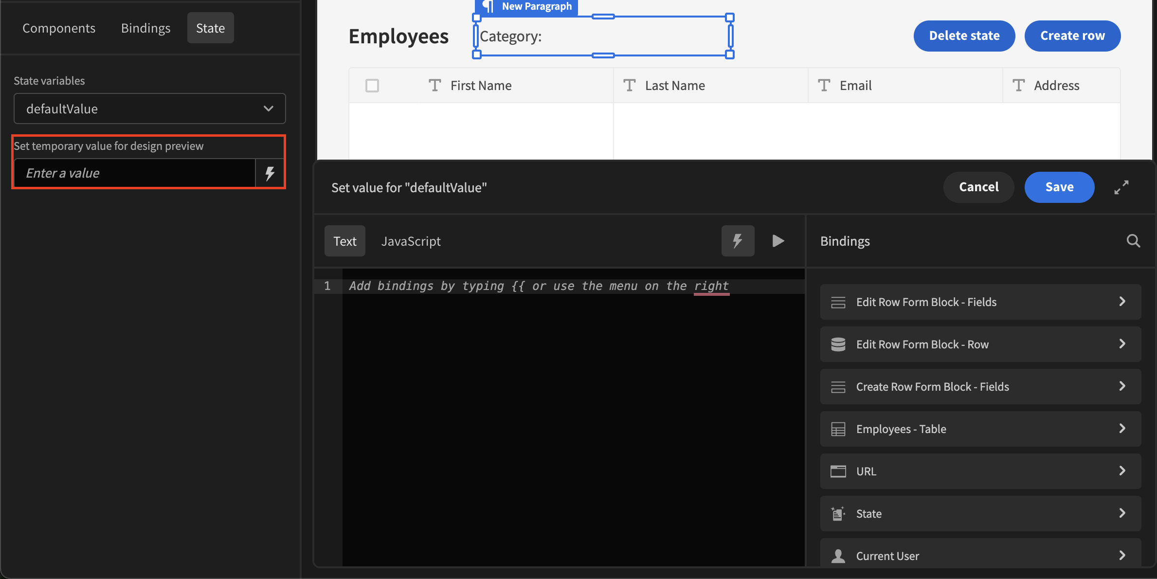
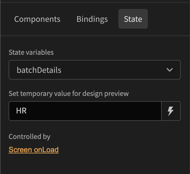
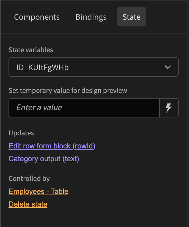
Below the State variables selection field, you will see the Set Temporary Value for Design Preview field.
Set Temporary Value for Design Preview
The Set Temporary Value for Design Preview field allows users to input a temporary value for preview purposes. This field can either be manually typed into or set using available internal Budibase bindings, providing flexibility when testing or designing interfaces.
Understanding State Usage
When a state variable is selected, the State Explorer displays relevant information about its usage within the current screen. This information is categorised into two sections:
Controlled By
This category lists state variables that are set/modified. These include:
- Input fields updating state
- Button on clicks that trigger state changes
- Other interactive elements affecting state values
Updates
This section shows where the state variables are being used. Examples include:
- A Paragraph component displaying the state value
- A Form Block applying the state variable to the RowID setting
- Data provider and or table filters
Navigating to Components
For each entry in the Controlled By and Updates sections, the associated component is listed as a clickable item. Clicking on a component will navigate directly to its Settings or Binding area, allowing users to see and modify how the state variable is used.