

Conditional UI
A lot of the time you want to change the state of some component when certain conditions are true or false. This might be changing color from red to green, showing or hiding a component. You will find the condition settings at the very bottom of the settings panel of your components.
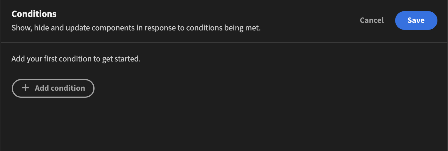
Adding a condition is simple. Once you click the settings button a drawer will pop up and you will be able to add, edit or remove your conditions. It will look something like this
Enabling and disabling conditions
You can temporarily disable a condition without deleting it by using the toggle switch located next to each condition in the drawer. This is useful for testing different UI states or temporarily pausing logic during development. Disabled conditions are ignored when evaluating component settings or visibility in both the builder preview and the published app.
When conditions are configured, the Conditions tab in the component settings panel displays a status indicator dot:
- Green: All conditions are enabled.
- Orange: Some conditions are disabled.
- Red: All conditions are disabled.
Adding a condition
To add a condition, simply click the Add condition button. As explained above, you can choose whether to Show, Hide or Update setting. Depending on what you choose you will be presented with different options. They will all contain settings for comparing some value against another.
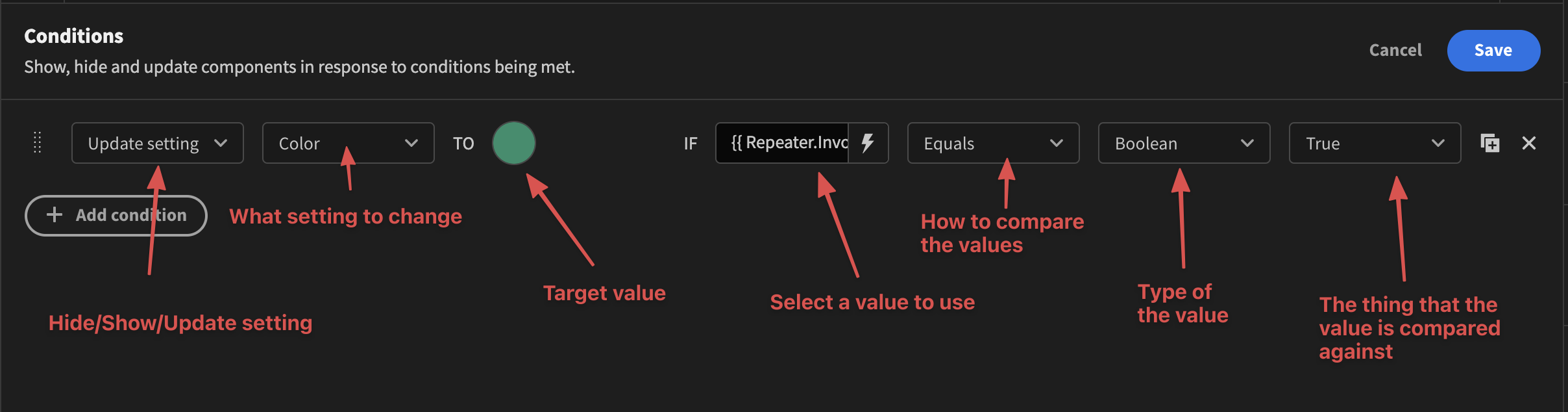
Show/HideWhen using a Show on boolean condition, the Hide occurs automatically for the opposite case, and vice versa.
Tutorial
In the example we're going to discuss we have a simple backend table that contains three records. It looks like this:
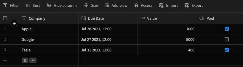
As we can see, there are four fields, Company, Due Data, Value, and Paid. In the Design section, we have designed a simple interface showing each of our invoices in rows. It looks like so:
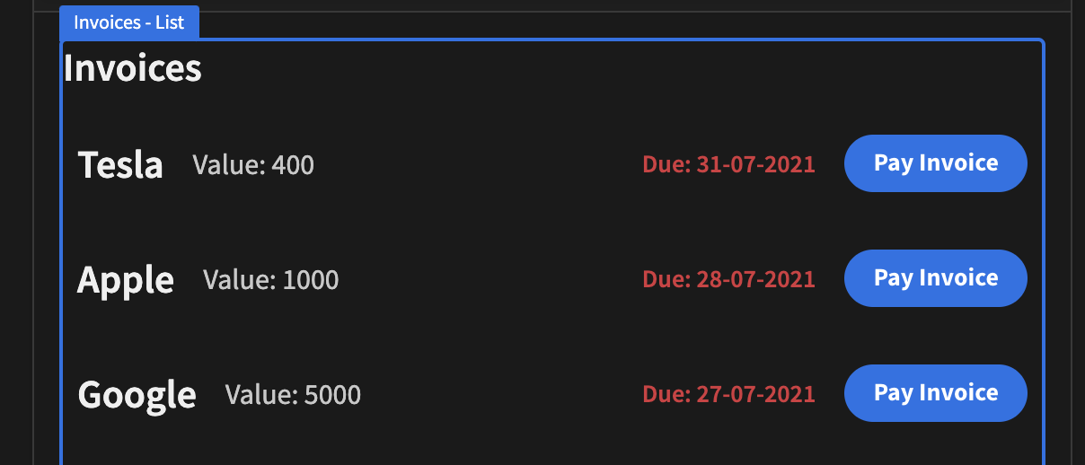
It would be great if the Pay Invoice button was in a disabled state if the invoice has been paid. So let's go ahead and add a condition to do just that!
Select the button component in the tree view on the left. Open the conditions drawer and select ``Update settingand then pick the Disabled setting in the dropdown. Make sure the checkbox is checked. We then need to figure out which field we want to check. In our case, it's found under{{ Repeater.Invoices.Paid }}`. This will of course differ depending on the structure of your application. If you click the little lightning bolt icon you will be able to see which fields are available for use. Now we just make sure that it equals TRUE. Hit save, and that's it!

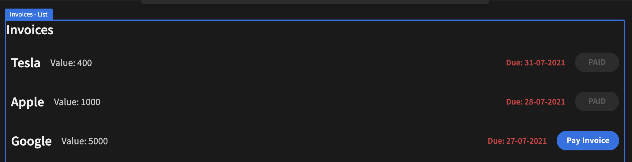
Now that we have this condition set up we might also want to change the text of the button to say "PAID". To do that, simply click the copy button and change the setting to "text". Change the text to "PAID" and hit save.
And here's the end result.
Showing and hiding a component based on the user's role
When building apps, we often want to limit a user's access to specific components. For example, we may not want a user to see certain data or access a particular action.
Below is a quick demonstration of how to hide a button if the user's role is BASIC. Please remember, when typing the value of the user role, it must be in capitals: BASIC, POWER, ADMIN.
Updated 4 months ago