Checkbox
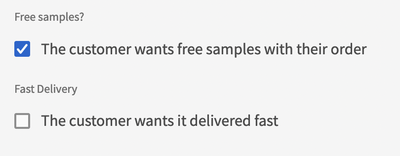
The checkbox component allows you to let the user check a box, or not.
Adding a checkbox
The Checkbox component can be added a Form component or can be used as a free-standing component.
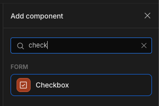
To add a Checkbox component to your screen, you need to click Form > Checkbox
Customising the Checkbox
To customise the checkbox, there are several settings in the Settings Panel that can be used.
| Setting | Description |
|---|---|
| Default Value | Accepts true or false as values to have it checked or unchecked respectively |
| Text | The text shown to the right of the checkbox, this text is also clickable with the checkbox. |
| Size | The size of the text and the checkbox, there's presets from small to extra large. |
| Disabled / Read only | When checked, the user cannot change the value |
It is worth noting that the checkbox integrates closely with boolean types. It can be used to represent whether a column's value in a table is either true or false.
Example Usage: Filtering
The Checkbox component can also be used as a standalone component (not wrapped in a Form) which can be useful for filter/sort functionality on Tables.
For this example, I'm working with the Budibase Sample Data table "Employees". I've made some changes to the "End Date" of some rows, suggesting that these employees are no longer employed.
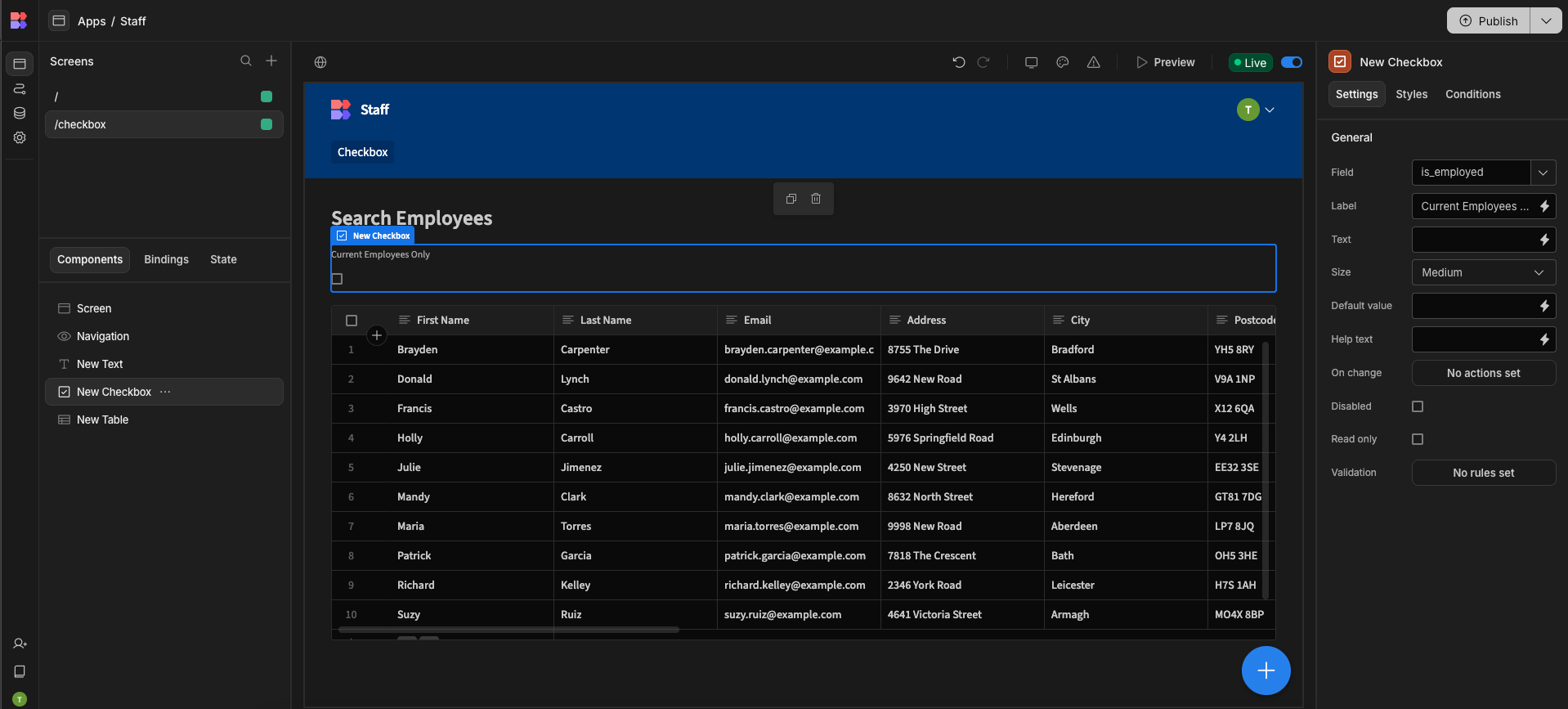
In a screen, I've then added a Checkbox component, and a table component set to display the employees table. The Checkbox component has a field setting "is_employed" and a label "Current Employees Only".
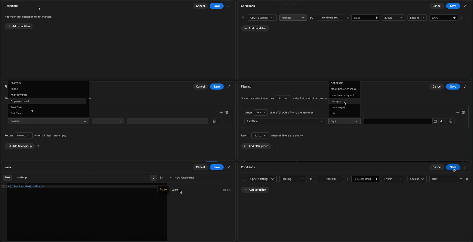
In the Table component's Conditions, add a new condition
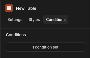
The Condition should read Update Setting >> Filtering TO 1 filter set IF {{ [New Checkbox].Value }} Equals Boolean True
When setting the Filter you'll want to filter on End Date is empty - this assumes that an employee with an end date is no longer employed, thus making the "Current Employees Only" checkbox update the table filters to only show those records of employees still with the company.
Updated 8 months ago