Custom component
Write a custom svelte component
Getting started
Budibase components are written in Svelte.
If you are using VSCode for your development, you will most likely want to install the Svelte plugin to enable syntax highlighting.
NodeJS versionMake sure you have node v20+ installed. You can run
node --versionto see if you need to upgrade.
Initialise component
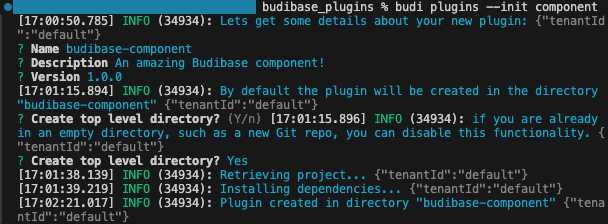
Make sure you have the latest Budibase CLI installed. Even if you have previously installed the CLI, you may want to install it again to be sure you have the latest version.
Once that's done, we need to initialise a template for our component.
Navigate to the folder location you want to create your plugin, and execute the following command:
budi plugins --init componentNext you will receive a series of prompts to enter details about your component. You can press enter without providing a value if you are happy to use the placeholder.
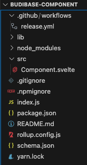
Within the newly created custom component project you should see a tree structure as follows:
Building your component
After you have created your new plugin directory, execute the following:
cd my-component
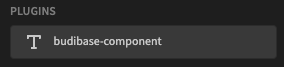
yarn buildAssuming you have updated the server env variable you should now be able to see your component template in Budibase:
Component.svelte
This is where your svelte code will live for your component. You can use html tags, css styling and bindings as you would for any other svelte component.
To make sure your saved changes are passed through to your Budibase server, you must execute a yarn watch within your custom component project. This will allow your local Budibase app builder to see those changes in real-time, which is very handy for getting your component to look and behave just right.
The
use:styleable={$component.styles}attribute must be included in your top-level component div. Removing this will cause issues when displaying your component.
SDK Context
The SDK context gives you access to the internal Budibase API.
const { styleable, API } = getContext("sdk")The packages/server/src/api/routes directory provides all of the available endpoint definitions, and the implementations can be found in the packages/server/src/api/controllers directory.
This provides a large amount of integration with various aspects of the Budibase platform.
Context
The context key is a promise of what data bindings the component is going to provide. The builder will use this information to generate data bindings to display, but it's up to the components themselves to provide the data they say they will.
Components can provide many contexts, so the value of the context key may be either an object or an array of objects.
Each context definition supports the following configuration:
Key | Description | Possible values |
|---|---|---|
type | The type of context provided | static schema |
values | An array of objects defining which static bindings are available | An array of objects containing Defines the readable and runtime values for the binding, in the label and key fields respectively. |
Example context:
[
  {
    "type": "static",
    "values": [
      {
        "label": "Row index",
        "key": "index",
        "type": "number"
      }
    ]
  }
]
schema.json
On the next page we will discuss the intricacies of the component schema.json file - which defines the inputs and outputs of your component, which will be controlled through the component settings panel in the builder.
You can jump to the component schema page here.
Using TypeScript
The Budibase svelte components use JavaScript by default. If needed, you can convert your custom component over to TypeScript by following the Adding TypeScript to an existing project section of this blog: https://svelte.dev/blog/svelte-and-typescript.
In addition, you may need to install tslib i.e. yarn add tslib, and add an index.ts file.
An example of a custom component that was ported over can be found in this TypeScript date-picker.
Example: Custom form field component
In this example we will create a Star Rating component that can be added as a field to Budibase Forms.
This example is taken from the Star Rating custom component
This example assumes you already have an empty component initialised and built. We're going to focus on the parts that allow this custom component to work as an input within the existing Form component.
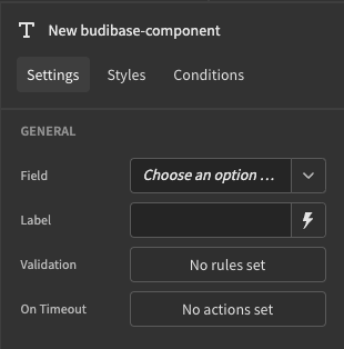
Updating schema.json
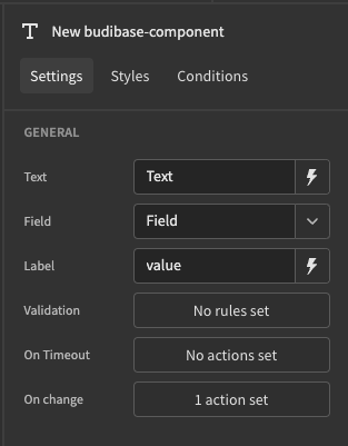
The first step will be to define the settings that will be available to our form. The most important setting for any form field component is the field that we want the input to be for. In my case, I have a Number column in one of my tables called Rating that I want to be able to use my Star Rating component with.
We need to add a setting for Field to our component and we can do this by defining it in schema.json. On an empty component template there is a placeholder setting for Text. We will replace this with a setting for Field which will be of type field/number and make it a required field. While we're here we can also add a text field for the label.
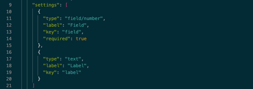
component settings within schema.json
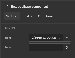
the new settings for our component now show up in the builder
Optional: Adding custom validation
If you would like the user to be able to add component level validation, you can add an validation type settings object to your settings array. We will use this validation object later when registering the form field.
      {
        "type": "validation/number",
        "label": "Validation",
        "key": "validation"
      }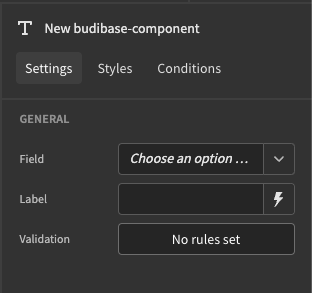
You can view my full schema with extra settings here or view documentation for the component schema here.
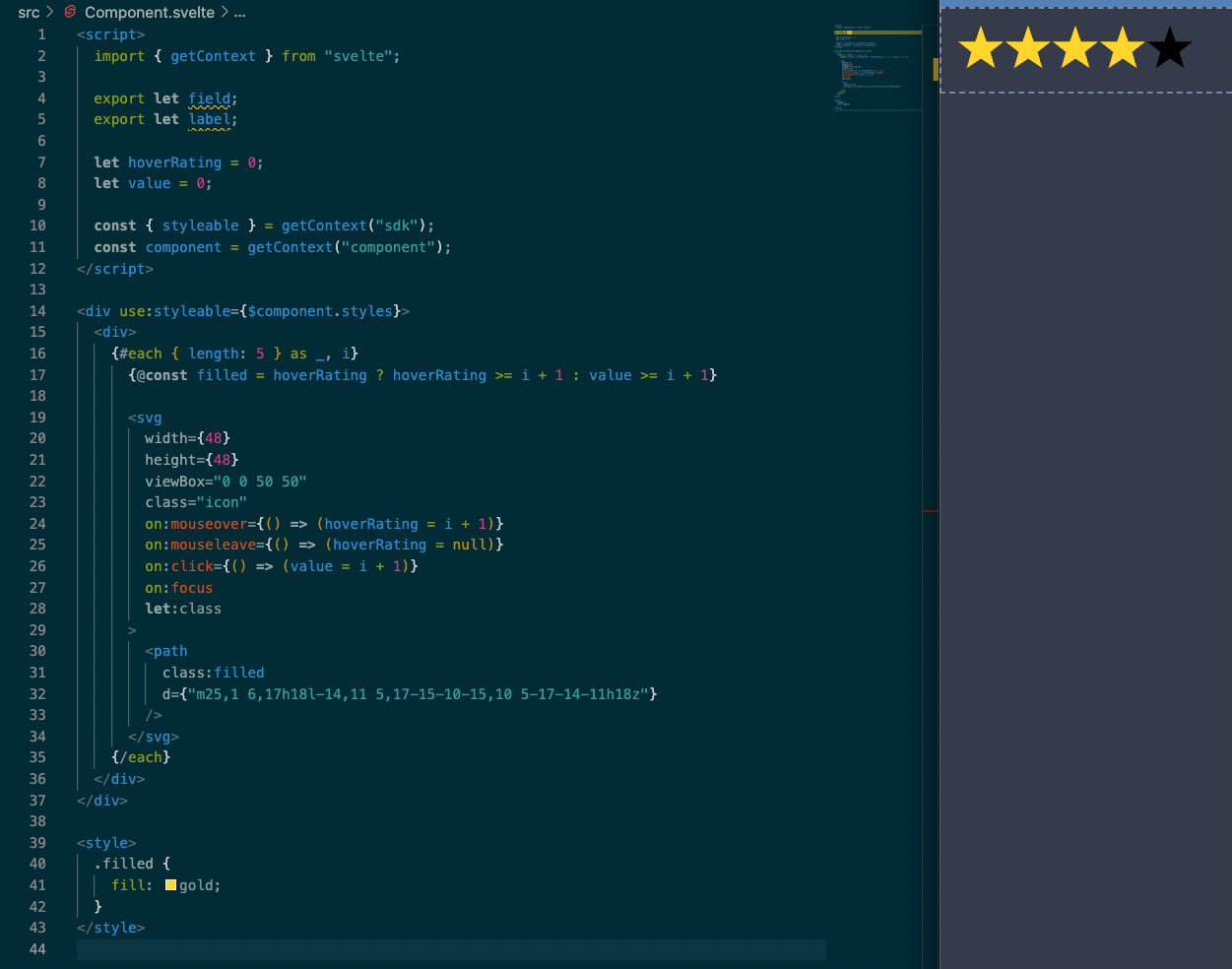
Working with Component.svelte
The plugin template comes with a basic placeholder in Component.svelte and this is what we will modify to create our custom component. This is written in Svelte - if you are new to it you can check out the tutorial here.
The first thing we'll do is declare props for our settings values we created above. The syntax for this is export let [your-setting-key]; This means we can use the parameters set in the builder in our component.
Now that our props are added we can continue to build out the front end. Using JS, HTML and CSS we can create the basic interface for our component and then make it functional.
looks good, now let's make it useful!
Integrating with the Form component
The first step here is to get the context from the parent Form component. We can then use that Form Context to register our component as a Field in that Form.
export let field;
export let label;
export let validation;

const component = getContext("component");
const formContext = getContext("form");
const formStepContext = getContext("form-step");

const formApi = formContext?.formApi;
$: formStep = formStepContext ? $formStepContext || 1 : 1;
$: formField = formApi?.registerField(field, "number", 0, false, validation, formStep);
formApi.registerField() parameters from our example
- field name - we are using the value of
fieldfrom our props- field data type - in this case, the field is for a
number- field default value - we have set that to be
0here- field disabled - ours is
falsehere but you could make it configurable- field validation - ours is
validationfrom props, but can be null if no validation is required- form step - we use
formStepderived from the formStepContext
As this is a form component, we need to verify that the component is actually being used as a child of a form in our Budibase screen. To do this, I will add a Svelte if/else statement to our component so that it will render our field if it's the child of a form, or show a warning if it's not.
  {#if !formContext}
    <div class="placeholder">Form components need to be wrapped in a form</div>
  {:else}
  	// our component goes here
  {/if}
Setting the field value
Now that the field is registered, we have to set it to update the form's properties in the parent component every time the store changes. Using onDestroy we can deregister our field from our form whenever the component unmounts.
import { onDestroy } from "svelte";

let fieldApi;
let fieldState;

$: unsubscribe = formField?.subscribe((value) => {
  fieldState = value?.fieldState;
  fieldApi = value?.fieldApi;
});

onDestroy(() => {
  fieldApi?.deregister();
  unsubscribe?.();
});
Just like that we have everything we need to set a value to our form using our component.
Consider the Icon svelte component:
<Icon
  filled={fieldState?.value >= i + 1}
  on:click={() => fieldApi?.setValue(i + 1)}
/>
We determine the how many stars should be filled from fieldState.value, and we can set the number of stars in the on click event via fieldApi.setValue('new value here').
Integrating with Field Groups
Remember we made a setting for the label above? Now we are going to make our component compatible with the Budibase Field Group component, so the label styling can come from that. In order to make this work we need to get context from the Field Group, just like we did above for the Form component.
<script>
  const fieldGroupContext = getContext("field-group");

  const labelPos = fieldGroupContext?.labelPosition || "above";

  $: labelClass =
    	labelPos === "above" ? "" : `spectrum-FieldLabel--${labelPos}`;
</script>


<div class="spectrum-Form-item" use:styleable={$component.styles}>
    <label
      class:hidden={!label}
      for={fieldState?.fieldId}
      class={`spectrum-FieldLabel spectrum-FieldLabel--sizeM spectrum-Form-itemLabel ${labelClass}`}
    >
      {label || " "}
    </label>
    <div class="spectrum-Form-itemField">
			// component logic in here
		</div>
</div>

<style>
  label {
    white-space: nowrap;
  }
  label.hidden {
    padding: 0;
  }
  .spectrum-Form-itemField {
    position: relative;
    width: 100%;
  }
  .spectrum-FieldLabel--right,
  .spectrum-FieldLabel--left {
    padding-right: var(--spectrum-global-dimension-size-200);
  }
</style>
Handling errors
{#if fieldState?.error}
  <div class="error">{fieldState.error}</div>
{/if}

 <style>
  .error {
    color: var(--spectrum-semantic-negative-color-default,
               var(--spectrum-global-color-red-500));
    font-size: var(--spectrum-global-dimension-font-size-75);
    margin-top: var(--spectrum-global-dimension-size-75);
  }
 </style>
Example: Context provider
Sometimes you want to expose bindings to child components without the need of a form component - you do this through context.
In this example we will add a toggle component that can provide its boolean state to child components. The codebase can be found here: budibase-toggle.
Add context to schema.json
First we need to tell Budibase that this component can take children. We do this with the hasChildren property in the "schema" object.
{
  "schema": {
    "name": "budibase-toggle",

		"hasChildren": true
    ...
Next provide the context array after the "settings" property. The context array provides a list of bindings that will be available to the children.
{
"hasChildren": true,
"settings": [..],
"context": [
{
"type": "static",
"values": [
{
"label": "Active State",
"key": "isActive",
"type": "boolean",
"defaultValue": false
}
]
}
]
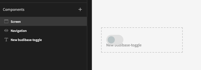
...If you now build and import the component, you should see something similar to the following:
Implement context binding
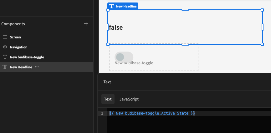
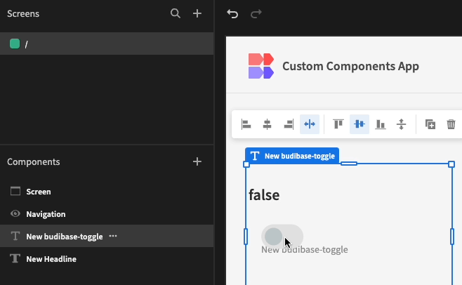
Whilst we have exposed the context, we need to do bind it to our toggle state:
- Import the Provider from the SDK:
const { styleable, Provider } = getContext("sdk")- Next bind the dataContext to the toggle state of the component:
let isActive = false;
$: dataContext = {
  isActive
}- Add the Provider and slot:
<div use:styleable={$component.styles}>
  <Provider data={dataContext}>
    <div class="toggle">...</div>
    <slot />
  </Provider>
</div>
The Provider exposes the dataContext bindings to the slot, which represents any nested child.
Result
Example: Data provider
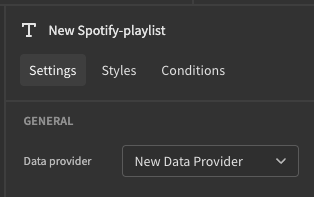
Whilst you can query data from an API within your custom component, it can be better practice to expose a Data provider so that the user has flexibility to choose their own Datasource.
Update the schema
Include the following setting in your schema:
"settings": [
  {
    "type": "dataProvider",
    "label": "Data provider",
    "key": "dataProvider",
    "required": true
  }
]
Which will appear as follows in Budibase:
Using the data provider
The data provider has a rows property which contains an array of objects for the current page of results.
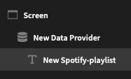
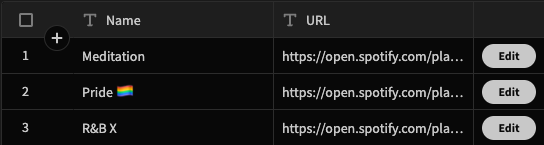
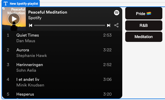
In this example we will look at a Spotify playlist component.
Add the following code to the script tag of your component:
export let dataProvider
$: playlists = dataProvider?.rows ?? [];
The first line assigns the data provider from the settings. Next we get all the rows and default to empty if needed.
We can now use the playlists variable to loop over each to be displayed in our component:
Example: Event handler
As seen in the component Actions it is possible for components to have On Click, On Change or any other event!
In this example, we will look at a timer component that will trigger some user specified action when the count down goes to zero.
Update the schema
Include the following setting in your schema:
"settings": [
  {
    "type": "event",
    "key": "timeout",
    "label": "On Timeout"
  }
]
This will appear in the Budibase builder like so:
Wiring the event
The user is now able to trigger any sequence of Budibase actions upon the On Timeout event. We now need to determine when to fire this event.
To do this we will need to import the Event Dispatcher from Svelte and then fire our event. This can be done like so:
import { createEventDispatcher } from 'svelte';
const dispatch = createEventDispatcher();

...

if (counter < 1) {
	dispatch('timeout');
}
Then in the parent component, we take a prop which matches the key name timeout, and also include the on listener like so:
<script>
	export let timeout
</script>

<div use:styleable={$component.styles}>
  <Timer on:timeout={timeout} />
</div>
On change event
An On Change event will be similar to the above, but you also will want to provide context to expose the {{ Field Value }} binding.
To do so, add the following to your schema.json:
"settings": [
  {
    "type": "event",
    "label": "On Change",
    "key": "onChange",
    "context": [
      {
        "label": "Field Value",
        "key": "value"
      }
    ]
  }
]
Then you can use your onChange function similar to the following:
<script>
  export let onChange

  const handleChange = e => {
    if (onChange) {
      onChange({ value: e.detail })
    }
  }
</script>

<div use:styleable={$component.styles}>
  <Input on:change={handleChange} />
</div>
It is important to note that we are providing an object with the 'value' key, to make sure Budibase can detect the binding.