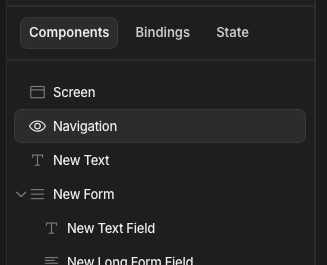
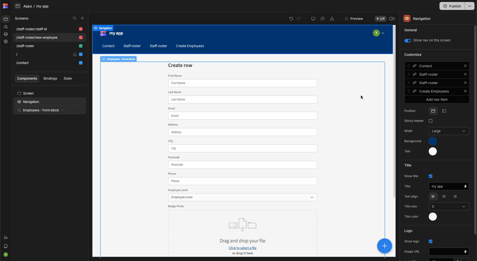
Navigation
The navigation section of the design tab allows you position and style the app navigation bar as well as the available navigation links.
Settings
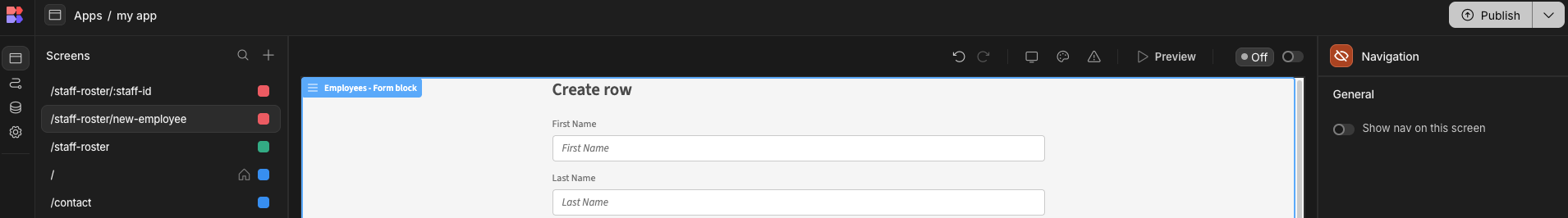
Click on the navigation icon in the Component Tree to access the navigation settings.
The list of properties that can be changed for the navigation bar are displayed in the table below.
Name | Description | Visual |
|---|---|---|
Position | Will anchor the nav bar to the top or left hand side of the page. | 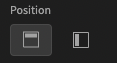 |
Sticky header | Top anchored nav bar only. When scrolling down the page, the nav bar will remain visible at the top of the page. | 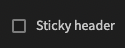 |
Width | Top anchored nav bar only. The width of the nav bar content. | 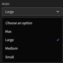 |
Title | Show/Hide the specified nav bar title. | 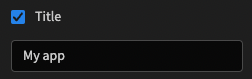 |
Background color | The background color of the nav bar. | 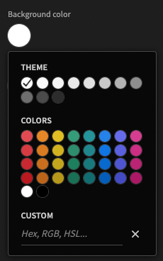 |
Text color | The color of the nav bar title and links. | 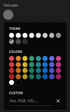 |
Below is a video that shows how each of the settings present in your app.
By default the navigation bar is visible for all Screens, however it can be turned on a per screen basis.
Configure links
The links shown in your navigation bar can be configured in the navigation panel by clicking on the 'Navigation' item in the Component Tree and then clicking the add new nav item button in the Settings Panel.
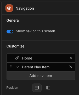
This will add a new navigation item under any existing ones. This will default to the name Nav Item. With basic role permissions attached to the navigation item.
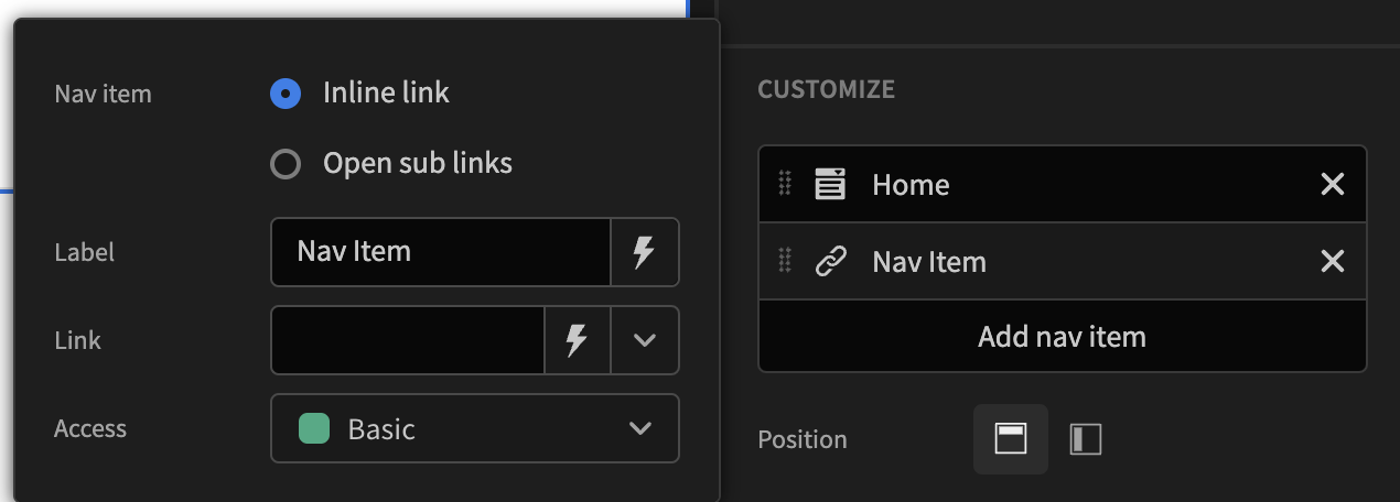
You can customise various elements such as the text, link (External links or linking to internal screens), role permissions, or deciding whether a nav item is a single link or opens up a modal which contains sub-links. These can all be modified by clicking on the specific nav item you wish to amend.
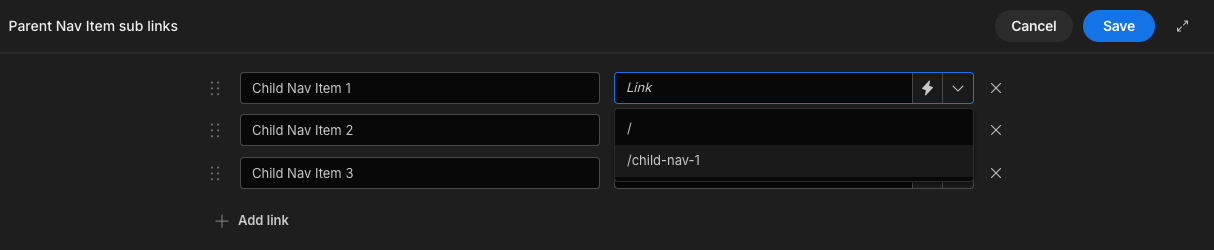
Sub links
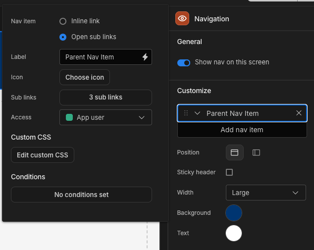
If you select Open sub links as the option for nav item. The link field will be changed to a button. When clicked this will open a drawer that allows you to add, update and delete sub navigation links related to the parent nav item.
You can begin adding sub-links by clicking the + Add link button. Feel free to add as many sub-links as you need, each with its own name. Just like the parent navigation items, these sub-links can direct users externally (e.g., to Google.com) or internally within your app. Additionally, the role permissions for these sub-links automatically inherit those of the parent navigation item.
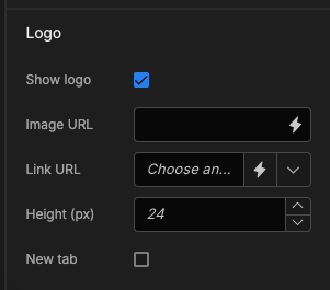
Logo
By default the navigation bar will show the Budibase logo, but there are a number of settings available to customise this under the Logo section of the navigation settings.
Default logo settings
Name | Description |
|---|---|
Show logo | Toggle off to hide the logo from the nav-bar. |
Logo image URL | Allows you to replace the Budibase logo with a custom image. |
Logo link URL | If provided, turns your logo into a hyperlink. |
Height (px) | Defaults to 24px, allows you to resize the logo image. |
New tab | Logo hyperlinks will be opened in a new tab. |