Card
This is one of the Budibase UI components within the design area of the platform.
Use the Card component to display lists of data to your users. Cards can contain content, images, and actions, and are a great alternative to the table component; especially, if you want to present an image for each card. You can switch between vertical and horizontal variants of the card using the settings panel.
Cards are highly flexible and have a lot of configuration options. We'll dive into those below
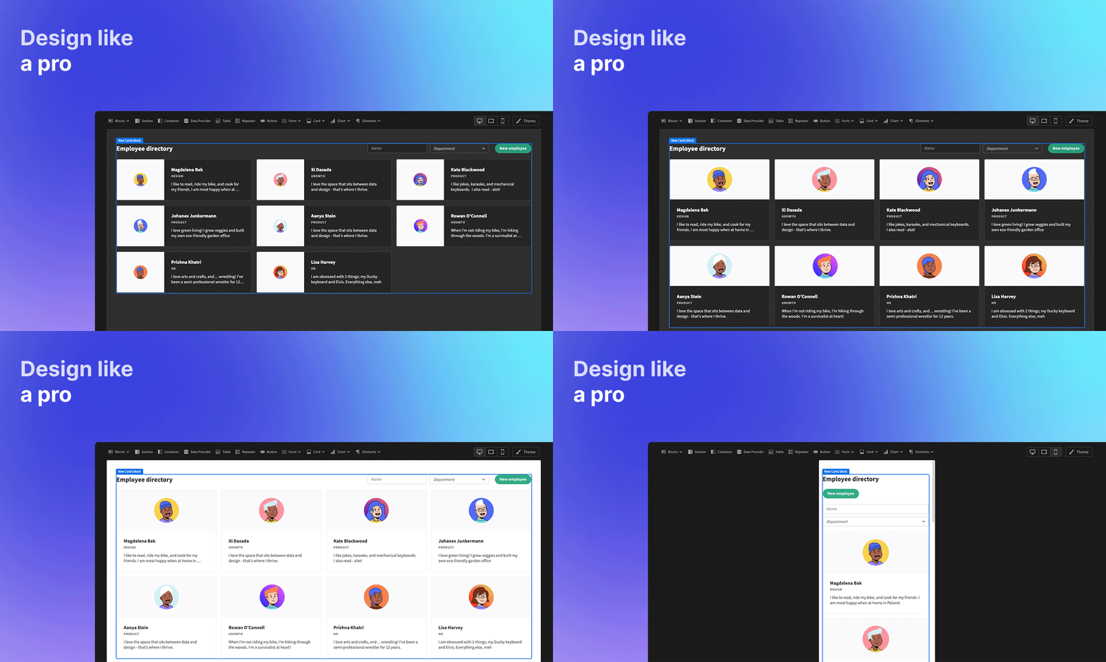
Cards BlockWant to quickly convert your data to a list of cards? Use the Cards Block instead
Layout
The card component has two different layout modes. Vertical and Horizontal. The vertical mode has every component aligned vertically, whereas the horizontal mode has the image left of the text elements.
For example purposes, I've loaded a list of countries into the database, with flags as images connected to it. In vertical mode, this looks like the following screenshot
Vertical Mode
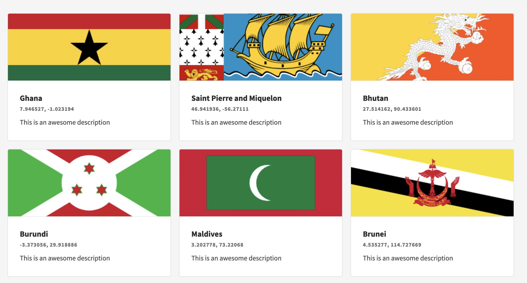
Vertical Cards Mode
As you can see, there's 3 items per row. However, this is purely dependent on the screen size. When you change the width of your browser window this can easily change to 1 (narrow or mobile), or 4 (or more) when you make your window wider.
The vertical mode is enabled by default, but in case horizontal mode is enabled, all you have to do is deselect "Horizontal" from the Settings Panel.
The order of elements visible in a card is from top to bottom, Image, Title, Subtitle and Description.
Horizontal Mode
To enable horizontal mode, you need to check Horizontal in the Settings Panel.
Immediately, the design will change into horizontal mode, which looks like the following screenshot
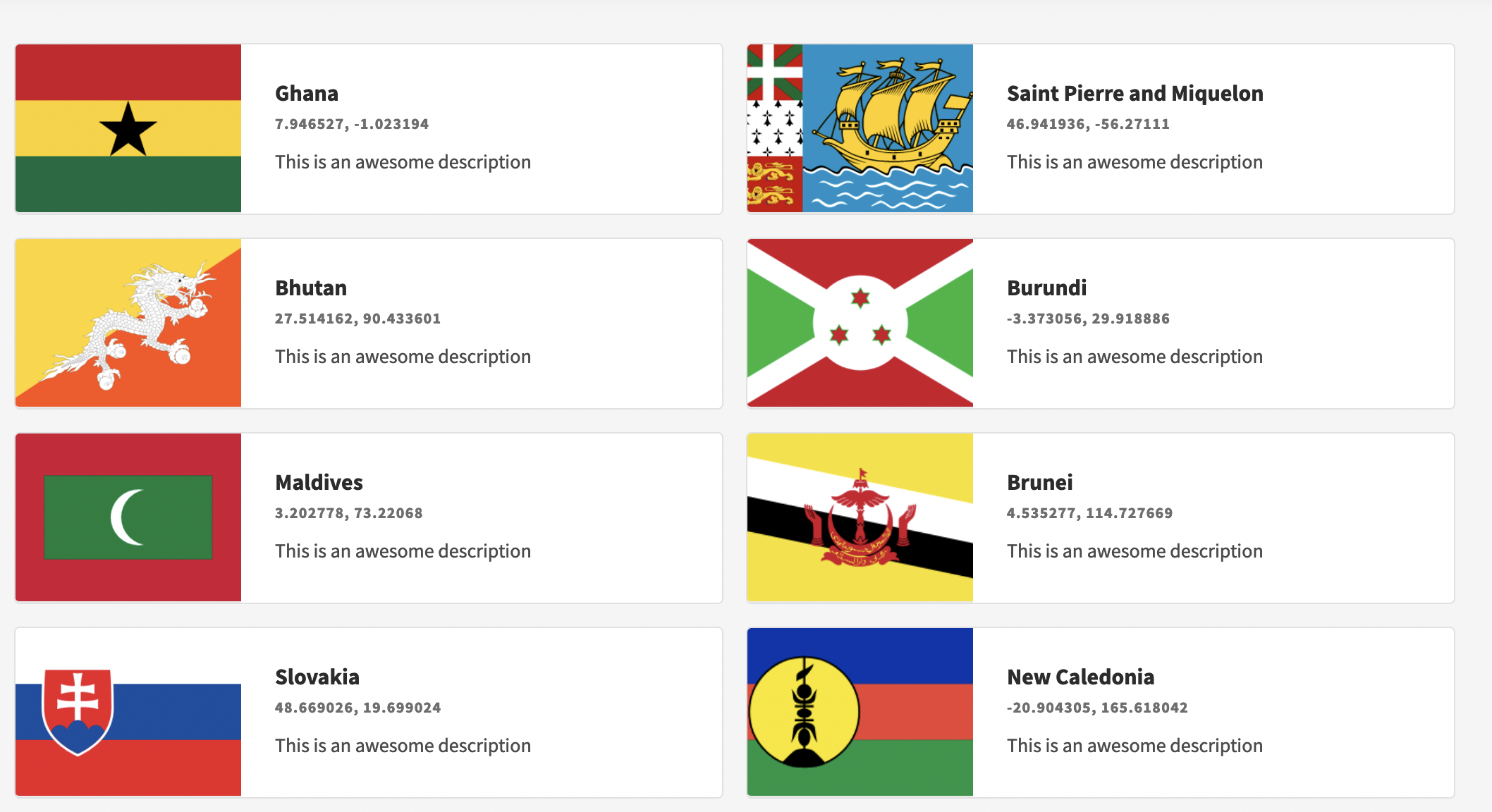
Horizontal Cards Mode
As you can see, the image has shifted to the left of the text elements, where the text elements themselves have not changed.
Card Elements
The card consists of several default elements, which are bindable through Handlebars or JavaScript functions. Read more about binding in our Bindings documentation. All elements can be configured in the settings panel.
| Element | Description |
|---|---|
| Title | The top-most text element inside a card, printed as the largest font and bold |
| Subtitle | Directly below the title |
| Description | Below the subtitle, in the smallest font. |
| Image | The image which can be displayed on top, or on the left of the card (depending on layout mode) |
Button
Next to the default elements, there's an optional button element. You can enable the button by checking the Button in the settings panel
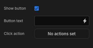
The button text can be configured through Bindings, or simply text as demonstrated above. The button will then be added to the card as displayed below
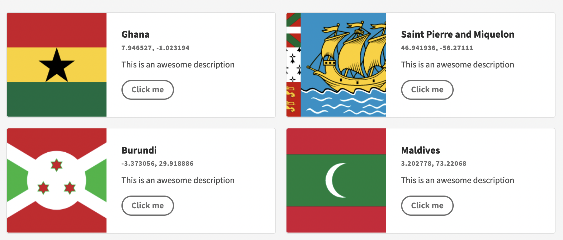
Right now the button doesn't do anything yet, when you click it, but that can be configured through the Define Actions button in the settings panel.
Define ActionsTo learn more about defining actions, read the Actions documentation
Tutorial
This tutorial is primarily going to focus on the card component itself as the Card Block variant has already been discussed above. This tutorial will be broken down into steps, going from a blank screen to multiple cards and related details shown. Lastly, this tutorial will be using the inbuilt Budibase DB as well as the sample data which it provides.
- Add a data provider component (In this case I'm going to use the Employees table).
- Add a repeater component nested inside the data provider.
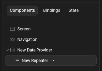
- Add the card component nested inside the new repeater which you created.
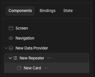
- Bind up all relevant information you wish to display within the card. From the title to the link, or even add a button with relevant actions you want to perform when clicked. For this example I was just show some basic information contained within the employee's table.
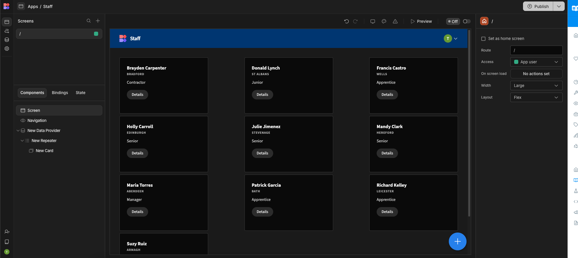
At the end you should have a screen similar to the image below.

Updated 7 months ago
Quickly convert your data to a list of cards? Check the Blocks page to learn more about the Cards Block