Candlestick Chart
The Candlestick chart is a chart type often used in financial charts. You can configure both a bar and a line on the same row.

There's a lot of data being displayed on a single column, so when you want to use this graph you need to have access to four different Numeric data-points per column. This could also be a great candidate to transform the data through Views when you want to do some calculation based on data points you have in your database.
Adding a Candlestick Chart
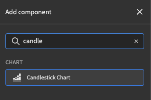
To add the Candlestick chart, first place a Data Provider and add the chart nested to it. To add the chart, click Chart > Candlestick Chart
Displaying data
Now that the Candlestick chart has been added to the UI, you can display data. For this type of chart you'll need 4 types of Numeric datapoints.
These 4 data points, or columns, are for the following fields:
| Setting | Description |
|---|---|
| Open | The opening for the bar inside the chart |
| Close | The closing for the bar inside the chart |
| High | The high for the line inside the chart |
| Low | The low for the line inside the chart |
What determines the colour?When colour will be red or green depending on the
openandclosevalues. Ifcloseis a lower number thanopen, the colour will be red. If thecloseis higher than theopenthen the colour will be green. This also applies to the line in the chart, not just the bar.
The labels on the x-axis are supposed to be dates, this is a financial chart after all. So when picking the Date column, make sure you use a Date/time field for best results.
There aren't a whole lot of other customization options in the Settings Panel for the Candlestick chart, but of course, there are some. You can find them in the reference table below.
Settings panel
Data columnsThere are 4 data column fields, which are explained in the
Displaying datasection above.
Besides the settings already explained, there are a few which you can still configure in the Settings Panel.
Setting | Description |
|---|---|
Provider | The Data Provider as a parent of your chart |
Format | Will divide by thousand or million on the axis and adds a |
Y-axis Label | The labels you want to display next to the Y and X-axis. |
Width | The size you want the chart to be, supports all CSS supported sizes |
Animate | Will animate when the data changes or on startup. Data-change can happen through Dynamic filter's for example. |
Tutorial
Getting Started
Head to https://www.alphavantage.co/ and get an API key
In the data tab, create a new data source using the REST API connector and build a query.
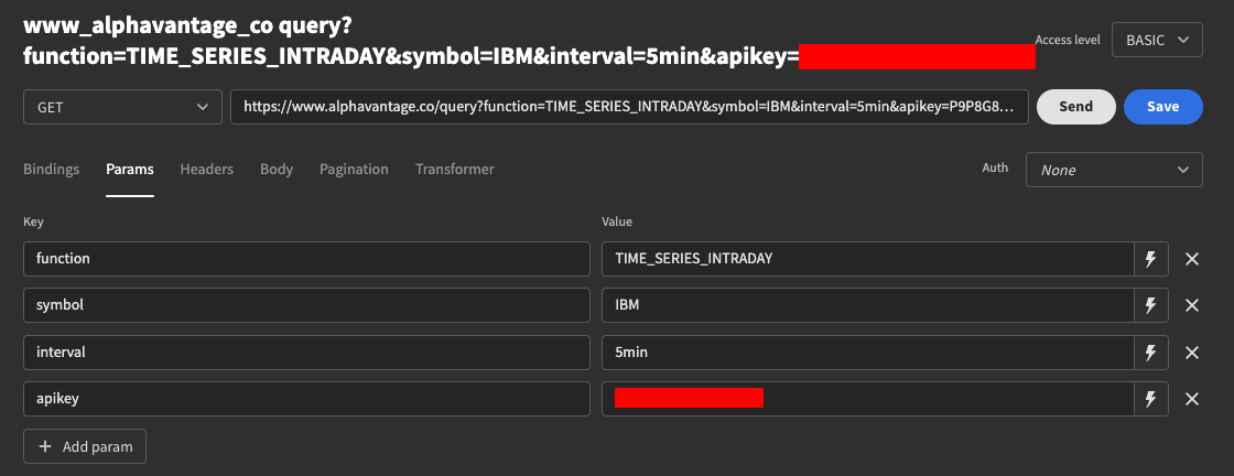
Your query should include the function, symbol, and interval parameters, as well as using your API. Click "Send" to verify a successful connection.
The response-data from the API isn't quite in the right format for Budibase to make use of, so you will need to manipulate it a little using the Transformer.
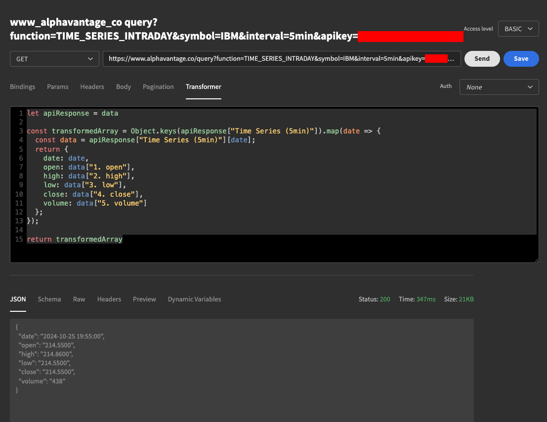
let apiResponse = data

const transformedArray = Object.keys(apiResponse["Time Series (5min)"]).map(date => {
  const data = apiResponse["Time Series (5min)"][date];
  return {
    date: date,
    open: data["1. open"],
    high: data["2. high"],
    low: data["3. low"],
    close: data["4. close"],
    volume: data["5. volume"]
  };
});

return transformedArray
When your transformer is set up, click "Send" to test the query. The response will be an array of objects, but the JSON window will show you an example of a single object. Be sure to save your query before navigating away.
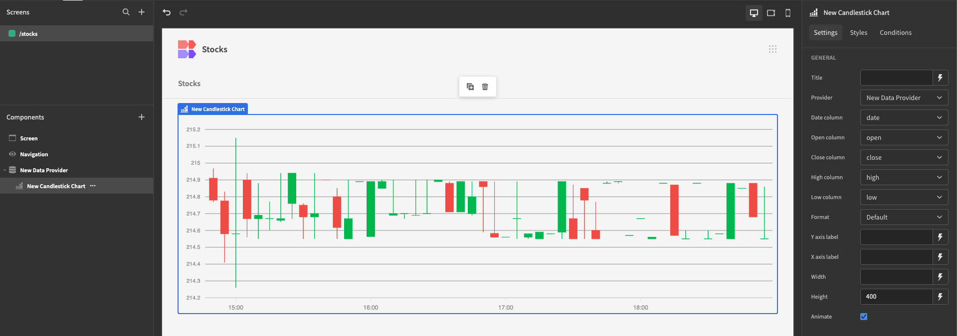
Displaying the Data
In the design tab, on the screen you wish to display data on, add a Data Provider and set it to fetch information from this query. Now add a Candlestick Chart set to receive data from your Data Provider. Once you have set the sources for Date, Open, High, Low, and Close, your chart will appear.