Introduction to bindings
What are bindings and why are they important?
Bindings are a core concept in Budibase, and expand the functionality of your Workspaces beyond the standard autogenerated screens.
You can think of bindings as solving these high-level problems:
- passing data from one location to another
- formatting data for display
- performing calculations
Bindings drawer
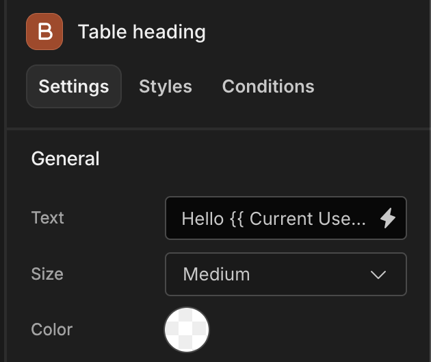
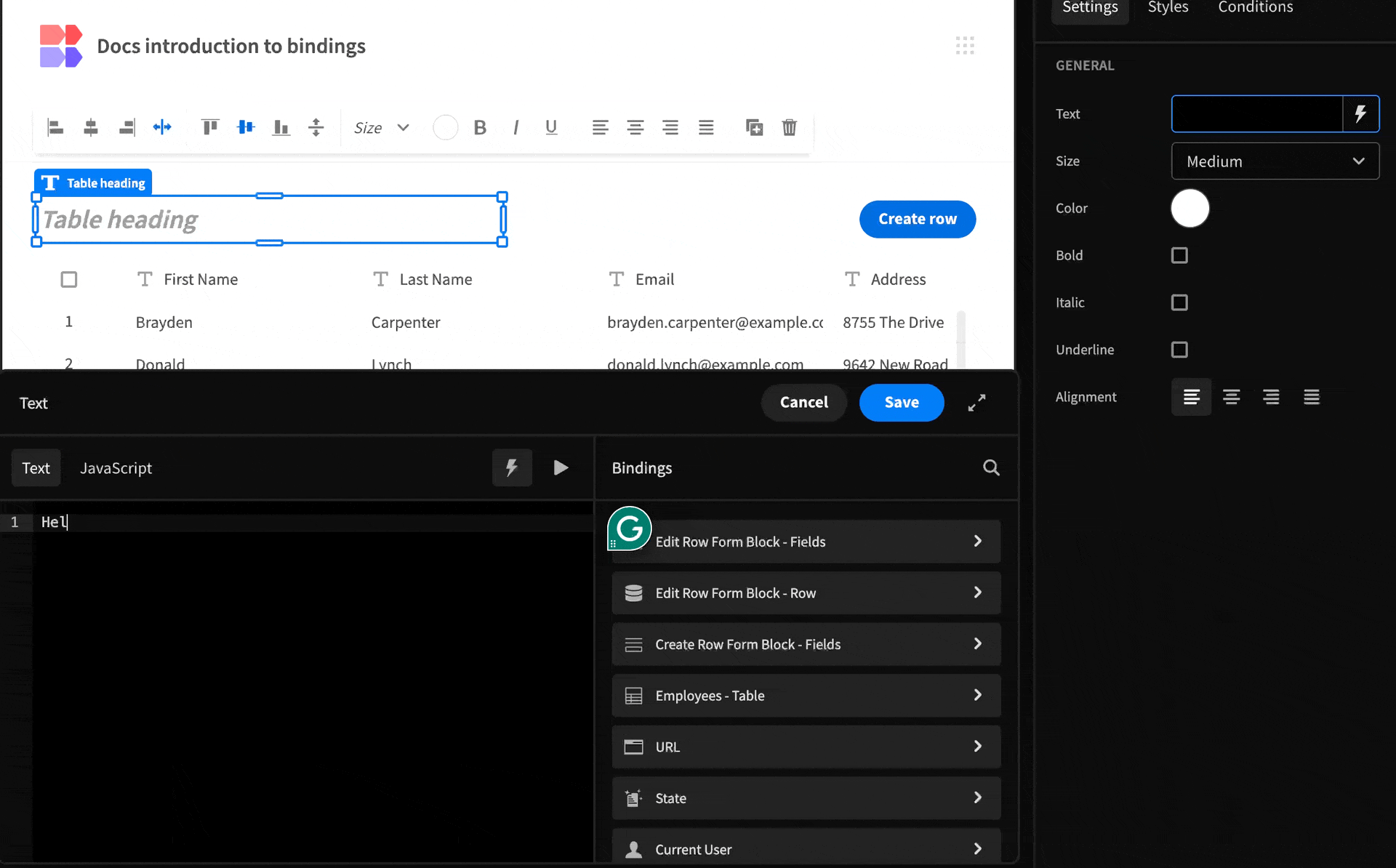
In its simplest form, a binding is a reference to a dynamic value, and is expressed with a syntax known as Handlebars by default.
Whether within the Design or Automate sections, look out for the lightning bolt icon next to input fields. This indicates that the field supports binding values.
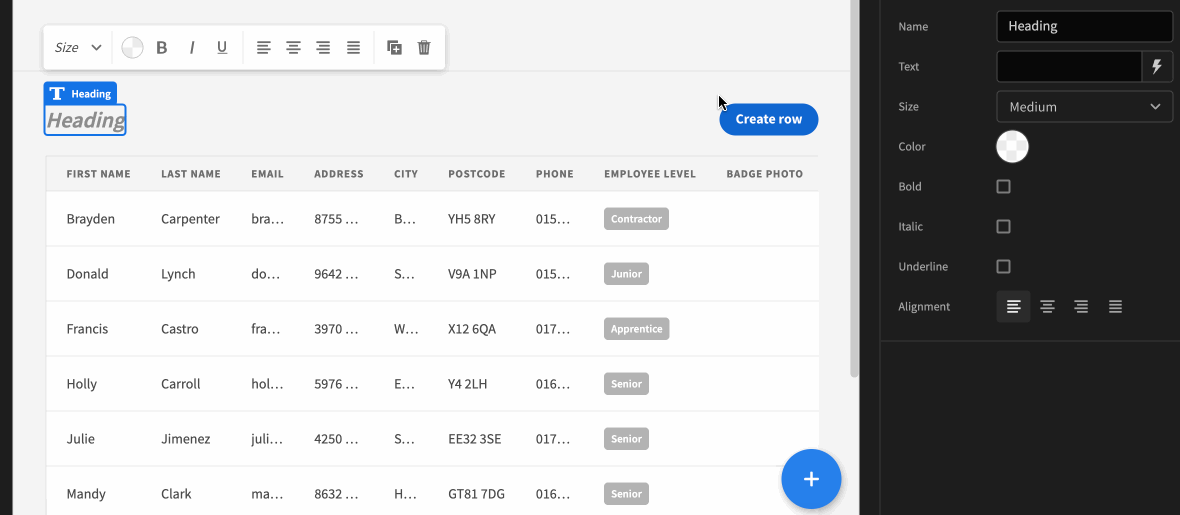
The 'Text' property of the Heading supports bindings
You can directly type bindings into the text field using double braces, e.g. {{ Field Value }}.
However, this won't give you access to the binding drawer, which provides auto-completion or the option to switch to JavaScript syntax.
To open the bindings drawer, click on the lightning icon. The drawer will slide up from the bottom of the screen.
You will see a list of binding categories on the right-hand side, which you can search and dig into to find the binding expression you would like to add. You can read more about binding categories and their scope here
It is worth noting that you can combine static text with binding values, which are distinguished by blue-highlighted text.
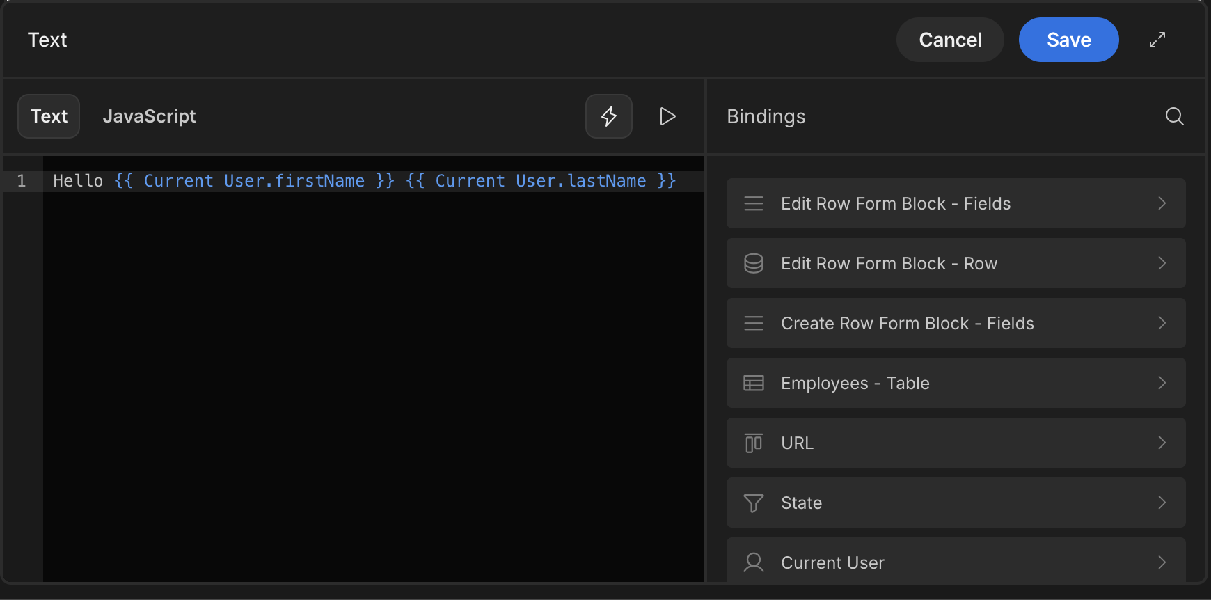
From the demonstration above, you may have noticed that each binding indicates the data type along the right-hand side, which will usually be a String (text) value such as the first name of the logged-in user. You may also have noticed in the above GIF that it is valuable whenever a binding is hovered. This is very useful as it lets users see what's being output before saving their changes. This only works if there is awareness of the value of the binding.
If an arrow is present, this means that the item is a category that must be drilled into. Regarding the binding {{ Current User.firstName }}, we are accessing the firstName text property from the Current User object.
Auto completion
While the bindings panel provides an easy way to explore available binding options, there is an even faster way when you get comfortable with using bindings.
Within the text area type {{. This will immediately prompt a dialog with a scrollable list of binding options. Start typing to filter this list; you filter by the property name or category name. Next, use the arrow keys to navigate the list, and press the Enter key to insert the binding you want.
JavaScript
As you can see from the tabs in the bindings drawer, there is the option to use JavaScript instead of text. The benefit of Using JavaScript is that it provides the maximum flexibility for manipulating data, although it will obviously require a little bit of experience in using the language.
If you have any existing text, clicking the JavaScript tab will provide a warning prompt - click Yes - discard text to proceed if you wish, but you can always click the Cancel button to revert your changes.
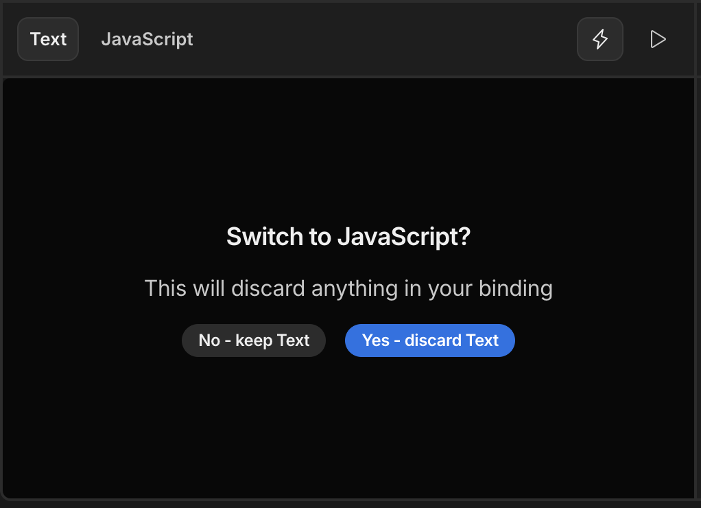
Switching to JavaScript will overwrite the existing text value
Auto-completion works in a similar way for JavaScript, however the difference is the symbol used to denote the binding. Instead of using curly braces, type the $ dollar symbol to access the bindings menu.
Return valueJavaScript bindings are considered to be functions, and thus you must always use the
returnkeyword to return a value.
Passing data around
Bindings open a link between your Data and your Screens and Automations, but they can also be used to connect two screens, or link components within a screen.
For example you may have a REST query or Custom SQL query. What if you wanted the app user to input a query param, or provide a filter value? You will need bindings to do this, with configuration needed in both the Data section and the Design section.
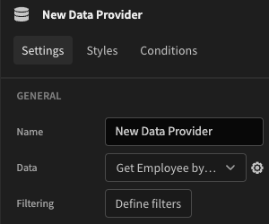
Data config
Whenever you add a query for any Datasource you have the option of adding bindings to be used in your query.
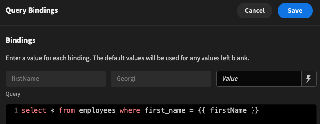
For example consider this SQL query:
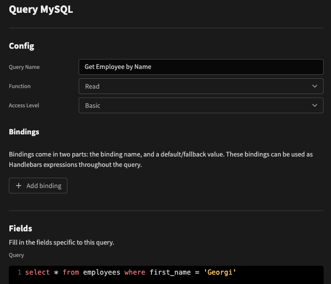
Get the row entry for Georgi
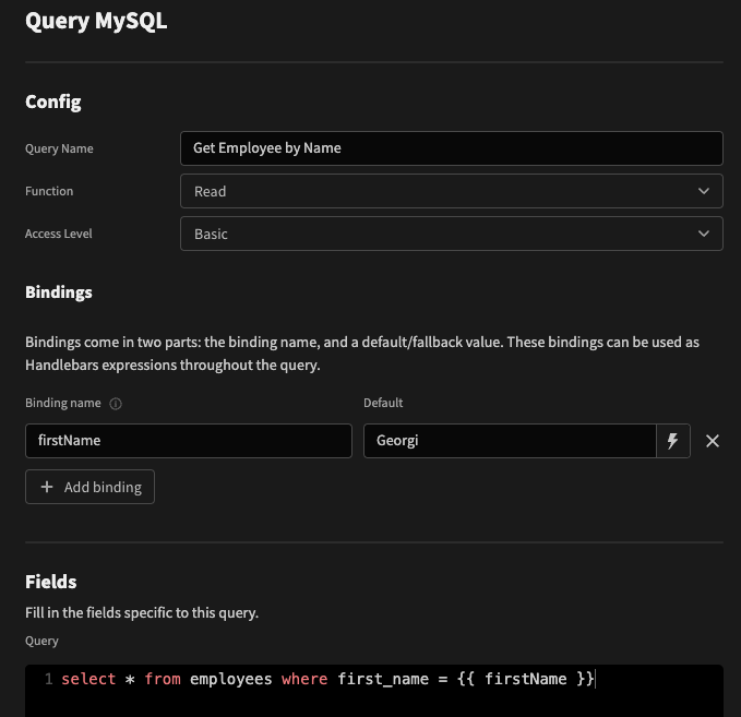
To make this query generically useable for retrieving an entry for any name, click the Add binding button. Type in a unique name for the binding, and provide a default value. The default value allows you to test that your query is working correctly, and in the case of a Read query, configure the Schema.
Next you need to reference this binding within your query. You do this through the curly braces syntax:
Design config
With the bindings configured in the Data section, we can now pass values from the Design section into our query.
As this is a Read query, we can use it as the source for a Data provider. Click the cog icon to open the bindings drawer.
Selecting a Read query as a data source
Query bindings drawer
You can now see a preview of our query, and also an input field for the firstName binding is available. A common scenario would be to use a form text field binding for implementing searching, which would look similar to:
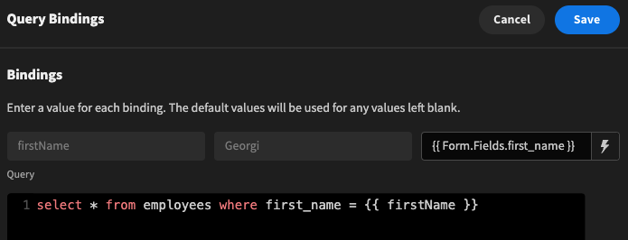
Passing the value from a 'first_name' form field into a SQL query
Further reading
In addition to passing data from one location to another, you can perform calculations on values, or choose the format you wish to display data.
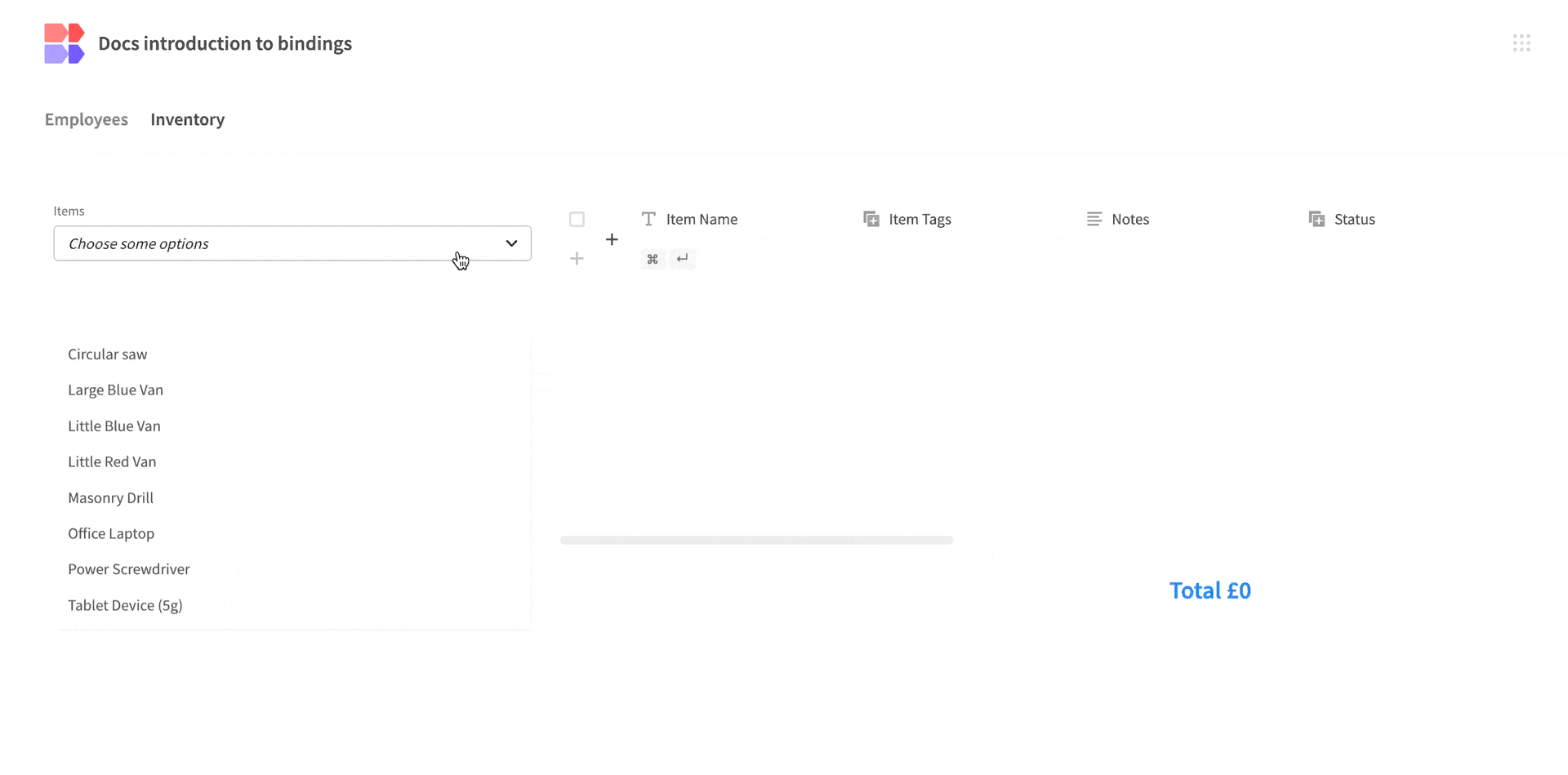
Tutorial: Calculating the total cost of selected items
To start, create a new workspace with the Sample data. In this example we will be focused on the Inventory table.
In the Design section, add a Form, nest a Data provider for the Inventory table, and nest a Container.
The idea is to have a dropdown for selecting the inventory items on the left, and a table that shows the details for the selected items on the right. At the bottom of the table there will be a headline that prints the sum total Purchase Price of the selected items.
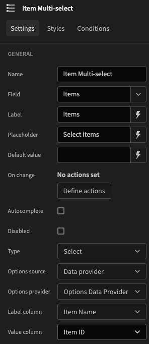
Add a Multi-select picker to the container. Type in a unique field name, and in the style tab provide a fixed width of 200px.
Under the Options source setting, select Data provider and then select the data provider we had added earlier. Set the Label column to 'Item Name', and the Value column to 'Item ID'.
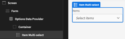
Component tree so far
Multi-select settings
With our multi-select configured, now we want to add a table to show more info for the selected items, and add our sum total of prices.
Add a container below the multi-select, and nest another Data provider, which will also be for the Inventory table.
Duplicate data providers🚧 Performance Tip: To optimise performance, minimise the number of data providers on your screen, especially for the same data source or table query.
It's best practice to avoid duplicating data sources unnecessarily. Ideally, use a single data provider to query the table's data and then rely on additional providers to filter that data. This reduces server requests and enhances performance.
In this case, a duplicate data provider is required because one is filtered for the table, while the picker needs access to all rows.
For a performance boost, consider using use custom options if the list of options is static.
Click Define filters and add the following:
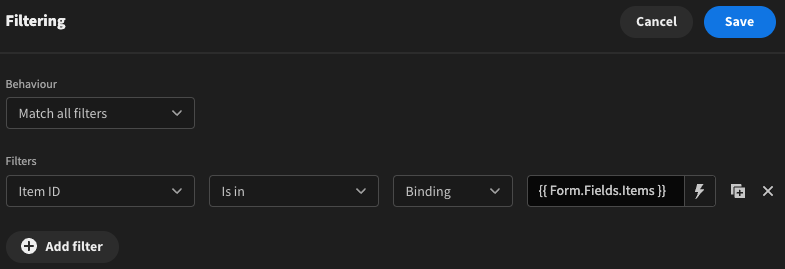
Make sure to Save! This will filter the data provider based on the selected items from the multi-select field.
Nest a Table component under the data provider. Add min-height: 320px; to the Custom CSS of the table - this is so the total text at the bottom of the table doesn't move as items are selected. Alternatively, you can drag the elements around the screen to get the same layout if you use the new grid layout.
After selecting the table on the right of the screen, you can show and hide table columns by toggling on and off the columns.
Finally, below the table component, add a Headline component, and right-align the text. Add the following binding after switching to the JS tab:
const autoID = $("New Form.Fields.items");
const arrayOfItems = $("Inventory Dataprovider.Rows");
const totalPurchasePrice = arrayOfItems.reduce((acc, item) => {
  if (autoID.includes(item["Item ID"])) {
    return acc + item["Purchase Price"];
  }
  return acc;
}, 0);

return `Total £${totalPurchasePrice}`;
Result