Options picker
The options picker component is a great tool to fill an Single Select data column or let your users select an item from a table of choice. It allows your users to pick a single option from a dropdown that is filled based on the connected data source, or through a custom schema to be used in other manners.

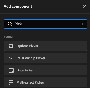
Adding an options picker
To add the options picker to your app, you first need to wrap it within a Form component. Once that is done you can add the options picker through Form > Options Picker
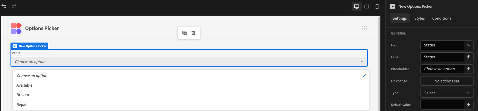
The options picker will now be added in an empty state to your UI.
Displaying options in the options picker
To display options in the option picker, you have a few routes to do this. Either you can let the options prefill based on the existing data or data-schema, or you can specify custom options so you can use the choice to do something else, for example, use in Automation, or transform it yourself before adding it to a table. Below is a quick table to highlight the purpose of each method.
| Method | Description | Examples |
|---|---|---|
| Schema | When you configure your data structure, you may configure an options field to have predefined, static options. Use this method, when the options are defined and unlikely to change. | Low, medium, high 1,2,3,4,5 Cold, warm, hot |
| Data provider | In some cases, you may want to populate your options picker with data from a field in your database, other than predefined options. So, when new data is entered in to your database, the Options picker is updated, dynamically. Use this method when the options are not predefined and likely to update. | Categories Tags |
| Custom | The custom method allows you to define options in the design section of the Budibase builder. It also allows you to assign a value to an option. Using the custom method, you can also:
| Thor = correct, Spiderman = incorrect, Hulk = incorrect, Iron man = incorrect |
Using options from the parent form
To use options straight from the table schema of your form, you need to make sure you have your wrapping form linked to a table. You can do this in the Settings Panel of the form, and picking the correct table in the schema option.
Once this is done, you can return to the Settings Panel of the Options Picker and define your schema. For this, you only need to select the right field, or data column, in the Field option in the Settings Panel.
You will then automatically see the options defined in the table schema reflect.
Form set to Inventory (sample data)
Supported Column TypesWhen using a schema options source, the column must be of type 'Single Select' with the options provided. When using a data provider, options can be populated from Text rows.
Using a data provider
Using a data provider is very similar to using the schema from the form, but in this case, it allows you to pick options from a data source that's different to what is configured in the form.
To be able to select a data provider, you of course need to have the form wrapped inside a Data Provider.
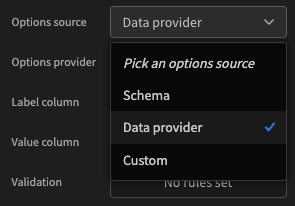
First, select Data Provider as the options source in the Settings Panel.
Next, there are 3 selections to be made in the Settings Panel. The actual data provider, the label column, and the value column.
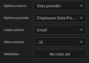
The Label column is what is visible to the user to select from, and the Value column defines what is actually selected in the background. This can be an ID or an Single Select data-type column, for example.
Using custom options
To use custom options, you need to select Custom as the options source in the Settings Panel.
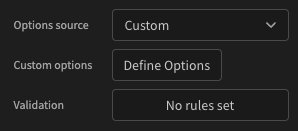
After selecting Custom, a new setting will appear in the Settings Panel, namely, Define Options. Clicking this will open up the bindings drawer where you can specify both label and value.
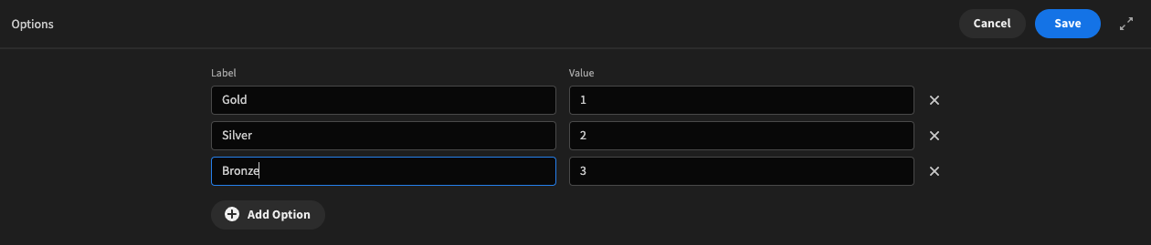
Add as many options as you need, and fill both the label and the value field. The label field is intended as visual to your users, where the value field is intended for usage in your application, such as storing in a data-source, or through other means.
Adding autocomplete
Autocomplete is a powerful feature which allows your user to type in the options picker to find the item they're looking for. This is especially useful when you have a long list of options to choose from. To enable this, you have to click the Autocomplete checkbox in the Settings Panel.
This will transform the dropdown to have a search field.
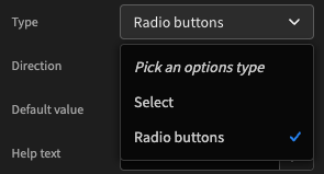
Using radio buttons
To use Radio buttons, all you have to do is select the Radio Button option through the Type setting in the Settings Panel.
This will automatically transform the UI to use radio buttons instead of a dropdown.
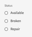
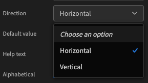
Horizontal or vertical mode
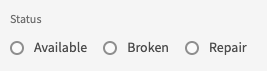
The image above illustrates the vertical mode of the radio buttons. You can also specify horizontal mode in the Settings Panel.
After selecting horizontal, your UI will look more compact, like below.
Further settings
There are more settings in the Settings Panel than have been discussed here. They're not complicated but might require explanation. You can find them in the reference table below.
| Setting | Description |
|---|---|
| Field | Connected field from the parent Form element, or custom by typing in a field name. |
| Name | The name of the field, displayed next to the options picker |
| Placeholder | The text displayed on the options panel when no option has been selected |
| Default value | A pre-selected value you can define using Bindings. |
| Disabled | Disables the field from editing |
| Configure Validation | Allows you to specify validation rules |