Components
Learn about Components within Budibase
Components are the UI elements of your Budibase apps. They are used to construct your user interface, which could be components that your user will interact with, or components for layout and displaying data. At Budibase we use the Spectrum design system created by Adobe. This gives you a great out-of-the-box experience with themes by default.
Adding components
There are a few different ways to add a component. If you have no components added, in the middle of your screen, there will be some text as well as a button that will allow you to add a component. The main way to add a component is to click the plus symbol found at the bottom right of your screen.
Clicking any of the above options will present a searchable and grouped list of components in the right-hand panel.
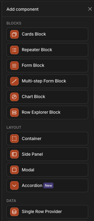
Component list
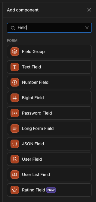
Searching for a component
When you search for a component, if it is highlighted in blue, add it immediately by pressing the Enter key.
Deleting a component
The easiest way to delete a component is to select it and press the delete or backspace key.
You will be prompted to confirm the deletion.
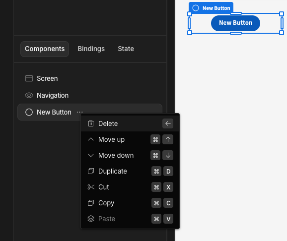
Alternatively, you can click on the three dots ... and then click the delete action inside the opened context menu.
Component tree
The component tree displays the layout and hierarchy of your components.
Components can either be below one another, or nested inside a parent component.
Parent components include those related to a Datasource or some variety of container:
- Data Provider
- Repeater
- Forms, Form steps and Field groups
- Container
- Sections
- Side Panel
- Modal
- Field Group
Components can be re-arranged within the component tree with drag-and-drop.
To assist with rearrangement, a green line will highlight the destination whilst a green box indicates that a component will be dropped inside that component.
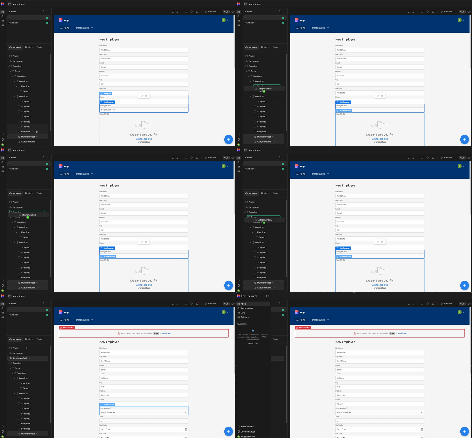
Editing
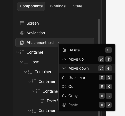
Within the component tree you can also delete, copy and move components by clicking on the ... beside the component name.
Keyboard shortcuts
In the above screenshot, you can see a range of keyboard shortcuts related to components. The above shows the following. You can replace the ⌘ (command) button on Mac with CTRL on Windows if you wish to use the shortcuts on Windows.
- Delete - Backspace
←- Allows quicker deletion of a selected component - Move up -
⌘+↑- Allows the user to move a component up in the component tree - Move down -
⌘+↓- Allows the user to move a component down in the component tree - Duplicate -
⌘+D- Duplicate component with all settings added - Cut -
⌘+X- Removes the component, saves it for pasting elsewhere - Copy -
⌘+C- Copies a component and allows it to be pasted elsewhere, e.g a new screen - Paste -
⌘+V- Pastes a copied/cut component in the component tree
There are a range of other ways to speed up navigate or perform additional actions more quickly. This is mainly done via the Command Interface
Renaming components
Sometimes, it's helpful to organise your component tree in a way that clearly reflects the purpose of each component. For instance, you might want to differentiate between various forms on a screen, such as the Create Users form or the Edit Users form. Similarly, labeling buttons can clarify their action, whether they're for endorsing, deactivating, etc.
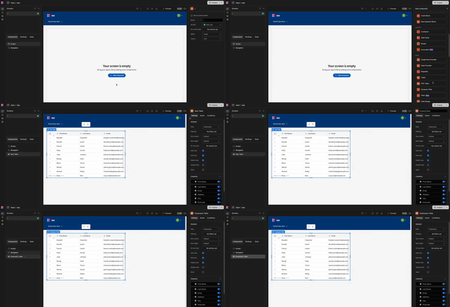
To rename a component, first select it. Then, locate the component's settings at the top in the side panel. Click the current name, delete it, and enter your desired name. The gif below should help guide you through this process.
Using components
When you have added a component you will be able to see the options that you can tweak on the right side under the Settings bar. Some components also have a toolbar that will appear above it in the preview window.

Video tutorial
Updated about 2 months ago