Area Chart
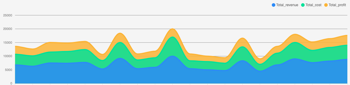
The area chart is a mixture between the Bar Chart and the Line Chart. Allowing you to display multiple columns of data on top of each other, having the area coloured.
Not only can you stack the different data like above, but you can also let them overlay.
Adding an Area Chart
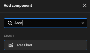
To add the area chart to your UI, you first need to wrap it in a Data Provider. Then you can add the Area chart to your UI through Chart > Area Chart.
Displaying data
After adding the Area chart to your UI, you can now select data. You should've already selected a data source through the Data Provider, so now you can select the Data Provider in the Area chart.
In the chart on top of this page there are 4 columns selected, and they stack by default. To do this, just select the data provider, a label column, and select the 4 columns you want to display.
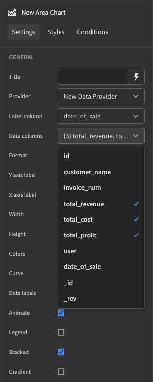
And that is all you need to do to get an area chart set up. But of course, you customize much more in the Settings Panel. To read more about further customization, check the reference table below.
Numeric data onlyOf course, line charts need to have a scale, so for the data column(s), you can only select Numeric columns (eg; containing values that can be converted to numbers)
Settings panel
The settings panel has quite a few customization options, allowing you to get the most out of your bar chart.
Setting | Description |
|---|---|
Provider | The Data Provider as a parent of your chart |
Label Column | The Labels you want to display with your data. These are displayed on the X-axis |
Data Column(s) | The data you want to display as lines. This has to be numeric. Can be multiple |
Format | Will divide labels by thousand or million on the axis and adds a |
Y-axis Label | The labels you want to display next to the Y and X-axis. |
Width | The size you want the chart to be, supports all CSS supported sizes |
Colours | Choose from one of the predefined colour-palettes |
Curve | The type of line you want to have.
|
Data Labels | Will display the value on every point on the graph |
Animate | Will animate when the data changes or on startup. Data-change can happen through Dynamic filter's for example. |
Legend | Will display, in the upper-right corner, the label for each of the data columns displayed on the chart |
Stacked | Check this setting to have the different data columns stacked, which means they won't overlay but be stacked on top of each other. |
Stacked vs non-stacked comparison

Not stacked (left) and Stacked (right) comparison