Field groups
Auto-populate and layout your form fields
Field Groups are components that group fields together within custom forms. They allow nested fields to be neatly aligned with each other, let you style your fields with consistent label positions, and offer us the ability to automatically update form schemas.
Form blockThe Form block will also automatically include all form fields of the chosen schema by default, and allow you to choose and arrange the included fields.
Form Blocks are a better option for most use cases, but we can still build our forms manually in more advanced cases, including using Form Blocks.
Updating fields automatically
Field groups have a powerful function that can save you a lot of time when working on Forms - they let you reset them. This automatically populates forms with all the fields in your Form schema.
This means you can generate a full form in one click, or you can add in missing fields if you change your schema. Field Groups must be nested within a Form component for this to work.
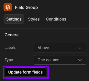
When you select a field group component in the builder, you'll be able to press Update form fields in the Settings Panel to perform this function.
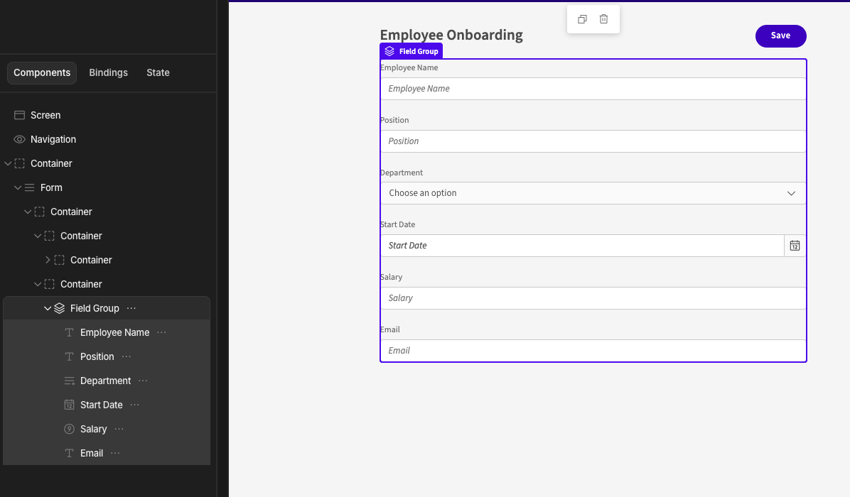
Auto-populated form fields
Layout
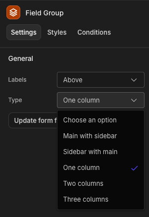
In addition to auto-populating form fields, you can also use field groups to determine how the fields should be displayed. The default layout type is One column, but you can add multiple columns or main and sidebar layouts in a couple of clicks.
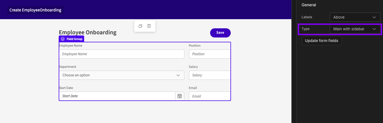
Main with sidebar layout
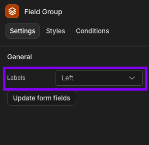
Label alignment
You can also choose whether labels are aligned to the Left or Above your fields.
It is worth noting that layout options are only available for labels that aligned Above the fields, as shown in the screenshots.