Tag
The Tag component can quickly display tags on, for example, a detail page. An optional delete button can be added, which can be configured using Actions.

Customising the tag
To customise the tag, you have several settings in the Settings Panel you can use.
| Setting | Description |
|---|---|
| Size | The size of text, choose between small, medium or large. |
| Color | Choose the color of the button, the text color will change accordingly. |
| Show Delete Icon | Will add a X to the tag which is clickable |
| On click delete icon | This setting will appear when the Show Delete Icon setting is checked. This will allow you to configure what happens when the user clicks the X using Actions. |
Tutorial: Movie genre tags
In this tutorial we will look at how you can use the tag component to display movie genres.
Setup
To get started, add an internal Budibase DB table called Movies, with 'Title', 'Year', and 'Image Url' columns. Add some rows.
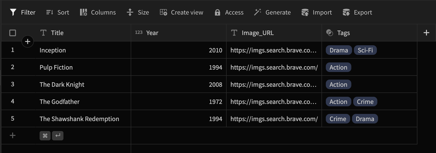
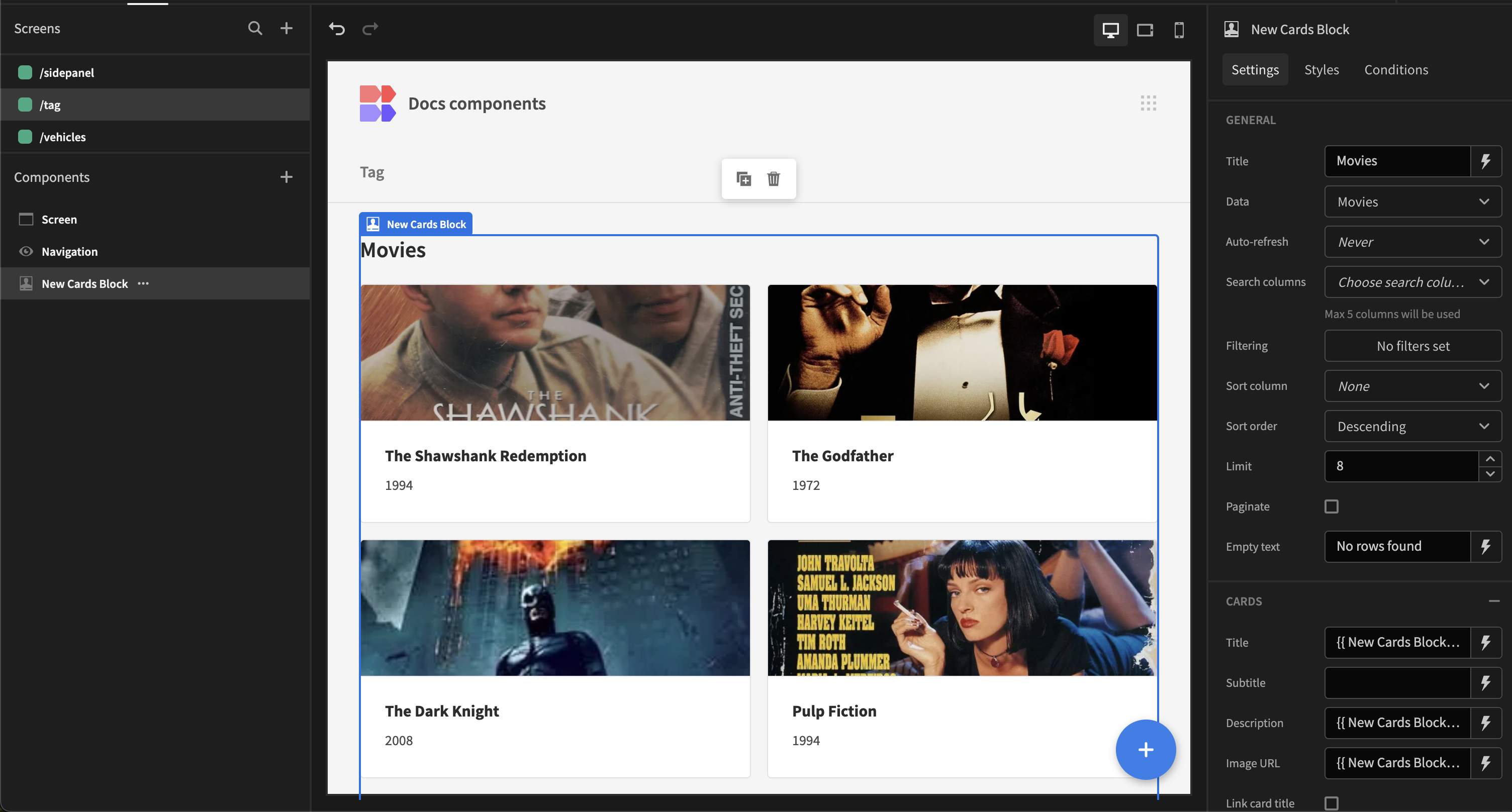
Next go to the Design section, and add a Cards block. Select the Movies table as the Datasource, and bind the Title, Subtitle and Image URL values to the table columns. For example, the Subtitle: {{ New Cards block.Movies.Year }}
Your screen should look roughly like so:
Adding the tags
Go back to the Data section, and add another table called Tags. Give it a text column called 'Name' and a Many->Many Relationship column linking to Movies.
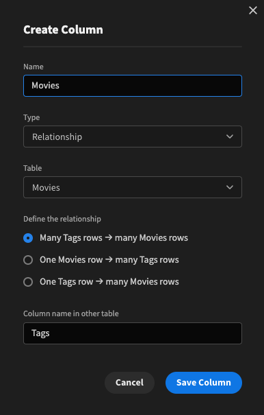
Many Tags to Many Movies
Add some tag rows, linking them to some movies.

Head back over to the Design section. To be able to add our tags, we must Eject the cards block.
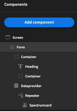
Component tree after ejecting the cards block
Next add a Container nested under the Repeater. Set the Gap to 'None'. Drag the Spectrumcard into the new container.
Below the Spectrumcard insert a Repeater block. Give it the name 'Tags Repeater Block', and select the Tags table from the relationship.
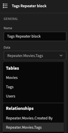
Selecting the tags from relationship
Finally add the Tag component underneath the Tags Repeater Block. Click Align right on the repeaters block to align the tags to the right-hand side of the card, and choose Row layout.
Give the tag the text binding: {{ Tags Repeater block.Tags.Name }}. This can be selected from the bindings dropdown.

Aligning the tags
As a finishing touch, it would be nice to give the different tags a color. To do so, we will use Conditional UI. Click on Configure conditions: Update Setting 'Color' TO ... IF {{ Tags Repeater block.Tags.Name }} Equals ...
The duplicate condition button will be very useful in this case!

Result
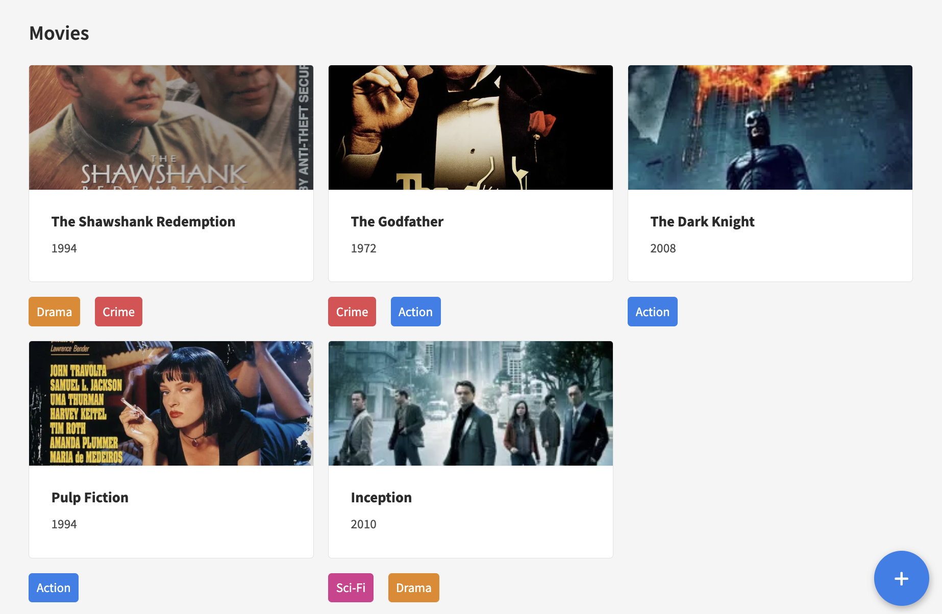
To see how tags can be used in a SQL database, have a look at this MS SQL Server tutorial.
Removing tags
You may optionally also want the ability to remove tags. To do so, first check the Show delete icon setting. This will allow you to specify some actions.
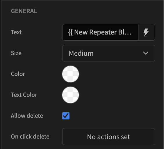
Add some delete actions
Add a Save Row action with the Movies Repeater as the datasource, (not the tags repeater block), and select the Movies table as the save destination.
Check Do not display default notification so that a toast is not displayed. Also Add column for the Tags relationship and give it the following JavaScript binding:
return $("Repeater.Movies.Tags")?.filter(tag => tag._id !== $("Tags Repeater block.Tags._id"));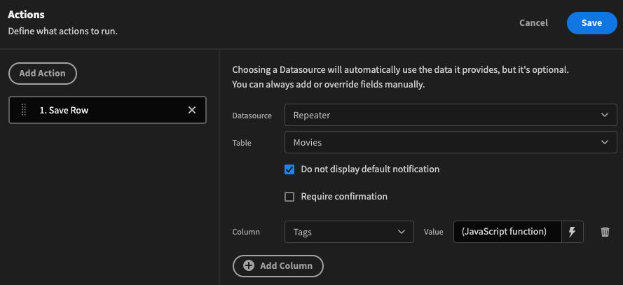
The JavaScript binding may appear a little daunting to some, but to explain in pseudo-code:
Save all of the movie tags excluding the one we are removing
After removing all tags, you will see a No rows found message, which isn't what we'd like in this case.
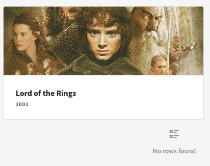
No rows found - Tags repeater block
Ideally this should just be blank. Click on the Tags Repeater block and Configure conditions: Hide component IF {{ Repeater.Movies.Tags }} Is empty.
As a finishing touch, it would be nice to add some margin when there are no tags so that the vertical spacing is consistent. Click on the Spectrumcard and Configure conditions: Update Setting 'Custom CSS' TO margin-bottom: 32px; IF {{ Repeater.Movies.Tags }} Is empty.
Naive result
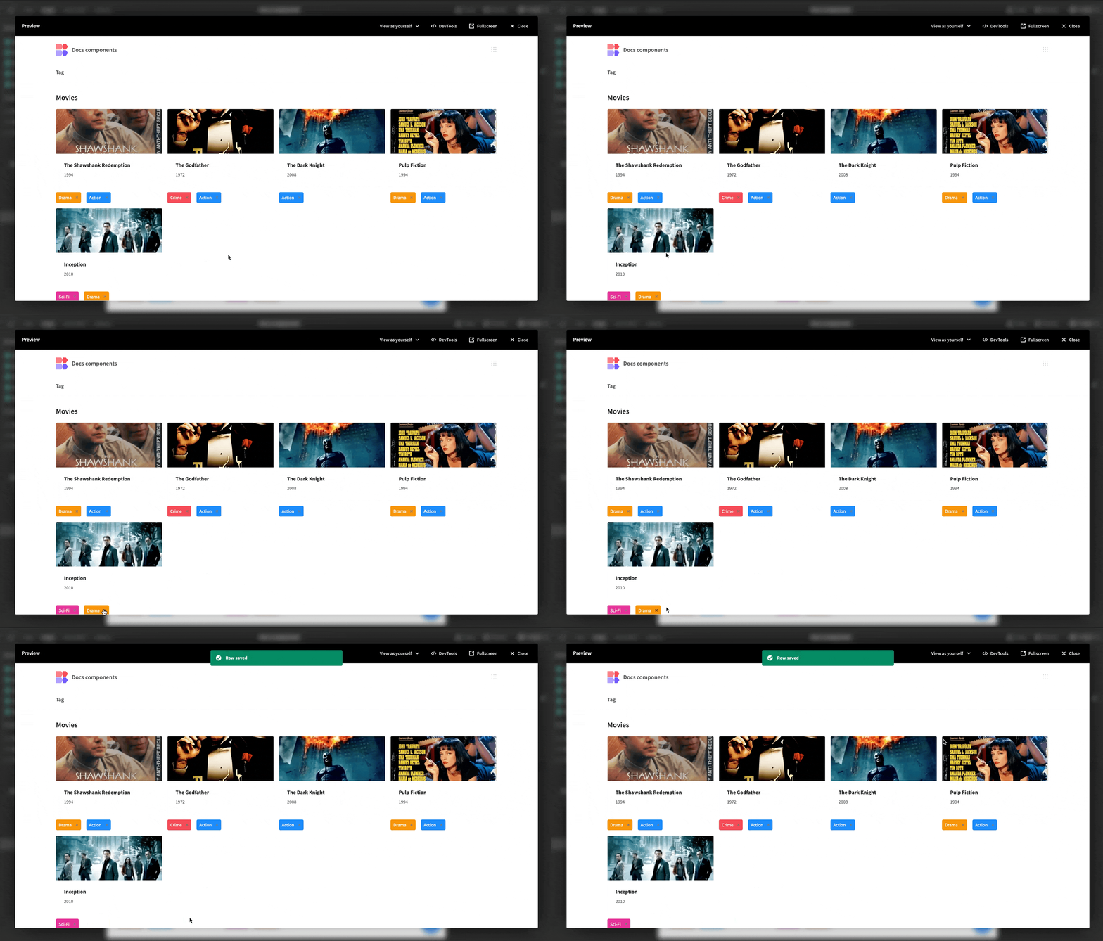
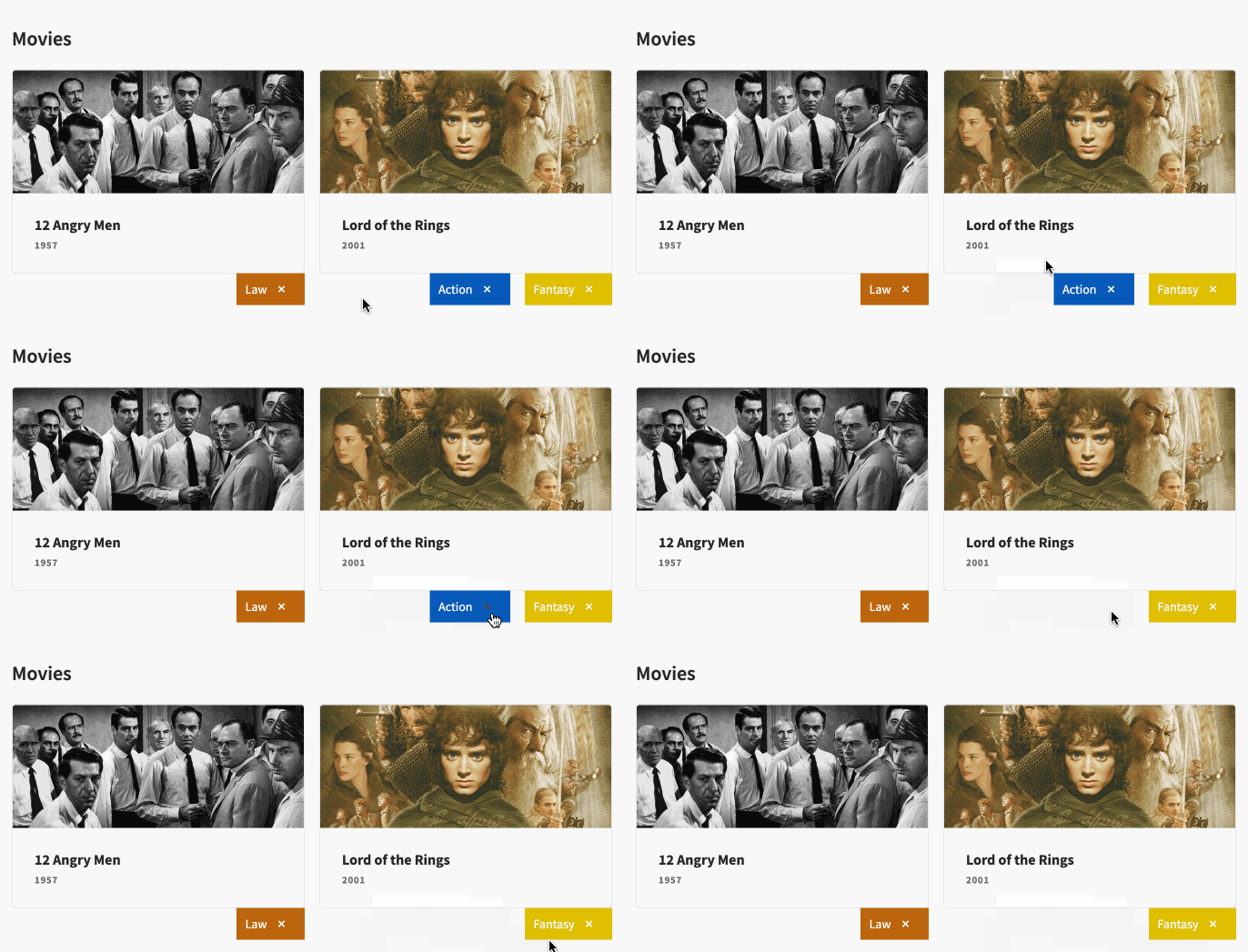
As you probably noticed, there is substantial delay between clicking the 'x' and the tag being removed. Ideally in this scenario we don't want to await for a database response. We can use App state to cache the tags and improve the tag deletion UX.
Add a second action for updating app state:
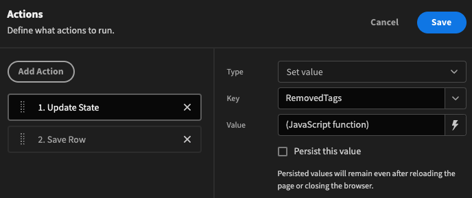
return {
	...$("State.RemovedTags"),
	[$("Tags Repeater block.Tags._id")+$("Repeater.Movies._id")]: true
}
Next we want to replace the Save Row action with a Trigger Automation action instead. Check Create a new automation, enter a name and check Do not display default notification.
Add Field for the tags, and movie_id.
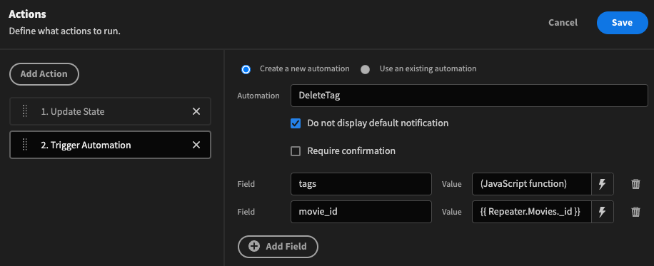
The JavaScript binding for the tags field looks as follows:
return $("Repeater.Movies.Tags")?.filter(tag => !$("State.RemovedTags")?.[tag._id+$("Repeater.Movies._id")]);Here we are only looking to save tags for each movie that have not been flagged as removed in our front-end cache.
Instead of waiting for a save row response, we will fire and forget a request to our Automation which will remove the chosen tag from our chosen movie.
After saving those actions, navigate to the Automate section and select the DeleteTag automation that was automatically created for us.
Make sure tags is set to type Array.
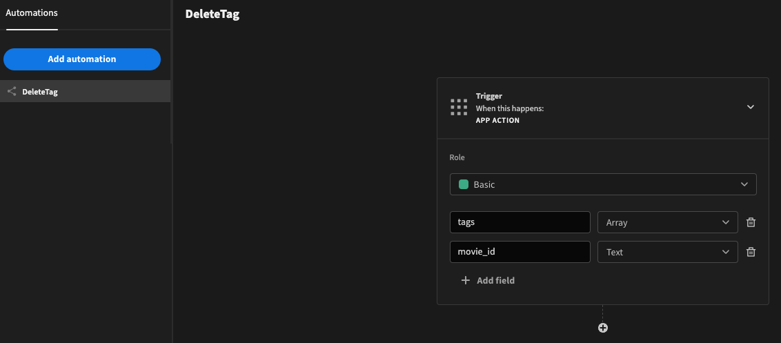
Set tags to type Array
Next add an Update Row step for the Movies table as follows, making sure the Use bindings options is selected!
In addition, check the Clear relationships if empty? flag to ensure that all tags can be removed.
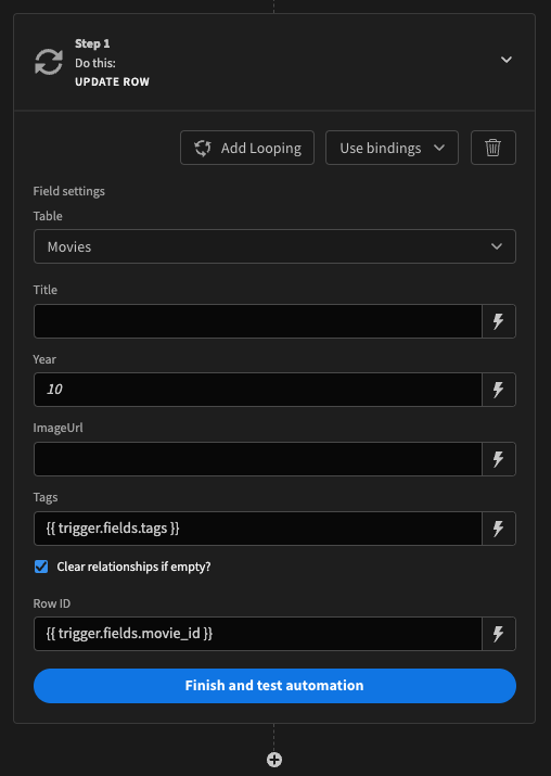
Publish your app to activate the automation.
Navigating back to the Design section, add another condition to the tag: Hide component IF
return $("State.RemovedTags")?.[$("Tags Repeater block.Tags._id")+$("Repeater.Movies._id")];Equals Boolean True.

Faster result
Updated 6 months ago