Designing for mobile
Learn how to design Budibase apps that look great on mobile.
Budibase allows you to build apps that look great across multiple devices, including desktops, tablets, and mobile. A few simple techniques that you can use to improve the design and usability of the apps you're building for your team.
Key responsive settings and defaults
Breakpoints
Breakpoints are the points in screen size or orientation where an app is triggered to adjust its layout. Breakpoints are how we define our app when it's being used on mobile, tablet, or desktop. Budibase comes with default breakpoints. Users cannot edit these breakpoints. You can visualize the breakpoints (and your design) within the design section by selecting the device toggle (see GIF below).
Flexbox
Flexbox is a one-dimensional layout method for arranging items in rows or columns. Items flex (expand) to fill additional space or shrink to fit into smaller spaces. Budibase uses flexbox to help users structure their apps. You can access the flexbox properties within the Container component - your components must be wrapped in a container for Flexbox to arrange your components.
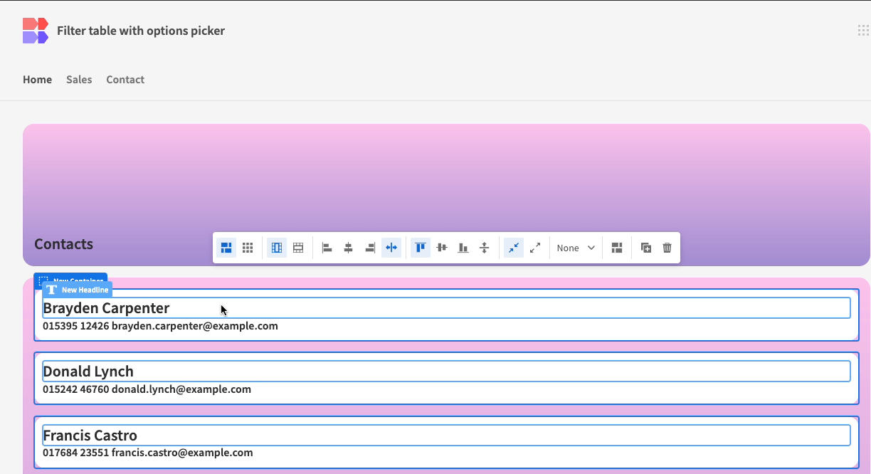
Flex wrap
The flex-wrap property sets whether flex items are forced onto one line or can wrap onto multiple lines. If wrapping is allowed, it sets the direction in that lines are stacked. So, within Budibase, if you have a row of cards and you select flex-wrap, the cards will 'stack'. In the GIF below, selecting the flex-wrap icon tells the browser to 'wrap' the elements within that container and allow them to stack - therefore free the initial component to take up the remaining space in the row.

flex wrap in budibase
Grid Layout
Using Grid layout, it is possible to drag-and-drop components into place, independently of other elements on the screen.
Update a component's setting based on the device
You can conditionally tell Budibase to update a component's setting if the user is on a particular device. For example, you may want to position your form labels to the left when the user is on desktop and above when on mobile. Here's a quick demonstration:
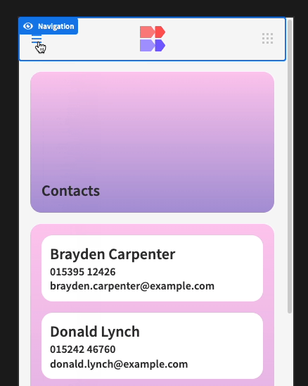
Hamburger menu
A hamburger menu is a menu button that enables a drop-down function for navbar links that helps save space in restricted designs. If you use either the side navigation or top navigation layout, Budibase will add a hamburger menu to your app. This is only visible when your users are on a mobile device.