Histogram Chart
Visualising buckets of data
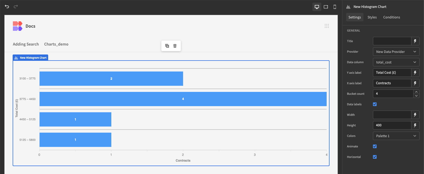
A histogram allows you to display the frequency of data within ranges, known as buckets. For example, here is a histogram showing the frequency of sales for different unit cost buckets.
Displaying data
Add the Chart Block or a Data provider to your screen, and select the data source, which could be a table, view, or Custom query. Apply any limits or filtering to the data source that you want.
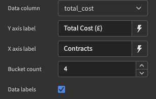
Next in the Settings Panel of the histogram component, select the Value column. This field must be a Number, and will determine the range for each bucket.
The number of buckets can be adjusted by the Bucket count. A checkbox is also available to determine if you want your Histogram to be displayed horizontally or vertically. You can provide labels for the x and y axis.