Forms
Learn about building forms with Budibase.
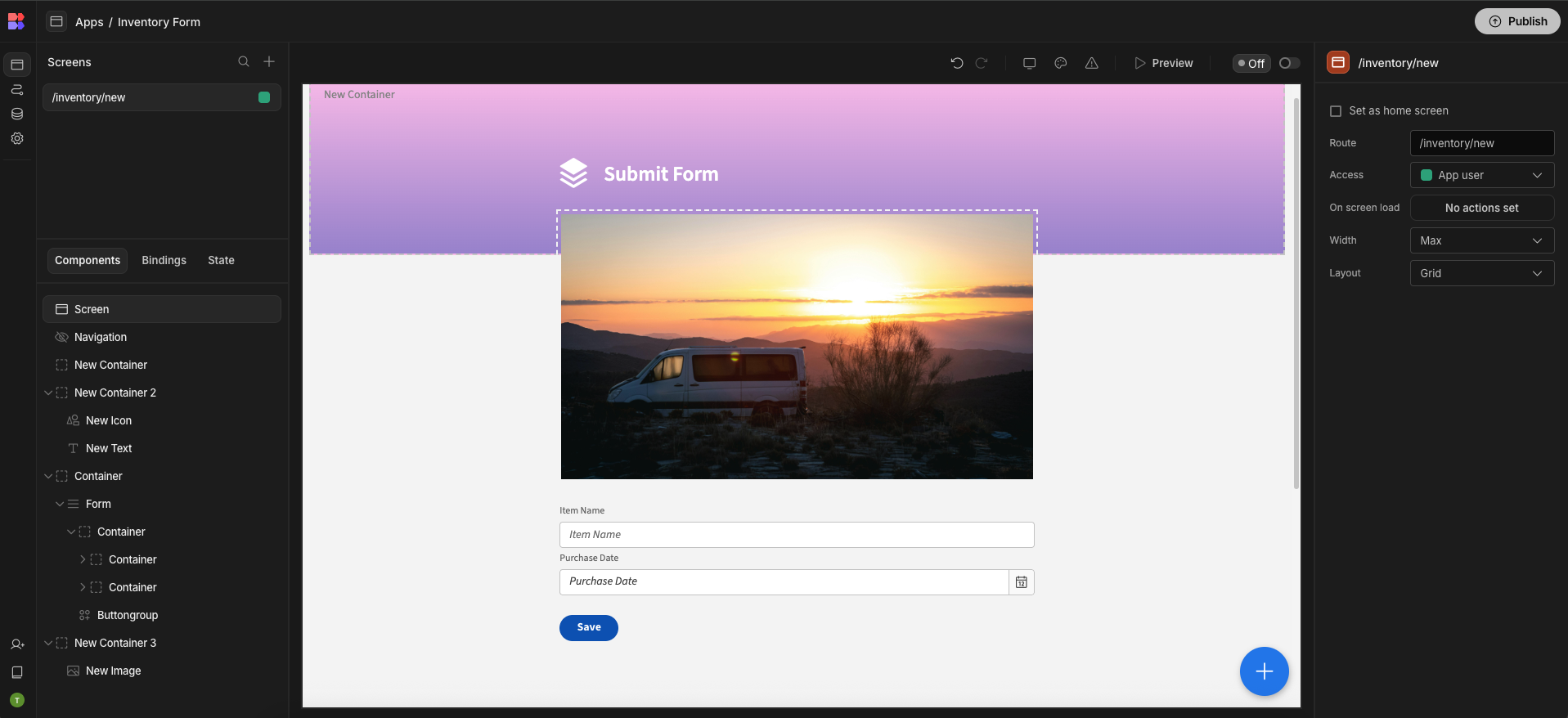
Forms are the primary building blocks of any data-heavy application. With Budibase you can build rich, themeable forms to create and edit your data. Forms are built up from 3 main component types:
- Form component
- Field group component
- Input components
Form component
The Form component is the top-level component of forms. All Field groups must be placed inside a form, and they won't work outside it. The form component is flexible and allows you to control layout, design, and theme.
Fields can now be used independently of a Form Component, which can speed up the development process when building things like Search fields. When taking this approach, fields will be available in the bindings drawer.
Form schema
Forms have a Schema setting which is optional. The schema for a form can be a table, view, relationship or "custom". A custom schema means that there is no backing data source schema.
Choosing a form schema has the following advantages:
- When adding fields, field names can be chosen from a dropdown rather than being typed
- Field validation is automatically added to match the schema
- If you want to create rows in a table using your form data, you'll need to choose the correct schema for the table you'll be saving your data to
- Fields will be able to automatically prevent you from entering an illegal field name for a certain data type
- Form components can be automatically generated to match the schema
Schema from queryWhen using a custom query or REST query as the schema source, the form fields cannot be linked to the query schema.
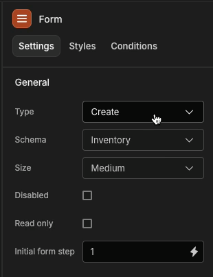
Form type
A form can be in 'Create' mode or 'Update' mode.
In Create mode, the form fields will be initially blank, with the exception of those with an assigned Default Value
In Update mode, the form fields will automatically be populated from the parent Repeater data, assuming the form schema is not set to custom.
Inputs
Each input component represents a single field in the form. There are different components for every data type. All fields have a field and label setting. The field is the name of the field or property of the schema. This can be free typed or if a schema exists on the form, selected from a list. There are unique components for every type of data, and if your form has a schema then you'll only be able to choose field names that fit the particular type of component that is selected. The label setting is the label that will be displayed beside or above your field. Most fields also have a placeholder setting to control the text displayed when the field is empty.
Custom Inputs / Fields
Whether your form has a schema or not, you can always add custom fields that don't exist in the schema by free typing the name of the field. Data Bindings will always reflect the names of all the fields in your form - so even if you don't have a schema on your form, you'll be able to bind to any of your fields.
Help text setting
To add some context to your form fields, you can add some 'Help text'. For example, you may want to pro-actively inform your users about the validation of your fields. If a validation error is triggered, then the help text will be replaced with the red error message.
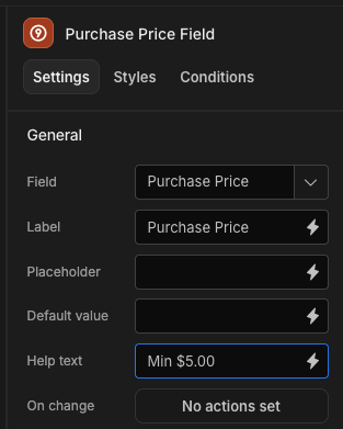
Adding some 'Help text'
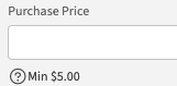
Help text on the form field
Nesting non-form components
Forms can contain any components, not just fields. A handy way to manage layout is to put fields and other components inside Field groups.