Bar Chart
The bar chart is a very basic, but powerful, method of displaying data in such a way it makes much more sense immediately, compared to simply browsing the data in tables.

Adding a Bar Chart
To add a bar chart to your UI, you need to connect it to your data source using a Data Provider. After adding the data provider, add the Chart > Bar Chart component to it, and you'll be able to link up the data from your table.

Grouping dataTo group data inside a bar chart, use Views on top of your data. This way, you can hook up your chart using the data provider linked to the view instead.
Displaying data
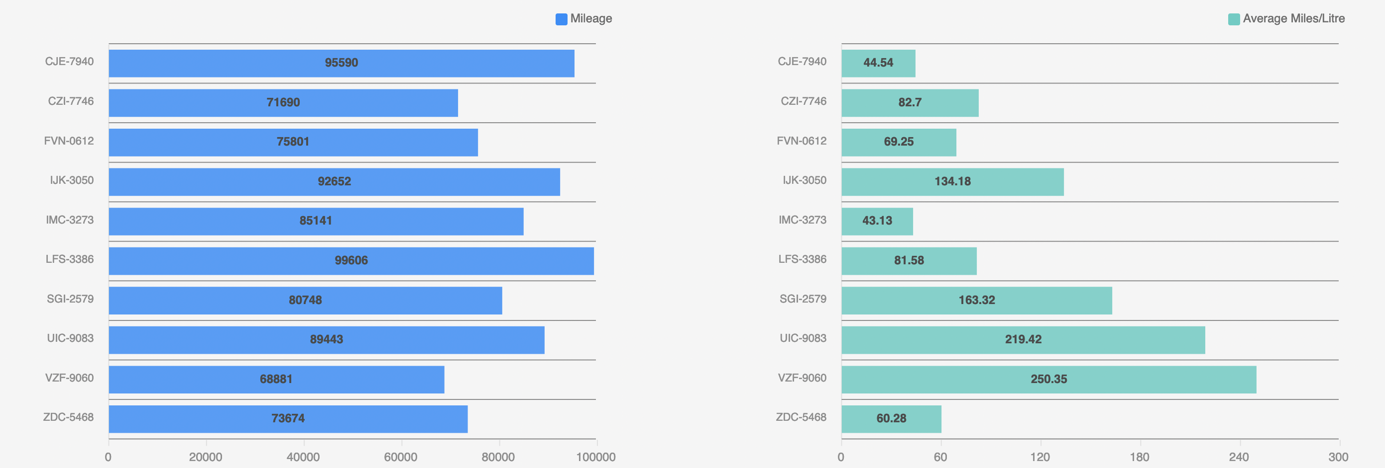
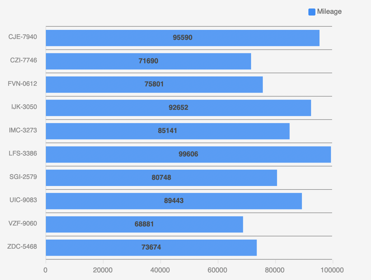
Now that you have the data linked up to your bar chart, you can select which columns you want to display. For example, we have a table with cars and their mileage, and displaying this in a bar chart is only a few clicks.

To get this view, head over to the Settings Panel, and select the License Plate as the label column, and the mileage as the data column(s). And to get the bars horizontally, instead of vertical, check the Horizontal setting in the Settings Panel. And there you have it.
This is just one of the many things you can do with the bar chart, explore all the features from the Settings Panel below.
Numeric data onlyOf course, bars need to have a size, so for the data column(s), you can only select Numeric columns (eg; containing values that can be converted to numbers)
Settings panel
The settings panel for the bar chart has the following options. Generic styling settings are omitted from this overview.
Setting | Description |
|---|---|
Provider | The Data Provider as a parent of your chart |
Label Column | The Labels you want to display with your data. These are on the X-axis in standard mode, or on the Y-axis on |
Data Column(s) | The data you want to display with the labels. This has to be numeric. Can be multiple |
Format | Will divide by thousand or million on the axis and adds a |
Y-axis Label | The labels you want to display next to the Y and X-axis. |
Width | The size you want the chart to be, supports all CSS supported sizes |
Colours | Choose from one of the predefined colour-palettes |
Stacked | Check this setting to have the different data columns stacked (aka, on the same line instead of each column as a separate bar) in the chart |
Horizontal | Displays the bars horizontally, rather than vertically, when checked. The labels will move to the Y-axis when this is checked |
Data Labels | Will display the value of the bar on top of the bar when checked |
Animate | Will animate when the data changes or on startup. Data-change can happen through Dynamic filter's for example. |
Legend | Displays the label for each colour visible on the chart as a legend in the upper-right corner |
Updated 8 months ago