Progress Donut Chart
It is possible to display a progress bar using a Donut Chart.
This can be useful when building KPI dashboards or other task tracking apps.
Data
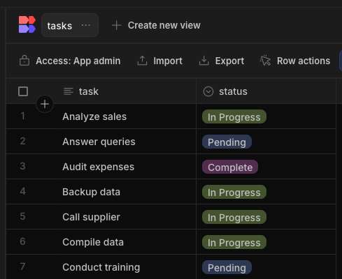
You may have a table with tasks, each with a status such as:
If you don't already have data like this but still want to continue with the walkthrough:
- Create Head to the Data section and create a new table in your workspace
- Create a text-column, and a Single-Select column.
- In the Single-Select column, set the possible options for your tasks that best suit your needs. Here we'll be using "Pending", "In Progress", and "Complete".
- Fill in with some sample tasks and set their statuses.
Preparing the Data
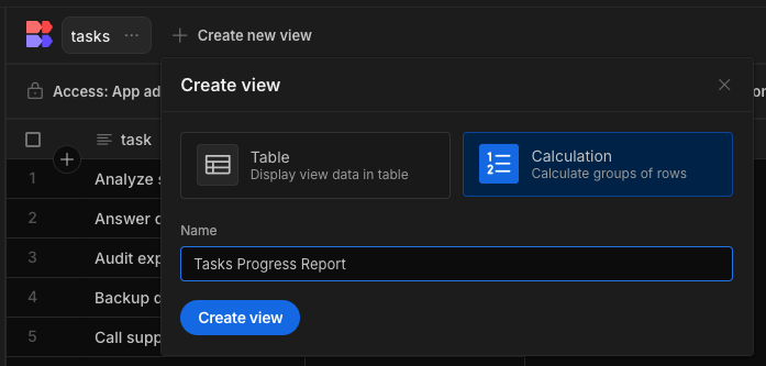
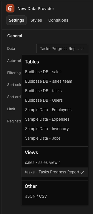
To provide our progress chart with the correct data, we will need to create a View so that the tasks can be grouped by status.
First click the 'Create new view' button, select 'Calculation', and set the name of the view to something descriptive like "Tasks Progress Report"
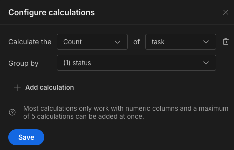
You'll be met with a very blank table - don't panic, we need to configure our calculations. Click "Configure Calculations". In this case we want to count how many tasks have each status. This is almost read as a sentence when we see the calculation is "Calculate the" Count "of" task Group by "status" - we're counting how many tasks have a particular status.
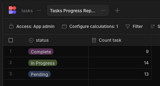
With my sample data, I can then see that I've got 3 rows, one for each status, and the "Count task" tells me how many tasks have that status assigned.
Apps > Design
In your workspace, add an App and create a new screen. Add a Data Provider with the view as its datasource.
Nested underneath, add your donut chart with the provider set.
For the label column select Status and for the data column select Count Task.
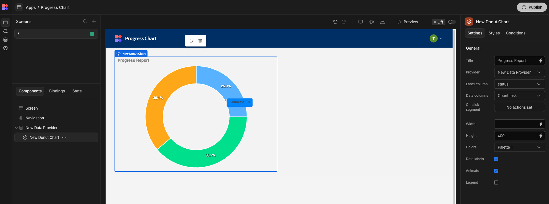
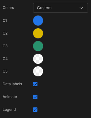
Adjust the settings as desired, for example setting colours specific to the status.
Adding more functionality
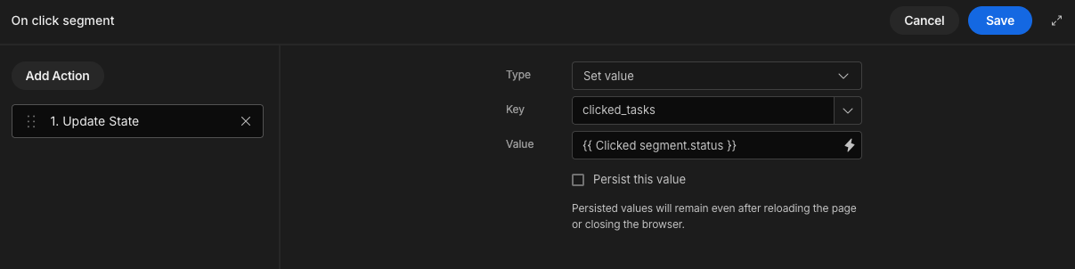
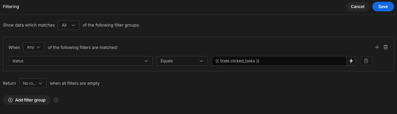
Using the Donut Chart's "On Click Actions" we can display the data that a user clicks on. Add an "On Click Segment" action and set the Clicked Segment's status into state. This will set the string "In Progress" in state, when the "In Progress" segment is clicked.
Next, in your Screen, add a repeater block set to display the Tasks table (not the Tasks view calculation). Use a filter on the Status column to match the clicked_tasks variable we set in state.
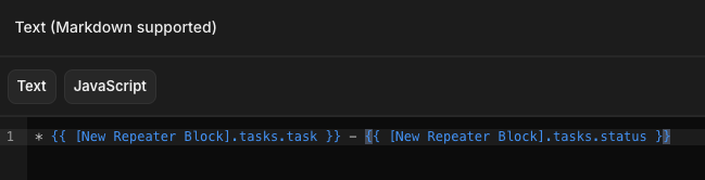
Now in your Repeater Block, you'll have every task with the status that the user clicks on in the donut chart. Add a Text component to the repeater block and use it to display your task and status.
External datasource
Instead of using an internal table view, you may wish to use a Custom query from an external datasource.
You will need to transform the data in the format outlined here, where there is a label for each status.
Updated 8 months ago