Table Block (Deprecated)
Quickly display and action your data
The Table block effectively merges both the Data Provider and the Table component into one. It also integrates Searching and filtering data. This helps you simplify the logic of the page, and not have to worry about configuring two different components.
Furthermore, it allows you to add CRUD (Create, Read, Update and Delete) functionality to your table data; all in one component! It achieves this through the use of 'Create' and 'Edit Detail' Side panels.
Many of the settings will be shared with the Table component. The block specific settings are described on this page.
TableThe new table documentation can be found here.
Search fields
Select the fields you want users to be able to search on. For a Text field the search will be a starts with. Other fields will search for an exact match.
As noted under the setting, a maximum of five search fields can be used at any given time.
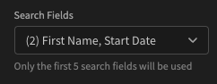
Allow users to search on First Name and Start Date
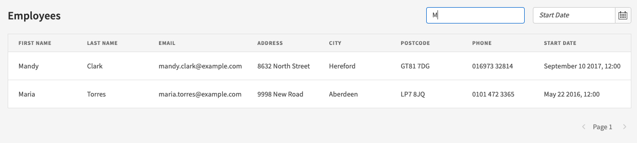
If you add search fields, upon Ejecting a Form component will be added like so:
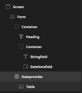
Ejected table block with search fields
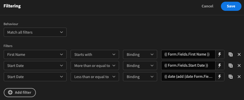
In addition, the added Data provider will include the necessary filters with the form field bindings.
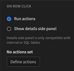
On row click
This setting allows you to determine what happens when a table row is clicked. By default Run actions will be checked, however with no actions set nothing will happen.
Run actions on row click
Click Define actions to get access to all of the available Actions.
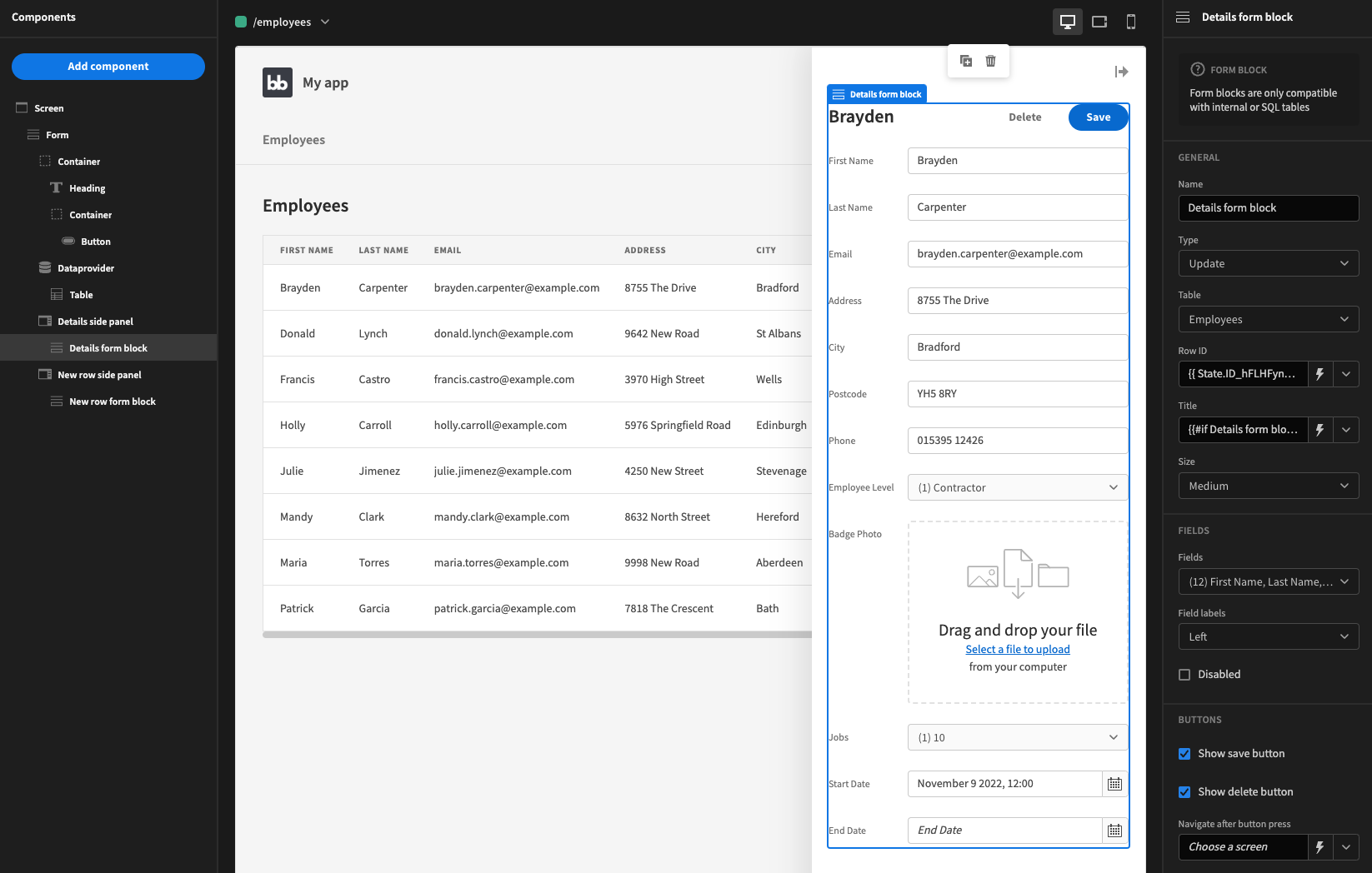
The other option is Show details side panel. This will open a Side panel when a row is clicked, showing the row detail within a Form block.
As noted under the option, table block side panels will not work with REST queries or other Custom queries.
Show button
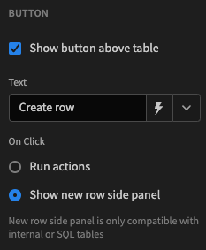
You can add an action button to the top right of your table. To do so, check Show button above table.
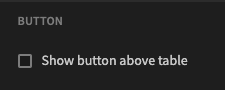
The table block will have no action button by default
Once checked, you will be able to enter some text for the button, and similar to on row click, you can choose between running some actions or opening a side panel.
In this case however, the side panel will have a nested form block in Create mode, i.e. the fields will initially be blank and save a new row on submit, rather than update an existing row.
Action button opens a new row side panel
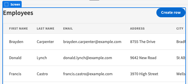
Table block with Create row action button
Autogenerated screen
When creating an autogenerated screen, the table block is the only component that is added, with both side panel options selected.
Ejecting an autogenerated screen table block will result in a component tree like so:
Ejecting in this case is useful if you wanted to view and edit the side panel forms within the builder.